DAY 2 | EPISODE 2
PAGES

Paul | 32:57 | No Tasks
Core to the session is setting up your pages for SEO, plus, understanding the difference between Page Settings and Product Pages Settings. if you have an online shop, you can manage you entire product data without ever having to visit the Page Editor.
LESSON PLAN
Pages Tour
Paul Davenport | 06:09
Take a Quick Tour around the Pages Area as we answer a frequently asked question for teams of content editors, "Did somebody delete by page?"
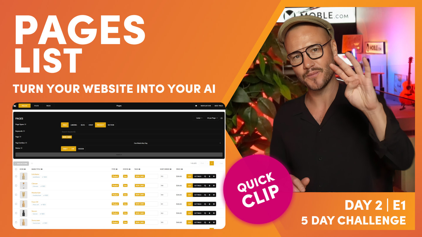
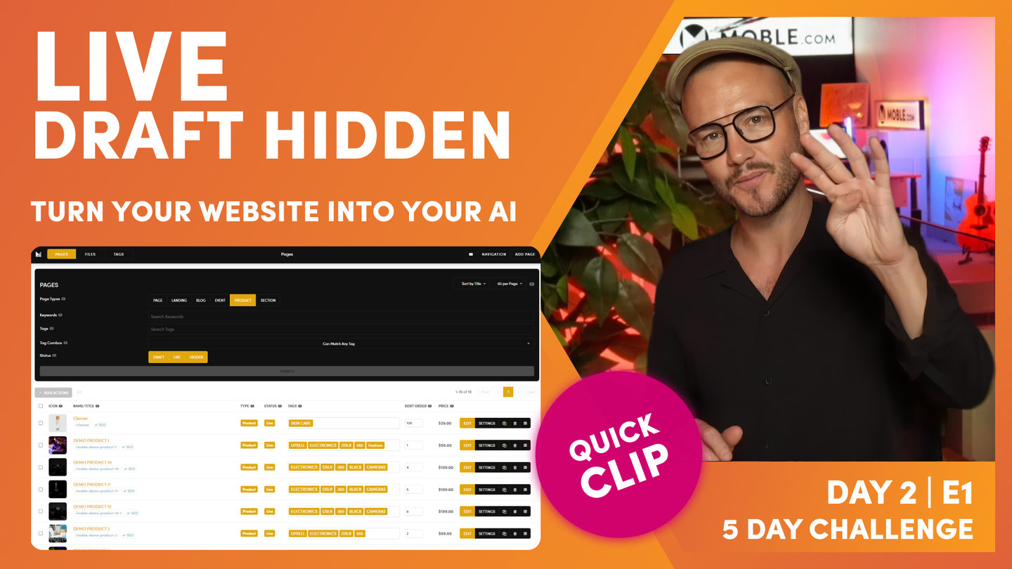
"In this episode, we're going to take a look at the pages area. Now there are no tasks in this episode. It's simply a follow along tour as I take you through some top tips and frequently asked questions. Well here you can see I'm in the pages area, which you can navigate to by the top menu and click pages. And the first thing you'll notice is the page is split into two. We've got a black search box at the top and then we've got a list of pages below. Well, why such a detailed black search box? Well, that's because a lot of our clients have got thousands of pages and they need to be able to find them and that's actually one of the most frequently asked questions that we get. And that is often people in a panic thinking that the page that they've been working on or edited previously has been deleted or most likely hasn't been deleted.
But mobile, a lot of our clients have many different content users. So it could be people in your team or it could be people from external agencies like a marketing agency or a content agency, and they might have changed the page or maybe even made a variant and changed the url. So let's have a quick look at how you can always find a page even if somebody has completely changed it. Well, you can see we've got five main types of pages. We've got pages, landing pages, blogs, event pages, product pages and sections, sections that we looked at in the previous episode. We're also going to dive a little bit deeper in sections on the next episode too. And you can see at the top here super useful is our sort order. You can sort pages in title. You can see here alphanumeric, but you can put them in the latest that they were created or the last that they were updated.
What I like to use is sort order a lot. I like to sort my pages so I can decide how they're going to appear in the dynamic widgets and feeds. But you could look in date order and the latest date order as well.
Okay, well let's look at this. So let's imagine here that somebody has gone to the about us and randomly put it into the products area. So we'll put this into products here and I'm just going to hit search and that's going to update that. You can see our about us page has disappeared now. So let's now go over to products, which I'll highlight products and uncheck pages and I'm going to hit search. And you can see here our about us page has now been moved into the products. So that's how it works. I think you get that. It's pretty straightforward. I'm just going to put this page back into the pages there. So the about us page now goes, I just hit the search.
So the next thing I'll show you is the sort order. So here I'm in the products area and I will go to sort order here and click search. And you can see I've got a whole bunch of pages here that are live. I've got some in here that are draft that we're currently working on. And then I've got some others that are completely different tags. So you can see here these are in the skincare category and these are in the electronics category with subcategories under cameras. And you can see here that the sort order, I've got them in a completely different numbering system here. So these start with one and this category starts with 101. So that's a nice way to work in terms of categorizing your pages because these are going to go into a feed and I'm going to put these into sort order.
So if I jump over to the homepage, let's have a look at that. Skincare, you can see my products here in the shop are in a nice sort order that I choose I want them to appear. So that's kind of sort order. If you do change a sort order in here, just remember to hit save at the top of the page. So if I click here, save will light and now you can save it. So if it's been a year since you've been into your website, you've set it a particular way, the whole team has come in, they've changed things, your page has gone missing, it's in the wrong category or it's you're feeling it's been deleted and you're in a panic. Well, what I would advise is you just highlight absolutely everything. Okay? And then use the keyword search to search for something.
Now the keyword search will search for the page title and the URL, everything on the page and even the SEO title of meta description. So you get a good chance that you're going to find it because you'll know a word that's on the page. Well, we looked at skincare there, so I'm just going to type in the word skin. I don't need to type in a whole sentence, just one word will be fine. Now if I just search here, I can see all of my pages that have got the word skin in them. And these are all the different types of pages including draft, live and hidden, which we'll come onto shortly.
Now the beauty is if you tag your pages, you can also search for them. In this case skincare. Now if I just sort this and you can see these are in the latest order now, but if I just put that here and press search, you can see now I've got all of my products in a nice sort order. So that's a really nice way to work using tags and using sort order. Top tip. And don't forget, tags is not just for eCommerce and categories. You can tag your news pages, projects pages, services pages, anything that you like, you can tag them because most likely at some point, either yourself or your team members are going to want to put them them into feeds, into what we call widgets."
Page List
Paul Davenport | 01:58
Get to know some simple but convenient features of the Page List.
"Okay, well now let's move on to the list area. This is pretty obvious stuff, but if you click the link here, it will open up the page in a new tab. So this is a product page. I'll click face oil. It opens up into a new tab where I can just go and see how the page looks on the front end. And here I can copy the URL to my clipboard. Now I'll just tell you one cool thing with this copy to clipboard link. If your webpage is live, we copy the whole URL, https www, and if it's not live, we just copy forward slash about just the path. So why do we do that? Well, if your webpage is live, most likely you want to share it so we copy the whole link. But if your webpage isn't live, you don't want to share it and you'll want to use it mostly for editing pages, maybe copying a link to include an internal link elsewhere.
So that's a pretty cool feature. All you need to know is if your webpage is live, you can copy this and use it to share. Well next you'll see that we've got this blue SEO tick. Well, that's because the page has been set up for SEO. But what if the page hasn't been set up for SEO? What does it look like? How do we know? Well to show this, I'll go back into the pages area, I'll remove the skincare tag and just look for draft and live. So I'll hit search. And you can see that not all of these pages have been set up for SEO. Some have got a blue SEO tick and some have got a red SEO cross. Well, I'm going to come onto this just shortly and just show you how we set up the page for for SEO."
Page Icon
Paul Davenport | 05:21
Your Page Icon is used for your Widget Feeds but also when you share a link on Social or SMS. MOBLE automatically sizes it for you no matter where it appears.
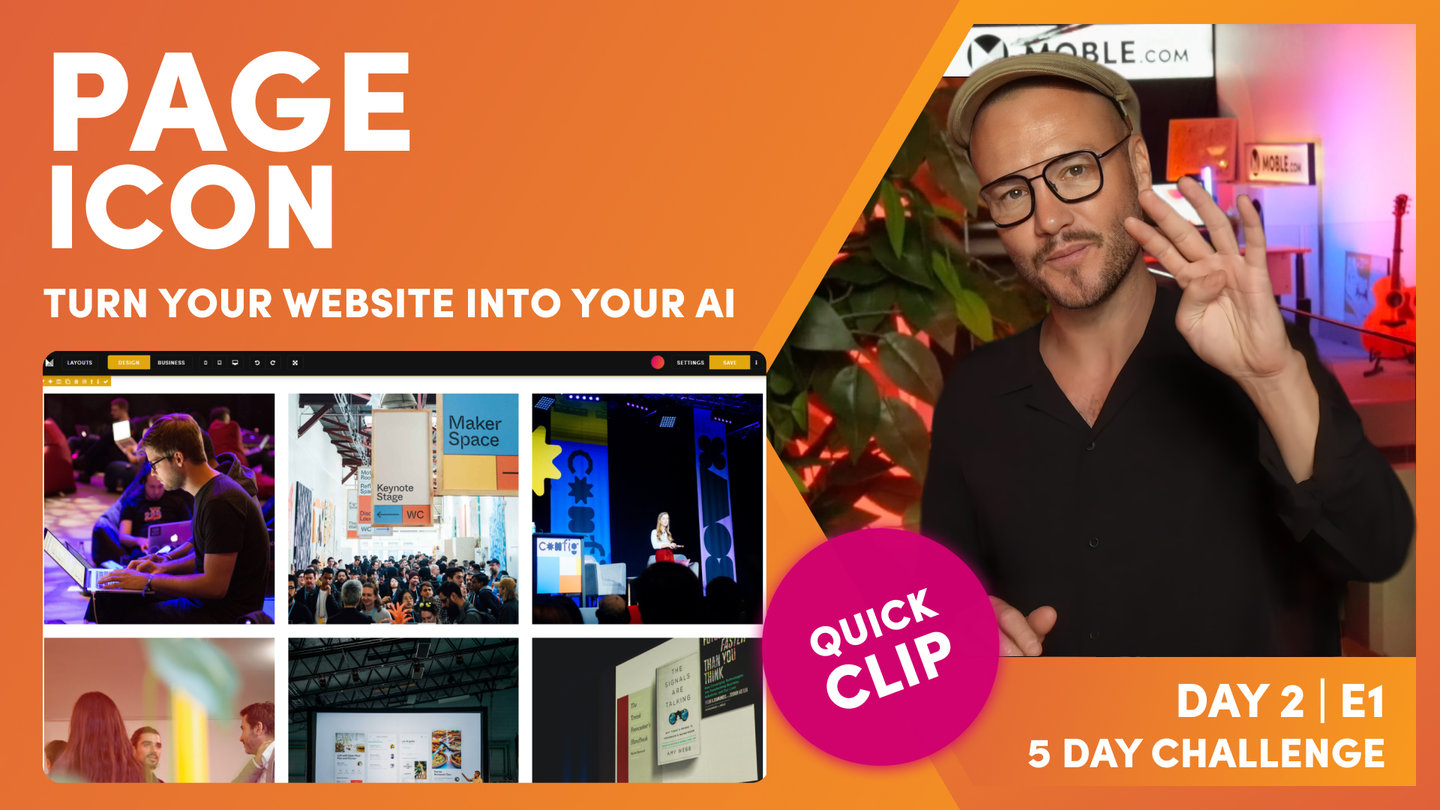
"I'll show you page icon, because this is actually super important. Here is this image that we call the page icon. Now the page icon is doing four things, so I'll race through what those are. Well, first of all, it helps you identify the page in the CMS. You can imagine if we were looking at the products pages and you had thousands of pages, you want to see the product. So that's number one. It helps you find the page. Now number two is your mobile phone. When your clients share a link of your page on their phone, it's always accompanied by an image, isn't it? Well, this is also your page icon. So when people share on their mobile phone, they're also going to see this image. Now number three is very similar. Number three is social media. So on Facebook or Instagram, someone might send a link of your page to again, one of their friends, and that is also accompanied by an image. Well, again, that's your page icon. So very important.
But number four is perhaps the most important of all, and the page icon is the link in your widgets. Well, what are widgets? Widgets are those dynamic feeds that pull in all of your pages into feeds right away around the website. So that could be an event feed, a newsfeed, a feed of your projects or services or even your online shop products. Well, these are the images that are on your page, so they're important for people to find your pages and see what's in the pages, but it's also important for design as well. So we put so much emphasis on making sure that your page icons are really the best quality that they can be.
Okay, so with that said, let's just have a quick look at the page icon on the front and you can see our page icons here for a product widget.
And if we scroll down, you can see them here for an event widget. One of the things I'll just mention there with the widgets is our system will automatically size them for you. So if you've got a widget that's a full page or you want to show it as a rectangle slider, our system will automatically size the image for you in the widgets. So there's nothing you need to do. You just set the aspect ratio, which we'll dive into that in the widgets episode. So you don't really need to worry about sizing your page icon at this stage. That's the key thing I just want to show you."
Page Settings
Paul Davenport | 02:46
Page Settings are an essential page of any web page but especially for dynamic websites. Make sure you know how to manage your Widget info.
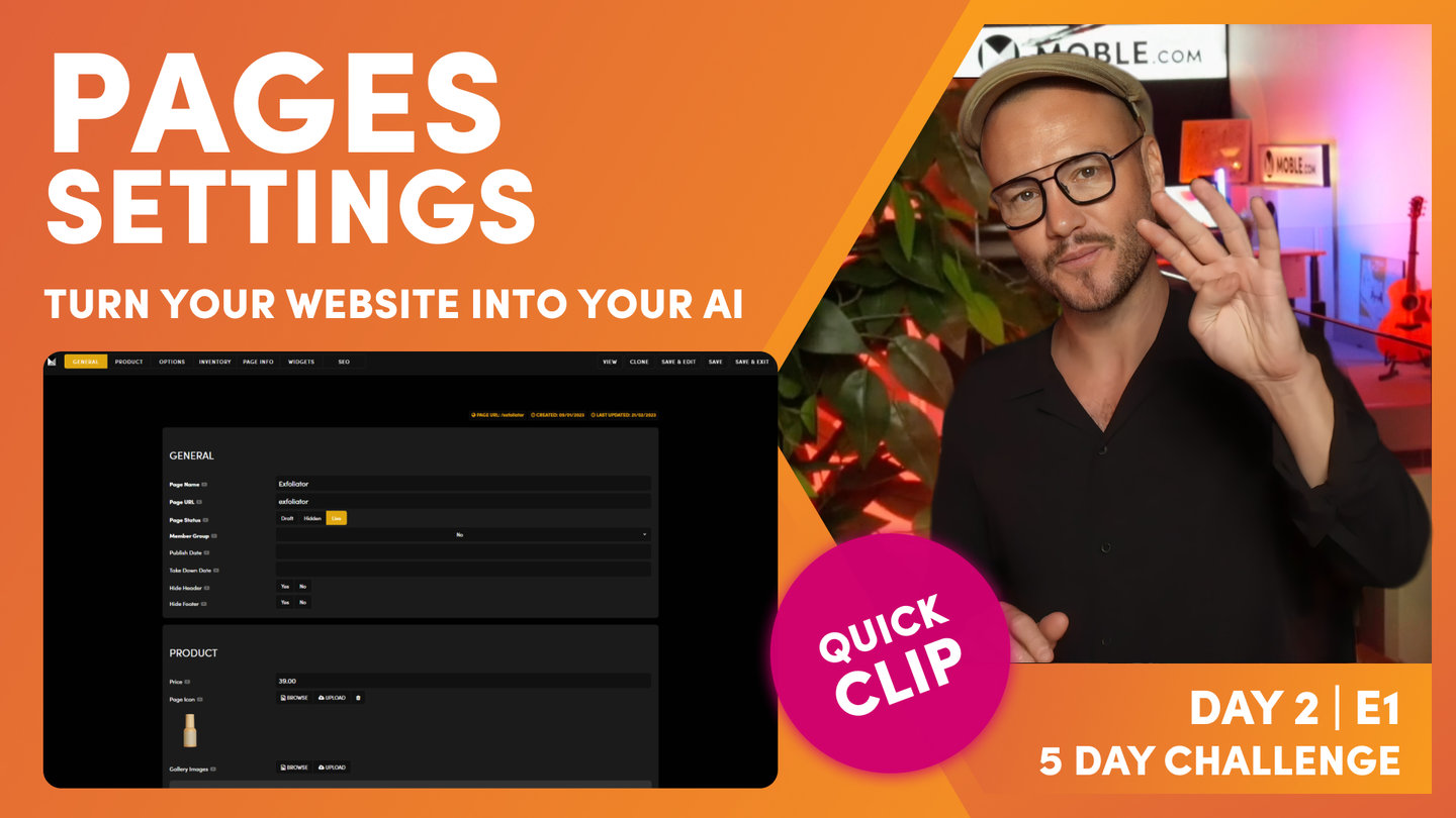
"Now let's jump back into the pages area and let me now show you where you go to edit both your page icon and update the SEO. Well, this is in the settings area. This is our meta information for this particular page. So we go into the settings tab and to demo our go into this particular page here, our products category page. So over into settings. And you can see here's some general information which we'll come back to shortly. But basically you've got the page name, the page URL, draft, hidden and live, which we're covering at the end. We've got member groups so you can password protect pages and only give access to certain member groups. So we're covering more on that in day five. Used less frequently. You can set a published date so if you are editing a page, you can publish it to a specific date in the future and also take it down at a particular date in the future.
And of course you can hide your entire header and hide your entire Footer. Why would you do that? Most common example is landing pages where you don't want people visiting the page to get distracted by other links. You only want them to click the form or the button on that page to increase your conversions. Well, in that case you might hide the header for this particular page and even hide the Footer so they only get one action and that's the form or the button on your page. Pretty obvious stuff, obvious stuff, but that's all there in the general section. So what we're looking at now is where you change your page icon. Okay, well here is your page icon and here you can edit it. You all know by now you can browse current images to select one or you can upload a new one.
Well, let's just have a look at how the page icon appears on the front end again. Let's remind ourselves. So here's a particular widget for events. Well, this is the page icon you can see in the background. But as you hover over, you get more meta information. So this is the image before you click on the page. Well, this is also the text that you see before you click on the page. So here we've got a date, the main page name, and then the summary. So let's have a look where that would be. Well here you can see this is the page name. And then in the widget, okay, this is why it's in the widgets area, you get the summary and a date. Now your product pages have very different meta information."
Product Page Settings
Paul Davenport | 03:43
Manage your Product Page info from the Products setting area without having to manage a page. This is a prerequisite so Sunset Talks 4 where we building store pages in more detail.
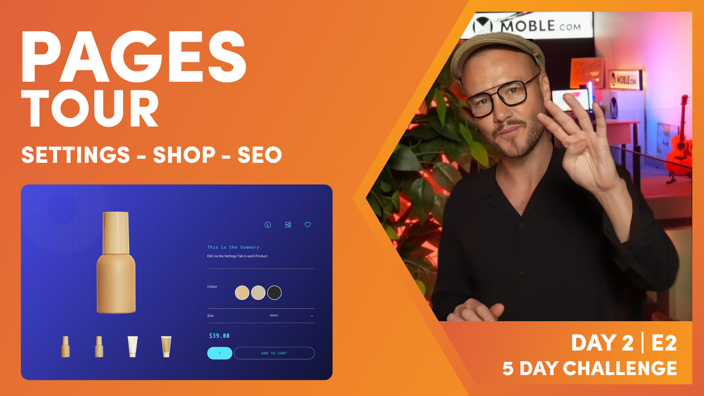
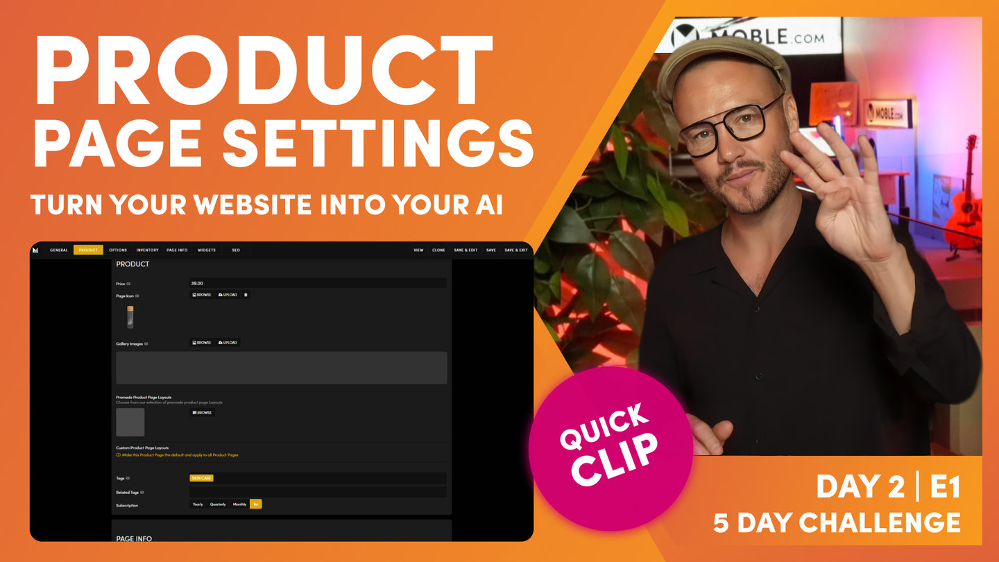
"The page settings area is different for eCommerce. So your product pages have very different meta information, which you can see on the product settings page here with things like a gallery of images that will go on the products page as well as things like a more detailed summary and description. But of course tabs for things like shipping, returns, terms and conditions, and of course options and variants. So you can see here all of the product options for this particular product. And it comes in two different sizes, which of course are going to change the price. So we need to see those in the variants. And you can see that price change here between the sizes in the variants. We can also keep track of all the inventory and of course SKU numbers and indeed a unique QR code for each product variants, which helps for things like help information or unboxing, which is really cool strategies to use.
Again, we'll look at the QR codes in just one second because not just every product variant has a QR code. Every page on mobile has a QR code too. Next, I'll just show you that you can actually anchor down using the tabs here. So I could go to options. And next we'll look at inventory where you can see we manage all of the inventory and shipping for this particular product. But we can also go down to more information like widgets that you are familiar with here. And you can see this is the information that displays before you click onto the page. So I could show that this is in the skincare category for example. But there's other fields here that are different from the normal page settings in the widgets area. So I'll just jump back in here So you can see, we'll go down to widgets.
So you can see the slight differences between the normal pages and the product pages. And that brings us onto the next key question that I get, and that is should the category pages go into the product detail pages, i.e., should this product page be changed from page to product? Well, the answer is no, it should not. And you know the reason why now don't you? And that's because the product settings offer actual products themselves. So they've got things like galleries, they've got things like pricing options and variants and shipping. You do not put a price on a category, you do not ship a category. So the category pages stay in the main pages, they stay in the main pages here, and we actually categorize those and sort them with tags.
Now we are going to go on to tags in the sunset talks. Sunset talks number two tonight is me going through in quite detail, quite a lot of detail, tags and widgets. That's more of a masterclass, so definitely watch that. I'm not going to go into tags in this episode right now. Okay. Now it is the same for events as well. Events category pages stay in the pages, the main pages tab. You do not put the main events category pages into events. That's for the events detail pages, which is similar philosophy to products.
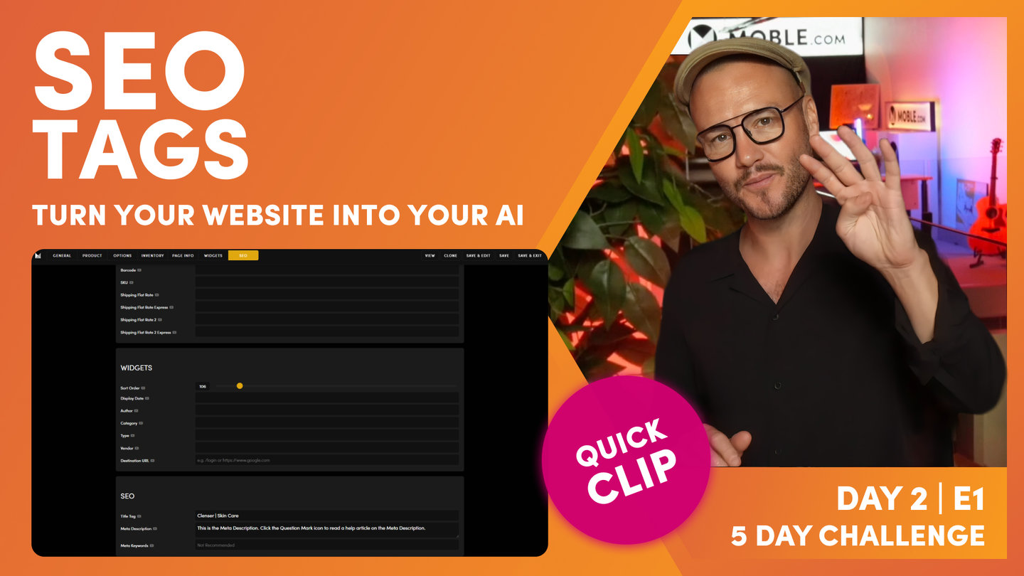
At this point, I'll now go back and look at this SEO tick. We know our products page has got a blue SEO tick, and that's because if I go down now to SEO, we can see here that we've got a title tag and we've got a meta description title tag, 70 characters, meta description, 300 characters. If you ever unsure, just like every feature on the mobile platform, there is help information and often includes a video. Sometimes it's just text as you'll see here, it's not too much you can say on a meta description, but it does give you quirky information like Google increased it to 300 characters in December 2017. So there's bits to read on those descriptions there. So if you're ever unsure number of characters, just click the help icon. My best recommendation would be is to include a call to action in your meta description.
Another common question that I get is why isn't Google showing my whole meta description on the search engine results page? Sometimes it will show all of the title tag, but it doesn't always show all of the meta descriptions. Sometimes you see a snippet from the actual page itself with a three dot ellipsis and then your meta description that you've written in here. And that's because Google's tracking things like hover attention where people are on the page and it might pull out what it feels is better information for your clicks. But invariably, if you take the time to put a call to action, then it might convert better. So here it says, click now to discover exclusive items from the last event, stock is low. Right? So an urgency or time limited call to action can actually help your conversion rates and can actually help to get better clicks than if someone else is in position one but you've got a nice quirky call to action or a punchy, even a punchy joke in the title tag, people are more likely to click on your page. So that's where we handle the SEO title tag and description."
SEO Tags
Paul Davenport | 02:40
Manage your SEO Page Title and Meta Description and be notified with Blue Tick when your page is set up.
"At this point, you can save and exit and that takes us back to the main pages area, that would take us back into here. But I'm just going to show you what you'll do here is save and edit. So save and edit actually takes us through to the main page here. So let's just go back. Save and edit. And here you can see I'm in the page canvas. Now this particular page doesn't have any information on it, does it? And that's because as you know from the last episode, the menus and navigation episode, we created this page. So let me just give you a quick recap here. We're in the navigation area and let's go over to the header menu. Well product sits in the header menu. We created this tab in here. We simply went to add a menu label, and when you create a menu label, you can create as a page at the same time. You can also create a product page at the same time. This goes straight into the products tab.
So when you do this, it has a blank canvas. So what we are going to be doing in day four for all of these pages that we set up is... Let me just jump back into my page. I'll just go back into the products page here... Is using the Layouts that we've created on day three. What we're going to be doing tomorrow is we've create all these beautiful Layouts, you're going to see how all these are built from scratch. But when we've made the Layouts, our team in day four can simply choose the Layout. So in this case, they might drop this main title onto the page, this main headline Layout onto the page and put in here products or products category or the category name like skincare, and then they'll drop in the Layout that they want and then they would save and exit.
But in this case, this is the next question I often get now, and this is the case of here's a new blank canvas page that we've got, and here's a sidebar page that's already been set up. With your Theme, there's a category mix page and a category sidebar page that comes with the Theme in the pages area, and we use those for demo purposes. So I'll just show you here. Here is actually a sidebar and here is a mix filter. So you can mix pages using filters. These are kind of common category pages. So we've got the mix category page, we've got the sidebar category page. But more on eCommerce sidebars in episode four where we show you how to, one, choose both your product pages and your category pages. And in here you'd use another menu from the menus and navigation area. This is a body menu as you learn in the last episode.
And when you have body menus for eCommerce, it can also help with sidebar filters. So Colour filters, price filters, and so this is a sidebar that comes with the particular Theme that's waiting for that menu navigation to go in here. So in this case, I do not want to create a new page. I want to effectively rename this category sidebar to products. So what I could do here is really just delete the products page and then go and rename this one products. I can't have two URLs that are the same. U in URLs means unique, it's a unique page. So I can't call this products at this stage because this one is already called products. So what I'll do now, I will be brave enough to just go and delete this one, and I'll come into my sidebar and rename this one. So I will come in here now and rename this one. If I could type and talk, I'll rename this one products.
Now I'll just show you a little tip with the URL. If I just delete this one and I come back in here and just hit the tab, so just come back here and hit the tab and it populates that for me. So just do that again, come in here and hit tab and it populates the products for me. If I was to say this products page, the benefit here is you can see I'll just hit the tab and it takes out the spaces and replaces them with hyphens, and it takes it from uppercase into lowercase. So that'll just save you retyping and make sure that you URL is correct. Now, at which point, if I save and exit, that's going to create that for me.
So what I'll do is just jump back down here and then make sure that's all okay, and then I'll save and exit. And you can see our products page here and our category sidebar page is gone. Well, let's go back to the category sidebar page that's in our tab previously and let's hit refresh. And now the page doesn't exist anymore. It goes to a 404. But if we were to click the products now to open up as a new tab, we can see we've now got our products page. So that page has now gone, the category sidebar. And we can now do the same with events. Now this is also a blank canvas that we created in episode one of day two in the previous episode, and we've got this category mix, haven't we? So I want to call this one event, so I'll do the same.
One of the common things, questions that we get, the common things that people do is actually try and rename this one events while this one exists. Well, this is a URL, it has to be unique. So what they'll do is they'll go into here and they'll type in events and it won't save, and then they'll be wondering why they can't leave this page, why it won't save and exit. Well, it just won't save because the events page already exists. But if you do want to back this page up and you want to name it something a bit nicer than what we've got here, then you could basically come in here and just rename it something like events old. So you could just type in events old and you might still just call this events. And just to be absolutely true, you might just take this one out.
So this is our page with our Mix It Up in, it's now been renamed to events old. So I'll just save and exit now just to go back and have a look at this. So we've now got two pages. This is still our blank canvas and this is our events old. Well, no, I'm going to delete this one. This is our blank canvas, so I don't want to get confused at any point. So we've got our old version nicely renamed. So I'm now going to delete the blank canvas one. You don't want to delete the events, the one with the actual page information on. This has got its mixed it up on. So just be conscious of that and just think as you go. I'm just going to delete now our events page.
And now if I want to keep the old page there. Now I'll clone the old page. So I'll go to the clone tool here. And now we've got a clone, which you can see here. The clone puts it into draft and it's both hyphen one. So I'm just going to close some of these tabs here just so we clean as we go. And I actually open both of these. So we've got our events page and we've got our events old clone. Both have got the Mix It Up widget in. As you can see, we haven't deleted the one with the Mix It Up widget. All right, so now we know this has been cloned because anything that's cloned has a hyphen one at the end and it puts it into draft. Well, I can actually just take out the old hyphen one in the URL here if I want to now.
And now we've got our events page. I'll make this one live and then I can just save and exit. So there we've covered renaming a page, and I've gone through that in quite explicit detail, and that's because occasionally we will see clients accidentally deleting pages in that way. I'm sure you can work that out for yourself. Just remember, URLs need to be unique. You can clone pages, puts a hyphen one and puts it into draft. And then you can delete pages too. Now, you can also delete pages in bulk over here. So you can highlight everything. I can go now to delete the page using the bulk actions, and then you'll see delete pages goes into the top right. We put that far away because we don't want you deleting pages. If I go to delete everything that we've done so far and hit delete, then final check comes up in the red. Don't click that if you don't want to delete all, but of course you can highlight lots of pages that you do want to delete. Just know that the blue tick is delete, not the unchecked items. Obvious stuff."
QR Codes
Paul Davenport | 01:40
Every Page has a QR Code, whether it's a regular page, your Home, a Landing Page or Product. You can use QR Codes in creative ways.
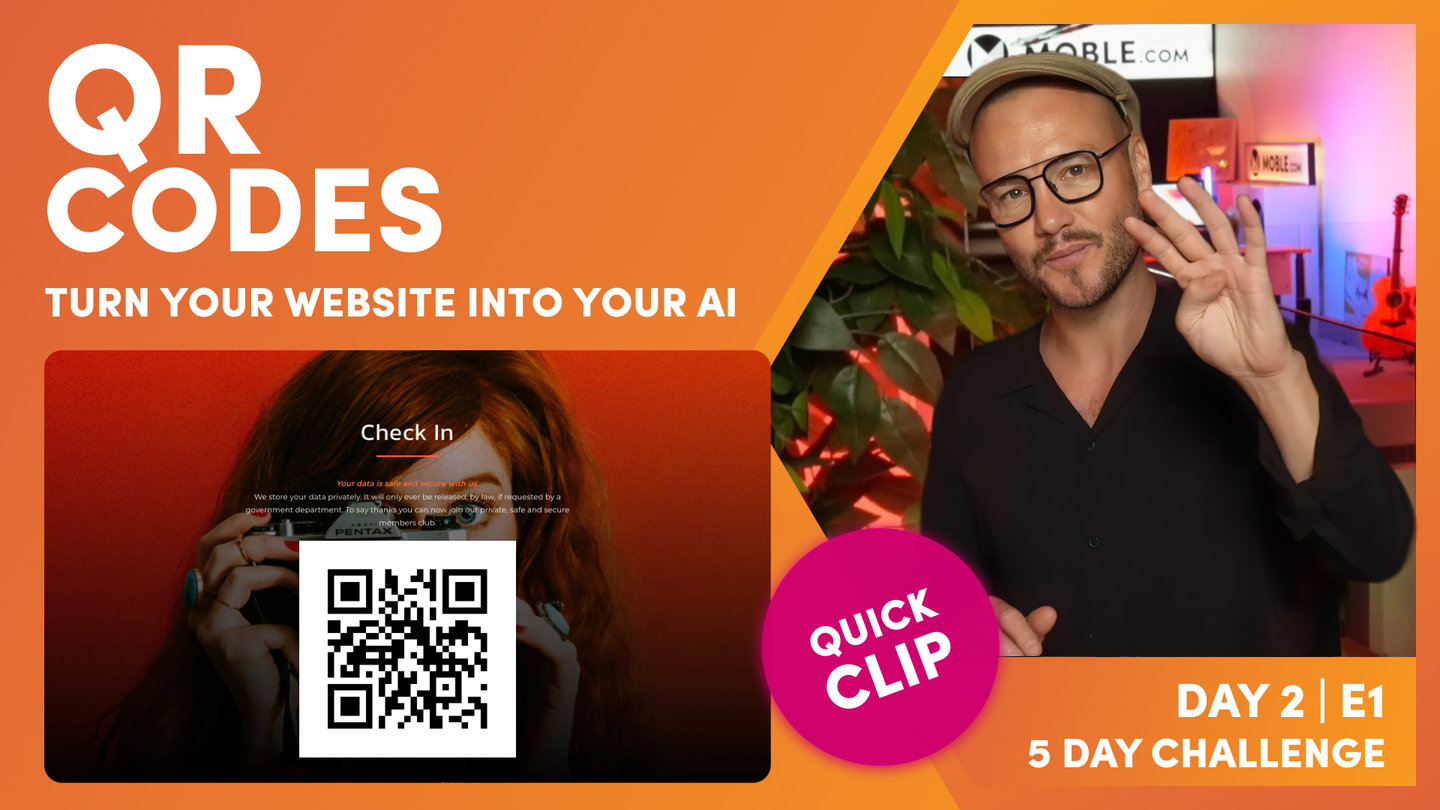
"Now finally we'll look at the QR code. So if I just open up here, you can see that every page has a QR code, just like every option and variant in eCommerce has a QR code too. So we get clients using QR codes for many different things, basic things like checking people in. But also QR codes can be used for things like event tickets. You can also validate that someone has paid, and when they check in, it's going to show that they've redeemed the ticket. So I'm going to be covering all this and more in the watch and learn episodes. We've even seen like hospitality popup bars put in the QR codes of product pages onto their taps.
So people come up, scan the QR code, it takes a payment, and then they serve them the drinks. So many different use cases, but I've seen people do it as treasure hunt around the city. So they scan a QR code goes to a page, the question pops up, and then they get the answer, move on to the next one. So many, many, many different use cases, and that's why we put QR codes on every single page and even every single product and variant as you've just learned."
TEXTBOOK
A user guide to Pages
PAGES
ADDING A PAGE
Adding a page is extremely simple. Nevertheless, to manage your website effectively, especially as a Team, there are a few essential things that you need to know about grouping different types of pages on MOBLE, for a tidy CMS and good housekeeping.
In this Episode, you'll learn the difference between 'Live', 'Hidden', and 'Draft' pages. You'll also discover how to categorise your pages by Page Type, so they can be found quickly and applied to Widgets.
PAGE STATUS:
LIVE:
Live pages can be seen by anybody and by the search engines.
DRAFT:
Draft pages can only be seen by logged-in CMS users. Draft pages cannot be seen by non-logged-in visitors, nor by the search engines.
HIDDEN:
Hidden pages can be seen by non-logged-in visitors. They can be accessed by anyone with a link or the page URL. Hidden pages cannot be seen by the search engines, as standard*.
* Hidden pages cannot be seen by the search engines. However, please note that if a page is already Live then you move it to Hidden the search engine may have already indexed the page. Moving to Hidden will not remove the page from the search engines.
If the content is sensitive and you don't want it to be found, it might be best to change the URL then make it 'Hidden', or consider making the page 'Protected' for logged in members only.

To add a new Page, click Add Page at the top of the Pages area.

Adding a Page via the Pages area. Understand the importance of Page Type and Status

Pages area showing the Page Types in the search area. Grouping your pages by type makes for easy ongoing content management. Also, notice the 'Settings' button for each page. We discuss this below.
PAGE:
Unless otherwise assigned all pages are created as a 'Page'.
A Page is the default. However, to assist with page management, common types of pages can be grouped together. We cover these below.
LANDING:
Used largely as landing pages for your ads, such as Landing Pages for Google Adwords or Facebook Ads. You can create many variations of your landing pages and progressively improve your conversion rate by testing your design and messages. Learn how to clone pages below.
Within the 'Page Settings' area of your 'Landing' pages, you can elect to hide the 'Header' and 'Footer' of your website. The aim is to remove distractions away from your visitors, focusing them towards content that matters and improves your conversions.

Hide Header and Footer in the Page Settings
BLOG:
Blog pages are added just like any other page. When you change the 'Page Type' to 'Blog' the page will automatically appear in your Blog.
In the 'Page Settings' area, you might decide to set a Publish Date for your Blog. This is the date that your page will flip from 'Draft' to 'Live'.
Also, in the 'Page Settings' area, remember to set your Blog 'Page Icon', the 'Display Date' and 'Author'.

It's very important to complete your page properties in each Page Settings area. This information will appear in your Widgets feed for pages such as Blogs, Events and Products. It's best practice to always add a Page Icon that will be seen in your feeds for that page. Notice the Page Icon also appears in the Pages area, as you can see in the screen shot at the top of the page. Also note, in any Widget you can sort pages by Display Date, in either chronological or reverse chronological order, for effective management of Blog and Events.
EVENT:
Events are also just like any other page. In the 'Page Settings' area, remember to set your 'Page Icon' and the 'Display Date'.
PRODUCT:
Much like 'Events', 'Products' are also just like any other page. In the 'Page Settings' area if your Page is set to Product your Page Settings area will have many more fields such as 'Price' and fields that are more suited to online sales such as 'Shipping' and 'Stock Quantity'.
SECTION:
Sections are special types of Pages that can be placed inside another page. An example of this might be your Footer, Sliders, or Testimonials. Often website CMS's only let you control the text or background of things like Footers, or they put Testimonials and Sliders into modules with restricted flexibility.
In MOBLE, Sections can are managed in the Visual Page Editor just like any other page, giving you the same amount flexibility and detail as any other page with full control to edit the content however you like. Imagine a footer with a background video, a photo gallery, or even a slider. By treating these elements as pages, you have the power for uninhibited editing in a familiar page editing environment.
Sections don't have a page URL. Sections also do not count towards your total page count in your Plan, meaning you are not billed for them.

Sections are more often than not 'Hidden'. Notice that the 'Action Section' and 'Footer' are core system pages and cannot be deleted. Also notice the other Sections have a scrambled URL since a URL is not required for Sections.
YOUR HOME PAGE
Your home page is one of the most important pages on your website. It is often where people first arrive, so it is good to put some thought into what you want to include on your Home page.

Your Home Page is like no other since it is the page that your domain name (or website address) points to, and visitors will first land on your Home page when typing your website address. It, therefore, does not need an additional path e.g. www.yoursite.com/home, it is simply just a forward slash www.yoursite.com/.
In creating your initial website draft, MOBLE has done the hard work for you and created a series of impactful sample Home pages for you to choose from in the Layouts Drawer. The key to this session is simply to choose a home page and then, you can come back to edit the content later at any time.
Many Pages and Sections have been made for you and we're adding new ones all the time. Simply open the Layouts Drawer to browse hundreds of Layouts.
CLONING PAGES
Often you may wish to replicate a page to keep the page formatting exactly the same on a new page. Rather than using a Layout, you might consider using the Clone Page icon to replicate a page.
- Click the Clone Button
- A new 'Draft' page will be created for you
- The new page will add '-1' to the URL
- Click the Page Settings tab to give the Page and new Page Name and URL
- Now Edit the Page by adding your new content

1. Clone Button. 2. Notice the cloned Page is in Draft. 3. The URL has been updated with -1.
SECTIONS
Sections are a Type of Page that is unique to MOBLE, therefore even if you're an advanced Website Designer it's worth taking a moment to familiarise yourself with the power of Sections.
Sections are special parts of your website that are not complete pages, they can be considered as sections that are included as part of other pages and as such, they don't require a webpage address (URL). The most common example of a Section that everybody is familiar with is your website Footer.
Sections are incredibly powerful for experienced designers since they give you all the tools and flexibility of the Visual Page Editor. Therefore, you could design a footer that includes a Background Video, Images, Forms, whatever you like. You have the complete unrestricted creativity to design Sections.
WHAT ARE THE COMMON TYPES OF SECTIONS?
Let's take a look at the Sections that every website must have. These have been made for you and cannot be deleted.
- Go to 'Styles', via the Main Menu
- Click the 'Sections' Tab. Here you will see the following Sections:
- Footer
- Action Section
- Menu Section
- Thank You Page
- 404
- Admin Login Screen
- Member Login Screen
- Forgot Password
You can also access common Sections in the Navigation area.
Sections are types of Pages and therefore you can also search all of the Sections via the Pages area, as follows:
- Highlight 'Section'
- Perhaps also highlight 'Live' and 'Hidden' to refine your search.
- Click 'Search' and you will see a complete list of all your website Sections.
- Notice that the Page Status for Sections is most often set to 'Hidden'. Ensure when searching for a Section you have highlighted 'Hidden' when you search.

Filtering Sections in the Pages area.
EDITING YOUR FOOTER
Rarely do we see websites without a footer and as you have no doubt guessed, MOBLE has designed several footers for you to choose from. Just like with the Home Page in the previous Episode, you can pick from a range of preformatted Footer Layouts and drag and drop them on to your page to get started quickly. You can find the Footer Layouts in the Layouts Draw under 'Sections' (see video below).
In Day 3, we focus on Layouts and you'll learn how you can completely customise your footer to make it your own. Your Footer can be edited just like any other Page in the Visual Page Editor.
Select from a Series of Premade Footers. Then drag and drop on to your page to customise and make it your own.
WHAT IS AN ACTION SECTION?
One of the most important features that you might consider on your MOBLE website is an 'Action Section'. This is used for a prominent Call-to-Action in your Header. You might call the Action Button something enticing like 'Quick Quote', 'Subscribe', 'Donate', 'Sign Up', 'Join Today' etc.
If you would like to link your Action Section to your Header, ensure that you add the 'Action Button' to your Header. This will automatically link to the 'Action Section' for you. More on this on Day 2.
When a user clicks the Action Button the Section slides down from the top of the page. Since this call-to-action button is in the Header it is only ever one click away from your users, no matter where they are on your website, and therefore it is a powerful tool to encourage online enquiries.
Many Action Section Layouts have been made for you. You can create your Action Section as follows:
- Go to 'Styles', via the Main Menu
- Click the 'Sections' Tab and 'Edit' the 'Action' tab*
- When you click 'Edit' the Page Editor will open. Notice that the Layouts Drawer will automatically be open with a selection of pre-made Action Sections for you to choose from.
- You can come back to these Layouts, by opening the Layouts Drawer at any time. Simply open the 'Base Layouts', then 'Sections', then 'Action'.
The Action Button is a prominent call-to-action in your Header. On click it slides down the Action Section.

A selection of draggable Action Sections out of the box with all MOBLE websites.
WHAT ELSE ARE SECTIONS USED FOR?
A common use of Sections is when you would like to include website pages in a Gallery or Slide Show. This might be a slider for Testimonials or a Presentation that is built with the flexibility of the Visual Page Editor.
Jump right ahead to Sunset Talks 2 to view a Slide Show being built. Sunset Talks 2 covers in detail how Tags and Widgets can be used to power huge volumes of content with feeds and animations.
WHAT'S NEXT?
DAY 2: EPISODES
70 Award
Winning AI Themes
GETTING AROUND
SUPPORT
AI SALES LINE
AI SUPPORT LINE
GET A QUOTE
A Web Builder for Design. A CMS for Business. We serve all businesses from SME's to Enterprise. Talk with us for AI development, custom website design, website development, ecommerce websites, directories, intranets and social networks.

