DAY 1 | EPISODE 10
EFFECTS

Paul | 3:51 | 10 mins
Typically, a website will have one standard Hover Effect that is used for a consistent site-wide look and feel. MOBLE CMS comes with two animations as default, Primary and Secondary. You can add more hover effects,though, MOBLE strongly recommend that you have no more than 5 in total, as each hover of ever will add to you CSS and JS and slow down the speed of your website pages.
LESSON PLAN
Effects Intro
Paul Davenport | 01:31
Apply hover over effects to your dynamic Widgets.
"In this episode, we're going to be choosing the hover over effects for your dynamic widgets. Now widgets are those feeds that pull in content from around your website. It could be a newsfeed, an events feed, a products feed, even galleries. Now when users hover over those particular pages or those particular images, a hover over effect will appear. Now in this episode, we're going to be choosing that hover over effect. Now you can have more than one. We are just going to choose a collection of hover over effects so that when our content team set up each widget on each page, they can choose the selections that we make in this episode."
Widget Hover Effects
Paul Davenport | 03:11
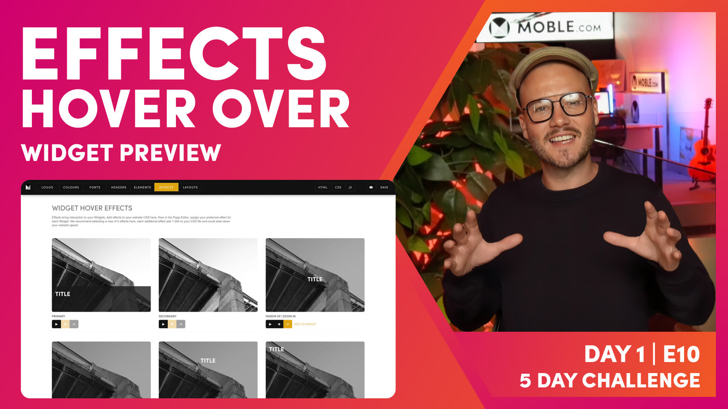
Your website has two standard effects called Primary and Secondary. You may add up three more effects. The effects you select here can be applied to each Widget in the Page Editor.
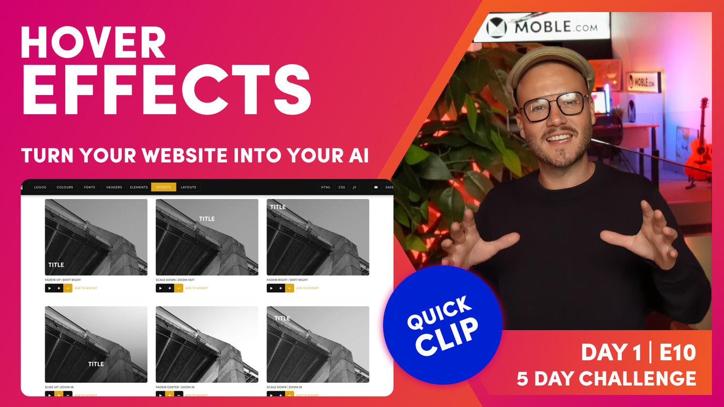
"Okay, so here we are in the effects area, which you can access via the top left menu. Click styles, and then you can see effects in the top bar. Well, here are the effects that we've got to choose from. I'll just show you the primary effect and the secondary. So I hit the play icon to preview it. So primary. And I'll hit play to preview the secondary effect. Now to add that collection to your widgets, you hit the plus icon. Now that will add it to the collection, which I'll show you just shortly. And to remove it, you hit the minus icon.
Now this widget has already got these two set up. You can see that by the plus icon. I've got slide up, zoom in. So let's have a look at that. Slides up, zooms in, and I've got this one, which fades in from the center and zooms in. Okay. So those are the two I've got selected. So let's go into the pages area and have a look at the widget.
So I'll open a widget and you can see hover over effect here. And these are my two selections and I can preview here. So the important thing to remember here is the primary and secondary come as default with all Themes. And then you can choose two to three others. I like to choosing two because the important thing to remember is that by choosing these effects, by adding them to your CSS, it does take up space and memory. So that will slow down the page load speed. That's why we don't put all of the effects into the page.
So your job here is quite simply, I would say, to choose two additional effects, put the plus icon onto two additional effects and press save. And that way all of the widgets around the website will stay consistent. Your content team has only got really four, maybe five effects to choose from. And it's as simple as that, really. So this choice is an advantage because it keeps your website nice and consistent throughout.
Now during day three, we're going to be working a lot with widgets. So during that day, you can come back to the effects to change it at any time. So this isn't a big decision at this stage, but I do want you to have chosen your final effects by the end of day three because that's important when we invite your content team on day four, so that everyone's working together consistently.
Okay, that's it, that's effects. So go and choose your effects. Hit the plus icon for the ones that you want. Don't choose more than five max. So the two default, primary and secondary, and up to three others. And then remember, once you've chosen your widgets to hit save in the top right."
TEXTBOOK
A user guide to Widget Hover Effects
SELECT WIDGET HOVER EFFECTS
MOBLE CMS enables the Hover Effect of your widgets to be changed. The default animation are applied in the Effects Tab of the Styles area.
Typically, a website will have one standard Hover Effect, that is used for a consistent site-wide look and feel. MOBLE CMS comes with two animations as default, Primary and Secondary. You can add more hover over effects, though MOBLE recommends that you have no more than 5 in total, as each hover of ever will add to you CSS and JS and slow down the speed of your website pages.

Widget Component Popup in the Page Editor
HOW APPLY EFFECTS TO YOUR WIDGETS
The image below shows where to select your effects in the Widget Component, in the Pages Editor.

Widget Component Popup in the Page Editor
WHAT'S NEXT?
Well, now all the Styling work is complete! Next we ask you to consolidate all your hard work by letting our bots update the screenshots in your Layouts Drawer to showcase all of today's styling work.
70 Award
Winning AI Themes
GETTING AROUND
SUPPORT
AI SALES LINE
AI SUPPORT LINE
GET A QUOTE
A Web Builder for Design. A CMS for Business. We serve all businesses from SME's to Enterprise. Talk with us for AI development, custom website design, website development, ecommerce websites, directories, intranets and social networks.


