DAY 1 | EPISODE 3

COLOURS

Paul Davenport

  Paul  |    27:03  |    30 mins

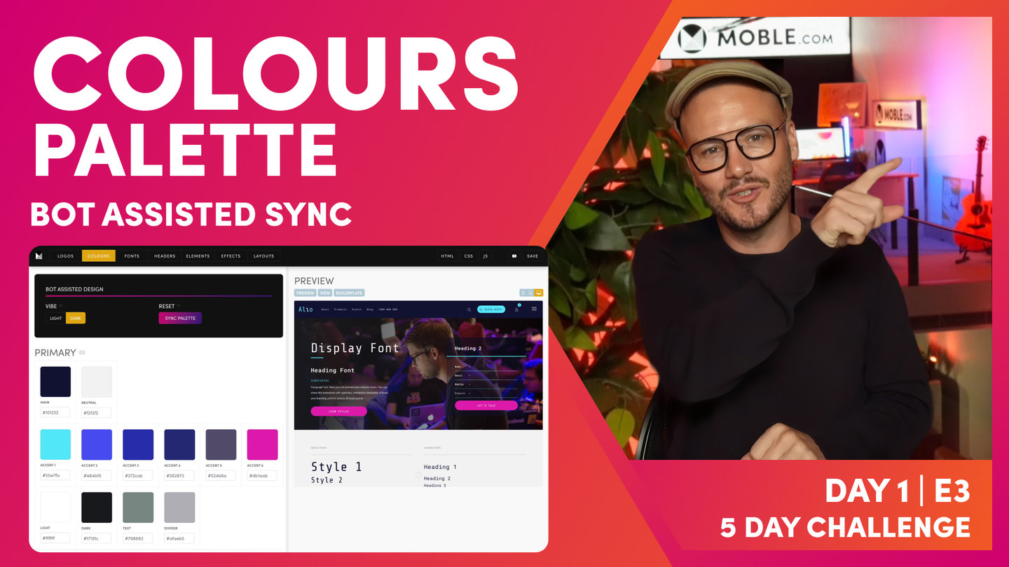
Complete your colour palette and let our bots update it across your entire website for all your team to use.

In this episode, we complete your colour palette and show you how to pick colours to richen your design. You'll then use our bots to update your colours right around your website, including key swatches for your Header and the Visual Page Editor.

LESSON PLAN

  Use the Quick Clips below as a browsable breakdown of Full Flick above, with convenient class notes and takeaways.

Colours Intro

  Paul Davenport  |    03:47

Now we build on the three colours you selected in Episode 1 and complete your entire colour palette. Our Bots will help you along the way and we also show some neat tools to help your choose and outstanding colour palette.

   Transcription 

"Okay, in this episode we're going to look at Colours and one of the biggest mistakes that I see both website designers and website design platforms make is that they don't consider the management of Colours by a content team. Now, over the course of a lifetime, a website has many content team members come in. It might be initial people building the website, it could be staff changes in the future. And you might also be inviting new people from different agencies such as a content team or marketing team to come in and edit pages in the future. Well, consider that if someone in the page Editor chooses a particular Colour blue, even if it's not the exact text code, if something close, you might not even be able to see the difference with the naked eye, but that means that people are adding new Colours and it starts to become inconsistent over time.

Well, what we do in this episode is we're going to lock down a Colour palette in the Colours area and we lock it down there and then in the page Editor, people are going to be able to choose those exact Colours. And that also has a key advantage that in the future if we want to update one of those Colour swatches maybe to a completely different variant or completely different accent, it's going to update right the way around the website, meaning that things like redesigning websites become particularly easy and you'll never have to go through that redesign process again.

And to get us started, we're going to be building on the work that we did in episode one and letting the AI Website Bots go and complete the Colours right the way around the website. Now, you recall in episode one we built your initial Theme, but just using three Colours. We used your main, your neutral and your accent one. Well, you can see here I've got much more Colours in my palette. So we're going to complete that palette. Now, don't worry if you don't have a palette just yet. At the end of this episode, I'm going to show you ways to pick a really cool Colour palette. So what's the objective of this episode? But you can see here in the page Editor, the Colours I update in the Colours area will update right the way around the website, but more so than that, it's also going to create Colour palettes of which our team can use in day four so that they won't be introducing new Colours, they won't be adjusting your brand guidelines and they'll always be staying on brand and never messing up the website.

But you can see here in the text we've got a Colour palette here that they can pick Colours that we've selected. We can also see here the Colours for the background. So they can only select a background Colour from the Colour swatches that we create, and they can only mix those if they're creating gradients with Colour swatches that we create. So you get the picture here, we're locking down the Colour palette so that your team can never stray off around. And these Colour swatches, you'll see right at work around the website. Here you can see the same palette for border Colours and the same palette for dynamic text Colour, which is where we override Colours for dynamic elements such as news feeds, even online shots. So these palettes go right the way around the website. You'll see them more and more as we progress through the five day challenge. And this imports this episode, we're going to update all your Colours the way around the website and we're going to lock down your Colour palette so that your team will always stay on brand."

Primary Colour Swatches

  Paul Davenport  |    05:14

Add your Primary Brand Colours and use our Bots to swap in your new Palette right around your website. If you don't have certain colours in your Brand Guidelines, such as Neutral, Text and Divider, then leave it to our Bots to apply the best colours to extend your brands colours palette.

   Transcription 

"Well, here we are in the Colours area, which you can access by the main menu. Go down to styles and then you can see Colours is the second tab along. And what you'll immediately notice is these three swatches that we used in the onboarding to get your Theme off to a flying start. So they were main, neutral and accent one. So what we're going to do now is update all of these swatches and then use the bot to go and populate it right the way around the website. But before we do, I'm just going to show you a couple of quick things to note. You can see here neutral, I put some emphasis on neutral in the onboarding as opposed to white. So white is absolute white, which is six Fs, and then we have a neutral, which is an off-white. Well, let me go and show you a cool example of why it's important to have these two swatches.

So I'm going to go over to the Alio Theme, which I'm going to be designing through the five day challenge, and you're going to see how I make all of these Layouts and you'll be able to do the same yourself. Well, here you can see we've got absolute white and our neutral in the background and it has this shadow effect which makes for a really cool look. So this is just one example of how we use white with an off-white and neutral. And you can see here on this particular Layout, bit of parallax motion in there as well, which you'll be learning. So this is why I don't want you to use two whites. I see that done a lot and it kind of ruins your ability to do cool stuff in the five day challenge. So what I want you to make sure is that you've got an off-white in here. And also you'll see this text and divide a Colour.

Well, text is obviously the Colour of your text and divide a Colour is often these separators which are a middle gray because the divider Colour works on both the darker background in the dark Theme and also on the lighter Theme. So if you're unsure with neutral, text and divider, what I want you to do is just remove these and when you update the Colour palette for these items, our AI Website Bots will then use those Colours to decide your neutral text and divider. Pretty cool stuff because often I see brand guidelines, if you've got a branding company, they might leave off a neutral Colour sometimes and often they do leave out, believe it or not, text Colours too. And then dark. You can just choose a dark Colour somewhere down here. You might just even use black for that one.

But what I'm going to do now is go over to my brand guidelines, which you can see here. You can see here are my main Colours and you can see, I'll just zoom in. You can see my hex codes. So what I'm going to do now is just copy each of these hex codes and paste them into here. So I'm just going to take one moment to do that now. And our Colours are updated magically. Well, what I'm going to do now is just press save, only because I've just added these hex codes. I don't want to have to do them again. If you don't press save, they won't save, right? So there's no auto save on here for obvious reasons. We don't want people editing and then accidentally messing things up. So just going to press save, it takes two seconds.

Now, at which point I'm going to now use our bot. So do notice that I've left the text and divider blank for demo purposes. I've put in the neutral because I already had my neutral there from the onboarding. It makes sense. But if you are unsure, you can remove that too. Okay, so let's do it. Let's now press the sync button. And you can see as quick as that the bot has now gone to update those around the website. Well, what I'm going to do now is just drawer your attention to a few of these swatches so that even though the bot has now updated those, you can go and customize some very specific swatches for your website.

Well, you can see here I've got a dark Theme going on here, which mainly you notice this from the dark header. But if I just put this to light, if my logo was darker than this, this light header might look quite nice. But I think you know from the onboarding I'm quite happy with a darker Theme. Well, there's a couple of things I don't like what the bot has done here. So notably the legibility of the text, I've got a sky blue with white text. That's not so good. Let's have a look at this. This is okay, but again, that sky blue in here with the white text on top is perhaps not so legible. So these are some obvious things I can go and fix up. You can see here it's put in some text and divided Colours for me, which is pretty good."

Header Colour Swatches

  Paul Davenport  |    04:42

Your header is the most important elements of your website and includes your menus, your entire navigation, and key interactive features such as your Shop, Action Section and Mobile Menu. It's essential to get these colours right.

   Transcription 

"So I can navigate via this anchor bar, and you can see it scrolls me down to all the swatches of the header. So let's explore that just to get your eye in. Well, you can see this is the header background. And this is the header background. So this is the header text. This is the header text in white. When I hover over a text link, it goes to the sky blue, which is this swatch. And the active text is when, let's say, I'm on the about us page, that's going to light up in blue to say I'm on this page, so that's active. Well, I've just said that I didn't like this white on hover. Well, you can see here the background of the dropdowns are this blue, and when I hover over, they're this blue. So you can see here it's the background and the background hover.

Okay, so active is when I'm on that page. It will light up in that Colour in the menu. So we can see here the dropdown text is white and the hover over text is white. So the text is white, and when I hover it's also white. So first things first, let me go and change this to a darker more legible Colour. So if I do that, now I can just press save. And what that'll do at the same time there it will just update the preview for us, which now when I hover over, you can see that it lights up in blue. Well, let's have a look at that active page. Let's make this active a bit more pronounced. And we could do that as well with this one if we wanted to as well. So if I press save now, just jump over here and press save. Again, it's just going to refresh that preview for us so that we can see it.

And now if I go to one of the pages, let's just say I'll go to the product page. You can see the pages lights up, and now this lights up too. So if I just want to refresh the preview, I can just hit refresh and it will bring me back to our main preview. So I want you now to go and update your dropdown menu Colours and your header Colours. But the main one I also want you to play with immediately is your Action Section button. You can see here that mine is the sky blue with white, which I don't like that because it's not so legible. So what I can do now is just go through these swatches and find where it says action button.

Well, you can see here, here's my action button, background, which is blue, but my text is white. So let me make that our space cadet blue. And then you can see here the header scroll. So when I scroll, this can change this bar as well. So I could change this background to a completely different set of Colours when I scroll. But in this case, I don't want to do that. I want to bring attention to this action button. So what I'm going to do is actually make this one pink when I scroll. So at which point I can go and press save. And again, that's just going to save, update the preview for us, and now we can see our button. And when I scroll, it's nice.

So once you've added your primary Colours and hit sync and let our AI Website Bots go and update those right the way around the website, I'm actually happy for you to move on to episode four. So it's as simple as that for this episode. But what I'm going to show you now is that there's actually hundreds of swatches and the reason why we use the AI Website Bots, if you were to actually go and update all of these swatches, then this could take you a considerable amount of time, right? Because there's swatches for everything. So in the rest of the episode here, I'm just going to drill down to all these swatches and show you what they are.

Sometimes you might find that you've got a conflict where one Colour isn't quite working, but what you can do is then go and come back to that particular swatch, press save, and that will go and adjust that right the way around the website. So you've actually completed the episode at this point, but now the rest of it's just going to be more of an education of what these swatches are, should you need to go and change them. And then at the very end of the episode, like I say, if you don't have a full Colour palette at this stage, I'm going to show you a few little tricks and hacks of how to generate a really good Colour palette."

Other Colour Swatches

  Paul Davenport  |    03:12

You can update other Colour Swatches for your default Function Colours, Blog, Shop, Member Profile area and Widgets.

   Transcription 

"The top bar is when you have an extra bar on top. So when you choose a header, you might have an extra navigation bar. I don't recommend that. When we get to day two, I'll be explaining all of this for you. So I'd leave a top bar out for now. And you can also change the Colour of the top bar on scroll as well. Look at this. This is our default heading style. Well, I probably, that is a good idea from the bot, it's chosen the sky blue, which that will be legible on both backgrounds. If I've got a light neutral background here, and then I've got a dark space cadet blue background, this header is actually going to be legible on both, so that's quite smart of the bot. But in this design, my sky blue just isn't that legible and it's in my brand, so I have to make some key design choices. So I'm going to make my default dark blue, and that way when my content users use it on a neutral background, the heading will always be this Colour.

Now, I could change my link to blue, which I like that blue. It's going to work on both backgrounds maybe. But what I could do to make it absolutely legible is decide I'll have my links default in pink, and then when I hover, we will go to the blue. So those are some choices here. The key one on the shop is the cart items, which is the text, which is white, and the background, which is the blue. So that's what we call cart items. It's showing the number of items in the cart. So in this case, I'm going to make this my space cadet as well. And then you can update your blog. And if you want in the preview, you can just jump over to the blog. But this is just getting your eye in of what these mean. You can see it's not really rocket science, with the type of thing that as we go through the five day challenge, you'll look at these particular nuances and you'll say, "Oh, you want to change it." That's when you can come back and make those changes.

Member profile, you don't need to update member profile, that will just work. But this is your my account area. When people log in, they can go and see past orders or the rest of it. We can change those styles too. Now, the widget is one that you need to be aware of because we've got two types of widget Colours. We've got widget grid, and we've got widget card. So what's the difference of that? So this is just what I want you to learn now. So if I scroll down here, we can see card, which just means we have the information below the image in a card. And then if we go to grid widget, the information comes on top of the card, it comes over the image. So you can see here this is our grid overlay and it's in the blue, and this is our card background and it's in the blue. So I just want you to be aware of those for now. The bot will update those for you."

Supporting Colours Swatches

  Paul Davenport  |    03:56

Supporting Colours allow you to add even more Colours to your Palette so that your Content Team can use them in the Page Editor.

   Transcription 

"Now, think of supporting Colours. It's extra Colours that you can play with. So let me just show you what I mean by this. Well, here I've got my main Colours, the neutral, my main and accent, 1, 2, 3, 4, 5, and 6. But if I look at accent five here, I might not like that. It's a bit muted, so I might want to change it to a different Colour. So what I'll do here is go and add an extra Colour to my palette. So I'm treating this like a playground. So what I'll do here is go and choose something. And now I know I've got a raspberry in my brand guidelines, which is somewhere around here, but I've just copied the exact hex code, so let me paste it in pretty close. So this is a raspberry that I'll be using throughout the course of the five day challenge. Now, notably, even though the bot just populated these Colours for us, because that was what was there, it didn't try to add extra than the main two and our six accents.

So if we notice here, we've still got our accent five. So a supporting Colour has added extra Colours to that, but notably, if I want to go and use that raspberry now, it's here in the swatches. So that's cool. So now what I'm going to do is jump over into the Editor and show you the swatches that we've created and now they're ready for our content team. So I'll hit save and jump over into the Editor. I'll open the Drawer and you can see our raspberry Colour is in there. But because I kept accent five, I kept the accent five, which was this Colour here. It's also added this extra. So it'll keep your main accents, but you can add extra supporting Colours. Now, that palette is updated everywhere now, right the way across the website. These aren't just the Colour palettes here, we've got Colour palettes all the way through the platform, including things like normal text, as you can see, and also buttons and forms, everywhere.

So with this particular palette here now, you can see the advantage. What we don't want content users to be doing is choosing their own Colours. They might choose a Colour that's close, the hex code is different, but it looks close. Okay. Well, that's not good because what we want to do is to ensure that we work with the exact Colours to keep the brand consistent. And this has also got the benefit of when we go and change things in the future. So I might decide that I don't like my accent one anymore because with white on top, it's causing too many complications due to legibility. I might say it's a new campaign and we want to change the new raspberry Colour. Well, when we update it in the Colours area, it updates the swatches right the way around the site, but it also updates every instant of that Colour. Every time it's used on every single page, it will update it everywhere. So think about that. We can redo campaigns and we can even redo the entire website redesign just with a few clicks.

So you'll also see this philosophy next when we move on to fonts, because we do give you a pallet of fonts, it works in the same way. When we update one font, it will go and update that across the entire website. So you can see how this is working. The AI Website Bots are helping us get there quickly, but then we're also thinking about the future, new content Editors coming in, always staying on brand and then lining ourselves up so we can do redesigns quickly without ever having to go through this process again."

How to Pick a Colour Palette

  Paul Davenport  |    04:33

If you're designing a brand, here we show 3 tools that beginners can use to design a professional colour scheme. 

    MOBLE's Colour Wheel
    Coolors Colour Wheel
    ColorZilla Colour Picker

   Transcription 

"Okay, so now I'm going to show you how to pick a really cool Colour palette. And this is going to be important for two things. One, if you're not a website designer. If you are a website designer, you already know this stuff. But if you are not a website designer and you've only got a very limited Colour palette and you now need to add more Colours to your palette, I'm going to show you really cool tricks of how to do this quite quickly.

So number one is the Colour we are. Well, let's say that your brand has got one or two, maybe three Colours, and for the purposes of this website design practice, you might want to add some more. So a very simple way to do this is actually to use what we call the Colour wheel. Okay. So let me show you what I mean by this. This is a very basic tip, but if you already have two Colours, you could copy one Colour and actually paste it into another swatch. And now you can use the Colour wheel to slide up and pick a Colour of the same tone. So now you could repeat this for Colours four, five, and six, and just broaden out that palette with a few more Colours in the spectrum, and that will keep your Colours to the exact same tone. And this means later on, if you use things like gradients, as you've seen before, you've got much more of a chance at those gradients playing nicely together.

Now, building on the concept of a Colour wheel, there are actually websites that generate Colours, a Colour palette for you based on an algorithm around a Colour wheel. Okay. Colour wheels are really important for designers. You might have seen in the past designers having Colour wheels on the table, which is moving circles around to pick Colours. Well, there's websites that do that for you. And one of those sites is a website called Coolors. And this is a great resource.

I actually use it all the time when I'm creating brands for the first time just to give me a bit of inspiration for extra Colours in a palette. And it also gives you really cool names as well, sort of the exact names of those Colours. So let's just have a look at this. So what I'm going to do is pop in a couple of my first Colours and hit the lock icon. Okay. Now I can hit the space bar and it will generate new Colours. And these are based on the principle of a Colour wheel. And once I'm happy with one, I can hit the lock icon again and hit the space bar. I can then copy those hex codes, go back into my Colours area, add the Colours, and press safe.

The third really useful tip that I would suggest to anyone who's not a website designer is to go and install a Chrome extension called ColorZilla. I use this tool all the time for many different purposes in my sort of design life. So you can go and install this extension in Chrome and be using it too. So let's say I did a search, for example, tech Colour palette. And in my browser now, I can see what Google has brought up in Google images for tech Colour palettes. Well, I could now click on the ColorZilla extension to pick a Colour, and I could now hover over and grab the exact hex code. I could now put that hex code into something like Coolors, and hit the space bar and start to build out my palette. Okay, so there's three very simple techniques there of how you can build out a Colour palette for your brand."

Share your Boilerplate as Brand Guidelines

  Paul Davenport  |    02:46

Often partners will ask you for your Brand Guidelines. Your Boilerplate can offer a perfect online solution that that can easily be shared.

    https://yourname.com/boilerplate

   Transcription 

"And we'll finish the session with an FAQ. At this point in training, clients always ask me, I really like this preview feature, but can I go in and edit it? Well, the answer is yes. You can edit it via this link here, which says boilerplate. But you can also share that boilerplate with people. Too often you might have people that want to see it, like someone who's doing ads for you. They might say, "Can I see all of your hex codes? Can I see your fonts?" And you can say, "Yes, I am going to share with you my boilerplate," which is just your domain name or site name forward slash boilerplate. Okay. And you can just send that as a link on your mobile, in messages wherever. And they will actually see this as a page which they can view on their mobile, or of course on desktop or wherever they are. So forward slash boilerplate. You can actually share this page with all of your Colour swatches and so on and so forth. Okay.

Now, I will just go and update this. I'll show you two things. So let's go into the boilerplate. The first thing I might do is change this image. This image looks really cool, but you can see all of my images have come across from the onboarding, but I can improve this by changing the button Colours. See, the Colours have already also come across into our buttons, so I can choose the pink here if I wish. And then I also mentioned that they've come across into forms. Well, the forms, this is a dynamic element. It's pulling in a particular form. In this case, it's pulling in the form that's called short light. These are all the other forms that are currently made.

Now, because this is a dynamic element, it doesn't always pull through the Colours in the back end, but on the front end, you can actually preview this and it will be in the exact Colours. So just be conscious of that. Now, you can change all of your forms, all of your form Colours and settings in the forms area, which we're going to cover later on today. The key takeaway from this bit is just be aware that this is a placeholder. So when you see a form, it's not always the exact, it's just we've taken almost like a screenshot of it. You're going to learn much more about the reasons why, and I'll go through that in day three. But just know now, if you're looking at this, don't try and change the Colour here. It's actually in the forms area. So that's it. That's a quick FAQ on boilerplates."
TEXTBOOK

An old school guide to colour swatches

DESIGN TIPS


Now you've decided on your primary colours, and used the 'Sync' Button our Bots update your entire colour palette, in a logical way that works right across you website. However, our bots works to a logic but no doubt you'll want to customise it some more.

In the colours area, scroll down to 'Header Colours' and you will see all of the elements of your Header that you can play with.

The House Rules here are again 'keep it simple', especially if you're not a seasoned designer. Less is more.

Let's articulate this with an example of some of the horrible things that you can do with a Header. In the example below, you can see DESIGN A and DESIGN B. 

DESIGN A

In Design A, the designer got a little carried away with trying to use any colours of the Fictico brand. If the objective was to get people to take action by clicking the Call-to-Action button, then this Header will most likely fail, since the pick and mix style of colours is perhaps creating too much noise and distraction.

DESIGN B

In Design B, our bots were programmed to keep it simple. It didn't sway from the Primary colours and used them with White so that there was no conflict, the Call-to-Action was prominent. The Designer then simply customised the Header to make the buttons more inviting.

Notice that both the Search and Menu buttons didn't even have a background colour. There is often a temptation to complete every element of the colour palette, though this is really not required. If you don't need a colour, then don't use it, always remember to keep it simple and less is more.

MOBLE CMS Header Colours A

DESIGN A: Trying too hard

MOBLE CMS Header Colours B

DESIGN B: Keeping it simple

HEADER COLOURS KEY

Now let's use the Colour Key below to understand what each colour element does. You can use the chart below to cross check the role of each swatch in the Colours Area.


BACKGROUND
Header Colour Background

The main background colour.


TEXT
Header Colour Text

The Header Menu Text.


TEXT HOVER
Header Colour Text Hover

The mouseover text.


TEXT ACTIVE
Header Colour Text Active

The text or accent line that indicates you're on a particular page.


BACKGROUND SCROLL
Header Colour Background Scroll

When you scroll down a page your Header background can change colour.


TEXT SCROLL
Header Colour Background Scroll

When you scroll down a page your Header Text can change colour.


DROPDOWNS: BACKGROUND, TEXT, HOVER & ACTIVE
Header Colour Dropdown Background

You can also change the Background, Text, Hover, and Active colours for your Dropdown Menus.


MENU BUTTON: BACKGROUND & TEXT
Header Colour Menu Button Background

The Menu Button Background and Text colours.


MENU DRAWER: BACKGROUND & TEXT
Header Colour Drawer Menu

The Menu Drawer Background and Text colours.


ACTION BUTTON: BACKGROUND & TEXT
Header Colour Action Button

The Action Button Background and Text colours.


LINK BUTTON: BACKGROUND & TEXT
Header Colour Link Button

The Link Button Background and Text colours.


SEARCH: BACKGROUND & TEXT
Header Colour Search

The Search Button Background and Text colours.


TOP BAR ELEMENTS
MOBLE CMS Header Top Bar

The Top Bar replicates utilises of the elements above and adds new options for the Top Bar Colours.

FUNCTION COLOURS


Function colours are an important part of your website code or CSS (Cascading Style Sheets) and are used in the Visual Page Editor for elements such as:

  • Headings
  • Links
  • Underline
  • Divider
  • Default Form Field colours


MOBLE CMS Function Colours

Pick your Function, Accent, and Supporting Colours. Click Preview to view your changes as you go, before you Save.

ACCENT COLOURS


Accent colours are used in CSS for elements such as:

  • Buttons
  • Backgrounds
  • Gradients
  • Overlays
  • Borders
  • Animations such as hover effects

Accent colours are used within your website colour palettes, as we saw in the screenshots at the top of the page.

SUPPORTING COLOURS


Supporting colours are additional brand colours that can be used as part of your website style kit and if selected are added to your colour palette in the Visual Page Editor.

BOILERPLATE


Notice the Preview Pane can also be styled for your Brand. You can design your Preview pane to suit your needs and you can access it and design it just like any other page.

MOBLE CMS DirtyFeet Boilerplate

Design your own Preview page via the Boilerplate page. The Boilerplate page is a 'Hidden' 'Section'.

COLOUR SWATCHES IN THE PAGE EDITOR


Let's jump straight over to the Visual Page Editor and take a look at the colours in action.

MOBLE CMS DirtyFeet Text Component Colours

Primary and Accent Colours appear in your Text Component in the Visual Page Editor. The Text Component can be used to replace the default Heading colour that you select in the Function colours. 

MOBLE CMS DirtyFeet Frames Drawer Colours

Primary and Accent Colours appear in your Layouts Drawer in the Visual Page Editor. 

WHAT'S NEXT?


Now your colours are set, it's time to choose a  Typeface Pairing and build your palette of Fonts.

70 Award
Winning AI Themes

Start your AI Website now
Start your AI Agency now

GETTING AROUND

GET A QUOTE

A Web Builder for Design. A CMS for Business. We serve all businesses from SME's to Enterprise. Talk with us for AI development, custom website design, website development, ecommerce websites, directories, intranets and social networks.