DAY 5 | EPISODE 2
TESTING AND QA

Paul | 20:30 | 1 hour
You'll cover many things that you've already learned during the 5 day challenge, but that's no reason to skip this episode, we share some vital learnings and best practice like updating your 404 page, adding Google reCAPTCHA to avoid spam, and setting up redirects for any old URL's.
LESSON PLAN
Testing and QA Intro
Paul Davenport | 00:53
Before you Go Live it's important to Test your website, in this Episode we will look at 9 Steps that you can easily undertake to provide Quality Assurance.
In this episode, I'm going to take you through a nine point quality assurance checklist that you need to go through before you go live. So I'll just go through with each of them and make sure that you know what they are. And then when we do go live, you can feel absolutely confident that all the world are going to be looking at a beautiful website.
1. Pages
Paul Davenport | 03:02
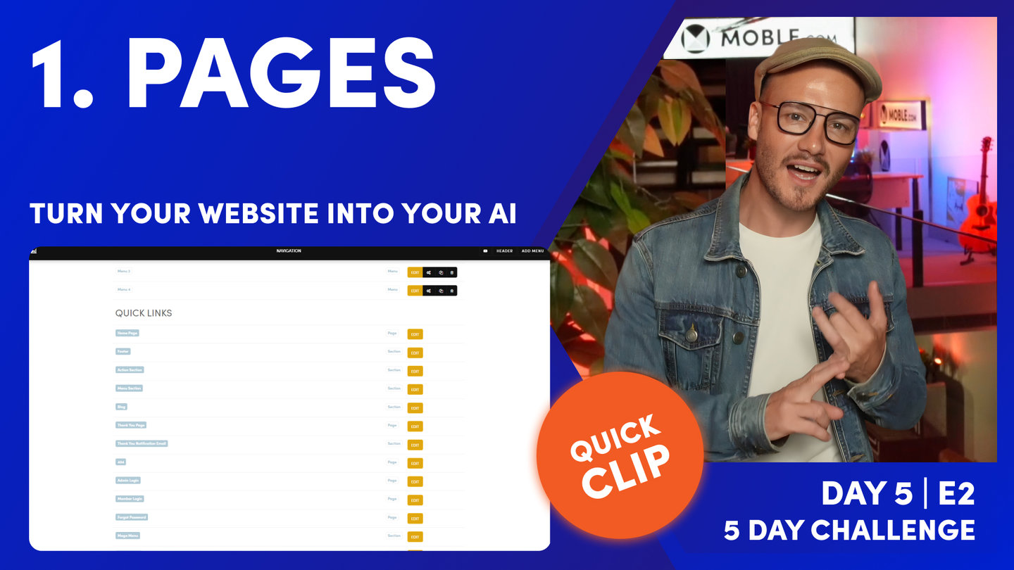
Most people text the main Live Pages of their website, but most beginners for get to test the Hidden Pages, such as Member Login pages, or your 404. To make this easy, the Navigation area of your website includes a list of Quick Links for for your to check and test.
"Number one, pages. Well, what do I mean by that? I want you to make sure that all your pages are complete and have content. It sounds obvious, doesn't it? Well, actually, as you should know by now, your website has many hidden pages and a lot of system pages. So to make this easy for you, what we've done is put all of these quick links in the navigation area. So if you hover over the main menu and go to navigation and scroll down, you can see these quick links. And, actually, the history of why we put it in here is because a lot of people would forget these pages before going live. So we just made a nice list and say, "Hey, make sure you've got your pages in here." So let's have a look. For example, we haven't covered the 404 page yet really, but this is the page that people are going to go to if the page no longer exists.
Maybe you've had a new website and an old page has been taken down, or maybe a page has been deleted and they're going to go to a 404. Now we're going to look at redirects just in one second if you're thinking that, so hang tight. But let's just go and have a look at a common way to edit. I'm going to click into our 404 page. But you can see here that this page isn't satisfactory. Is it? What we've got is text that's fighting with the image behind. It's not that legible. So let's improve this. With a 404 page, you can add a bit of humor, make light of the fact that someone hasn't found your page, and then give them a clear direction of what to do next. So in this case, we've got 404. The site's going to be for alio, so we can say, "Alio, no."
So I'll just type in, "Alio, no!." The page that you're looking for, no longer exists. What we can do is actually give this a big heading one, make it obvious. Make the button stand out a little bit. Notice this is going to the homepage, back to index. So we're sending them back home. Good strategy for your 404, and we need to make this stand out a little bit more. So, as you know, what we can do on here is put in a gradient. I'll just use my 130 angle as normal. I'm going to put the overlay here to be much more taking the emphasis off the image, but it could be any images. Someone looking confused that the page doesn't exist. Whatever you want to do there, you can have a bit of fun with that. And when you're ready, just remember to press save and exit. And now you can go and do that for all of your other pages. Just have a check and make sure that all the text is legible and you're happy with all the content."
2. SEO Page Titles and Meta Description
Paul Davenport | 01:15
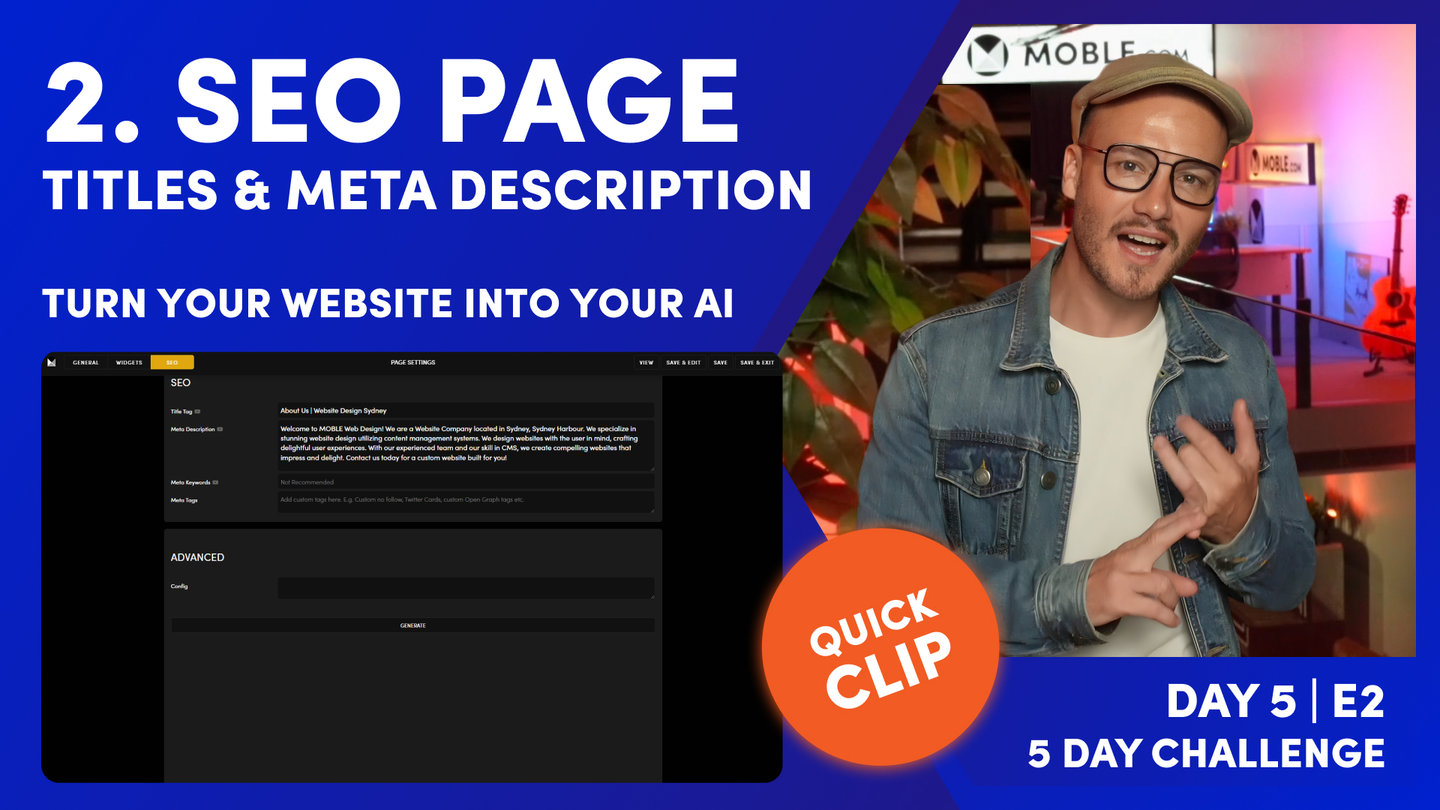
As we discussed in the Pages Tour on Day 2 it's important to add SEO Page Titles and Meta Descriptions to your Pages, and also Alt Text to your Images. Now you can quickly check and amend any pages that are not optimised.
"Number two is your SEO page titles and meta descriptions. As you know, if you've updated your page titles and meta descriptions, you're going to get a blue tick rather than a red SEO cross. And to update this blue SEO tick, you can go to the settings, scroll down to SEO and make sure you've got a title tag, which is 70 characters, and a meta description, which is up to 300 characters. And my advice for the meta description is finish with a call to action. In which case it's saying here, "Contact us for a custom website built for you." Okay. So think about that with your SEO title tags and meta descriptions. And also remember to do that for your images too."
3. File Size - Image Compression
Paul Davenport | 03:02
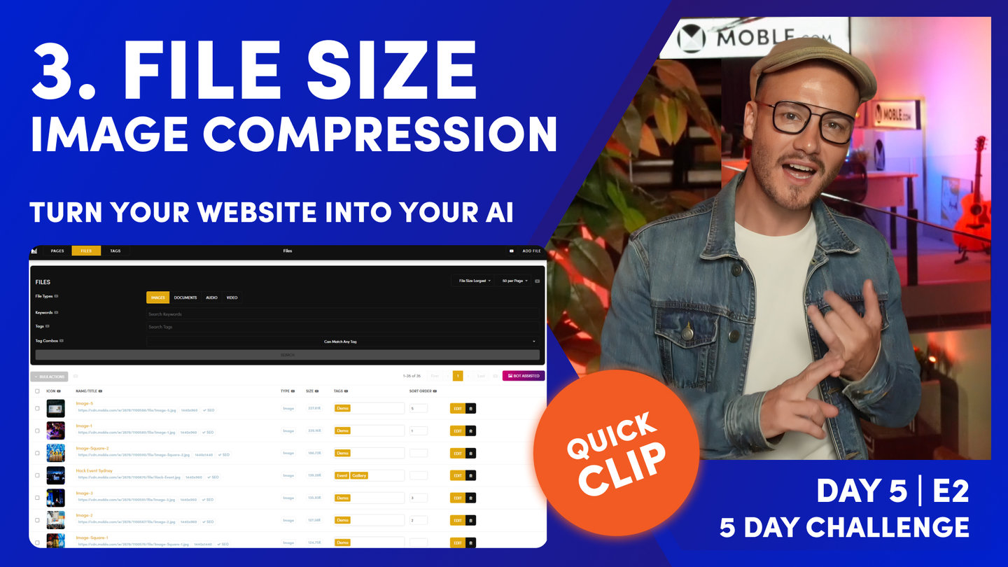
As you have learned your MOBLE website compresses your images when you upload them. Now is a good time to go an check your images and decide if there are any images that can be optimised further.
"Number three, I want you to check the size of your files. We don't want any large or necessarily large files slowing down your website. So you can come over to the files area. Now, top tip is if you sort by file size largest, so I'm going to do this in click search, and what you'll see is the largest files appear at the top. Well, as you know, on mobile when you upload a JPEG, we're compressing that down. Now we're aiming for below 200 kb or as close as we can to get there. Now if this is over 300 kb, this won't be blue, it'll be red saying to you, "Can you do something about that image?" Maybe you'll make it a bit smaller, or maybe you forgot to turn on the compression when that image was uploaded. Now, as you know, you can go and change the compression over in the global settings area, and we often see that if, sometimes, some users have turned that off and they'll upload a five megabyte image and they forget to turn the compression back on.
So top tip there, check your file sizes and make sure that's running. Now if you have got a large image that's above 300 kb, it's most likely one of three things. One, like I've said, someone's turned off the compression and forgot to turn it back on, then uploaded an image so it hasn't compressed. Number two is it's a PNG file. Now we do attempt to compress PNGs, but remember their graphic files. So JPEGs are your images and PNGs are graphic files maybe for your logo with a transparent background. So we do compress those as well. But the key tip here is make sure that if you have got an image, you've actually uploaded a JPEG and not a PNG, those PNGs will be larger and Google will penalize you if you're using PNGs rather than JPEGs for your images.
And the third is PDFs. Well, you don't really want to compress a PDF so often. We'll know not to compress that when you upload a PDF, but the PDF could actually be quite large. So one of the episodes we looked at files in the end, very end, of day two, well, when we're... if you put a PDF into a widget, will automatically put the lazy loading on that anyway, so it won't start loading until the user gets to that particular point in the webpage, making sure your site is optimized just naturally and organically. Okay so let's move on to number four."
4. Redirects
Paul Davenport | 02:29
If you have an existing website, you might have changed some URL's. Here we look at MOBLE's philosophy for migrating pages from your old website to your new website, and look at how to redirect any URL's that you've decided to change.
Number four is redirects. This is something that everyone should do and should get into a habit of redirect. So what you can do is go to the optimised tab, and in here we've got redirects. Now with redirects, it might be that on your old website, it was called about-us, and your new website, you've changed it to just simply about. So what would we do in that instance? Because if that webpage is on the search engine somewhere, it's still going to be on the search engines about-us. So we're going to redirect it to about. So we can go over to the redirects here and we can put what's the old path, put in the forwards slash, and we're going to type in about us. And then I'm going to put in the new path here, redirect to about, press save. And now we've got our first redirect setup. So you can build a whole list of redirects here. But my advice for SEO is first preserve and then enhance.
Well, what do I mean by that? Well, if a page is ranking well, you want to preserve it. So you want to preserve the URL and you want to preserve the content and then you can enhance that content over time. So if it was me and I had this situation as a old URL, which was about-as, I'd probably keep that URL the same and keep it about-us. So if that's your basic strategy, always think first preserve and then enhance , and then you're only changing those essential pages that you have to change or that you need to as part of your marketing plan and structure. So that's a top tip there. First preserve and then enhance. And if you do this, the migration process from the old website to the new website will go well because years ago we really had to focus a lot on site migrations, but these days Google knows anyway. So as long as you keeping those URLs the same and the copy is quite similar in most regards, then you're going to be just fine.
5. Cross Devices
Paul Davenport | 02:43
Your MOBLE website is responsive, meaning that it should render perfectly on all devices. Here we look at some simple ways to test in the MOBLE platform, but also look deeper in to how for specific devices via your Browser.
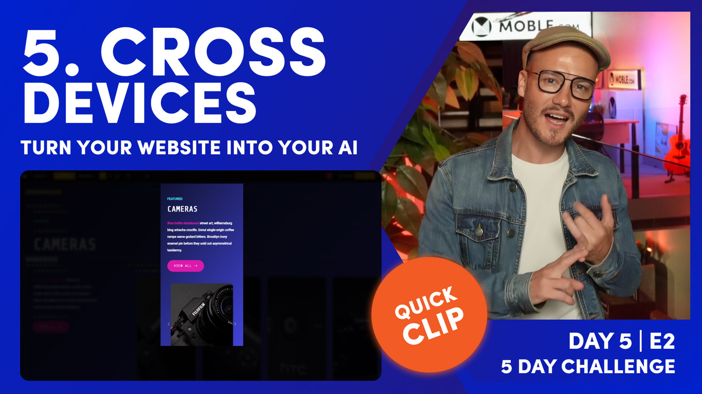
"Number five, you want to check your website on different devices. Well, as you know, in the MOBLE platform, you can come and check your website on mobile, tablet, and on desktop. Now the preview settings here, what we are doing is taking the smallest size, the smallest break point for each of those devices so you can be sure you're looking at the smallest one. Now if you've, which I hope you have, watched day three, episode one, where I took you through the essentials class, then you'll know how to structure a website page so you don't run into any issues on MOBLE from the get-go. And that's because our AI Website Bots are going to come in and make sure all your padding and alignment is working just fine. But still make sure you have looked at your pages on mobile, tablet, and desktop.
And do remember that if your page are particularly long and there is some information that you don't really want to display on mobile, then you can come into any layout, any frame, and then go to the advanced tab and say, "You know what? I just want to show this particular layout on desktop only." And you can do that right down to this frame here. So I could say, "You know what? Don't show this card on mobile, show it on desktop only." Now that's my advice to most users. Just make sure you use our preview tools in here because we are look previewing there on the smallest size for that particular device. But you can also go a step further. I'll just flip into another tab.
Now looking at this on the front-end, and I could go to inspect element here in Chrome or on Safari as well, but I could click the mobile tab and you can see I can change my screen size here to different dimensions and across different devices as well. So I'm here on a Mac, but I could go and look at this on a surface and a Samsung Galaxy and so on and so forth. So there's top tip there if you do want to have a look at other devices, another browsers, without having to go and buy a million phones."
6. Forms and Emails
Paul Davenport | 03:51
It's essential to perform test submissions on your Forms, and Checkout Page if you have an online shop. Here we will look at how to test Forms and ensure your have set up your Thank You Notification Emails and Thank You landing pages correctly.
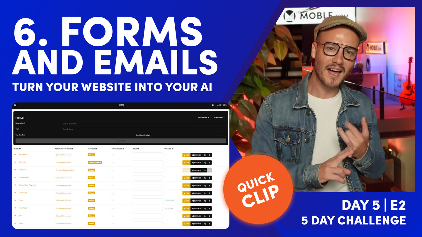
"Number six is test your forms. I know I've said this a lot throughout the five-day challenge, but do test your forms. Well, every time you have a new form, go to that page on the front-end and complete it and make sure that you receive that email, but also send it to your other account, maybe send it to a Gmail or make sure at least send it to yourself so that you can have a look at what that email looks like to your customer. So the first thing is come into the forms area, which if you go to the main menu and then forms. First of all, get your eye in down here and see which email addresses in your admin team, which admin notification email address is this going to. You see here on the checkout, this one's going to orders@youremail hasn't been set up.
So I could just jump in here, click the settings on this one and make sure this is going to our fulfilment team. In this case, it might be orders@blio.com or.com.au and making sure that that admin and customer is seeing the right email address. If this checkout has gone, you might actually want them to reply where do you want them to reply to. Is that going to a support email address or is it going to the warehouse? So make sure you update your emails. Just remember, if you wanted multiple people to see this one, you don't need a space here, you can do paul@blio.com.au. Now that would send me that email with this customer notification email. One top tip though, you could just do something like this, like Blio Support and then use the triangular bracket and set it up like that. Now the customer's going to see that in their inbox under the name rather than the email address.
So it just looks a lot nicer. So I would get into a habit of setting up your emails in this format. So now go back into your forms and make sure it's set up like that. And I want you to check that all your forms are set up correctly with the correct thank you email and the correct thank you landing page. So what do I mean by that? This is your thank you landing page. Just check this. This is a page that's hidden. And if you go down to the thank you email, this is a section that's hidden. So what do I mean by that? Let's just go back over into the pages area. And if you're ever unsure how to find your thank you emails and thank you pages, remember from the forms episode, just highlight page and section and highlight hidden and just type in a keyword like, "Thank," and then hit search.
And then you can see that these are set up. So what I like to do is set up my thank you. I'd like to have unique thank you pages for each different form because each form might have a next interaction so you can start to create funnels. Well, in this case, this thank you is tagged thank you page, and this one's thank you email. You can see the thank you page is a hidden page. You can see the thank you email is a hidden section. If that's not making sense to you, go back and watch the forms episode from day two where we look a little bit more at that."
Google reCAPTCHA
Paul Davenport | 01:52
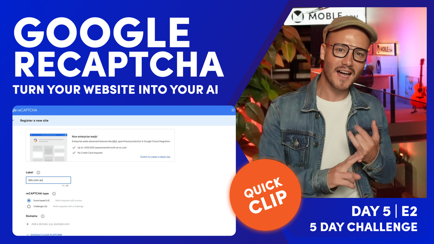
MOBLE has a honeypot, first line of defence, for Spam which detects Form Submissions from Spam bots. However, Spam Bots are particularly crafty, so we highly recommend that you set up your Forms up with a Google reCAPTCHA 'no robots' to ensure your email inbox stays clean and free of spam.
If your do receive Spam you can mark enquiries as Spam in your Enquiries area and the MOBLE team will Black List these IP Address for you and the entire MOBLE community.
"Now for your Google reCAPTCHA. Okay. So you want to put Google reCAPTCHA on your forms a no roAI Website Bots checkbox so that you don't get lots of spam. So that is very important. And to do that, you go back over into the integrations area, global settings, go to integrations, and then you want to add in your Google reCAPTCHA site key and your Google reCAPTCHA secret key. So there's the first two things you do. Add those two keys from your Google reCAPTCHA account when you add in your site key and secret key, press save. And now when you go back into your forms, which we'll just do here at the bottom of each form. So let's go to our short light and hit settings. And as I scroll down to the bottom of the page integrations, now you can see the Google reCAPTCHA toggle.
So first, you need to add in your site and your secret key in the global settings. Then for each of the forms that you want the reCAPTCHA on, now you turn on the checkbox here and press save. So that is also setting up your forms with the right email addresses, the right thank you page, the right landing page, and also with Google reCAPTCHA."
Proofread
Paul Davenport | 01:52
It's always hard to proofread your own writing, simply because of familiarity. A quick hack is to read your copy on a different devise to the one you wrote it on, or consider outsourcing to a gig website site like Fiver.
"And number seven is proofread your website, which sounds obvious, but if you're like me and you write a lot of content, it is quite hard to proof read your own work, and that's because you've written it. So as you're reading through, you tend to skip ahead. So what I like to do as a top tip is just open your website up on your phone and proofread it on your phone and you'll find you pick up a lot of changes that way. But if you don't have any other team members that can help you do it or you don't have any friends that can help you do it, you can always use lots of resources on the internet that exist now, such as things like fiverr.com. Now I've used that service once before to proofread a lot of MOBLE work and, actually, found an English tutor from Oxford University that could go through all of my sloppy work and make sure that it was well proofread."
8. User Testing
Paul Davenport | 01:32
While most small businesses can't afford professional User Testing, all businesses can ask their staff and colleagues to test your website before you send it live. User feedback always uncovers quirks, suggestions and opinions that you may not have considered.
"And number eight is user testing. Now, not everyone will have a huge budget to go and hire a user testing team, which is quite understandable because that can get expensive. But there are simple things you can do. Obviously, you can share your website with people outside of your company that can go and test that. So even if it's friends and family or people within the industry that are going to give you good feedback, so obvious stuff. But you can also learn a lot from your testing, from your ads.
If on your landing pages, your multivariate pages, you're seeing things that are working, then you can actually take those things that are working, apply them to your other pages so you can get a lot of good information there and a lot of good information from your stats programs like Google Analytics to look at things like bounce rate, are people leaving, where are they leaving? And there's a couple of cheap tools that you can try such as Crazy Egg and Hotjar, which will give you lots of information about what's happening on your pages so that you know exactly what you need to go and change."
9. SEO Audit and Health Check
Paul Davenport | 01:45
Speak to MOBLE if you would like additional services such as ongoing SEO. MOBLE also has a premium service for website speed where our team can review and optimise the code on your website pages to ensure your pages are outperforming your competition.
"And finally, number nine, you can consider an SEO audit. Now if you are looking for an SEO team, then you can contact MOBLE via the form on this page, or if you're watching this on YouTube, click a link into a description. And we do have SEO partners that we work with, but we also do have a site health check service. So after you've gone live, you might want to contact MOBLE, and we have a service where we can go through and optimize things for you. For our larger customers in the enterprise, we do actually build separate instances of the website. So we take it off the MOBLE platform and give you your own separate instance and your own dedicated hosting, and we can strip away all the things that are required in the CMS to only have the JavaScript and CSS that you need to make sure your pages are lightning quick.
Now you would consider that maybe if you are in the top three spots of the search engines and you are jostling for that first position, then site speed can actually make quite a difference with that. So definitely contact us if you've got any questions in regards to SEO, whether you need a service, or a health check, or you're looking to have a dedicated build."
DAY 5 Wrap
Paul Davenport | 01:01
Ok congratulations! Well done you, can you believe it, that's a wrap! Watch out for upcoming Episodes posted first on YouTube. Episodes will share new Themes and Layouts, while diving in to integrations such as Google Analytics and Google Tag Manager, and managing your website for growth of new leads, members, and online sales!
"Well, that's it for day five. We've learned how to go live and how to test your website for quality assurance. And all that's left now is for Sunset Talks number five where we look at growth, and we're going to look at MOBLE's five point sales philosophy and how we turn your business into a lead generation machine. So I'll see you there at Sunset Talks number five, and I will just say well done so far because this is now the end of the five-day challenge."
TEXTBOOK
A user guide to Testing and Quality Assurance
1. REVIEW EACH PAGE
Firstly, review each page to ensure you are happy with the content. Pay close attention to:
- Consistent Fonts Styles and Headings.
- Top Tip always select a Font Style first then decide if the Font requires a Heading Tag for SEO (more on this in the forthcoming SEO Series).
- Ensure that all your widget have the correct tags and your preferred effects are selected.
Put your Pages Live, or if they are not ready, make sure they are Draft:
- In the Pages area, highlight everything:
- Draft, Hidden, and Live
- Pages, Landing, Blog, Event, Product, Section
- Check to see if all pages are correctly assigned to Live, Hidden, and Draft.
Next, head over to the Navigation Area, check to see that all Menu Items are linked:
- Open up each Menu,
- Are any of the pages unlinked? if so use the Edit Button to reassign them.
- If the URL looks correct, ensure it has the /forward slash before it.
Have you created all of your System Pages? Often people to forget to style their 404 or Forgot password pages. You can easily check these in Navigation area.
- In the main Navigation page, notice the System Pages at the bottom of the page, marked with a denim blue button.
- Use the Edit tab to confirm that you are happy with the content for each of the System pages.

CREATE EACH SYSTEM PAGE
Head over to the Navigation Area, check to see that all Menu Items are linked:
- Open up each Menu,
- Are any of the pages unlinked? if so use the Edit Button to reassign them.
- If the URL looks correct, ensure it has the /forward slash before it.
Have you created all of your System Pages? Often people to forget to style their 404 or Forgot password pages. You can easily check these in Navigation area.
- In the main Navigation page, notice the System Pages at the bottom of the page, marked with a denim blue button.
- Use the Edit tab to confirm that you are happy with the content for each of the System pages.
2. UPDATE YOUR SEO META INFORMATION
Within the settings area of every page, you can update your meta information to help the search engines understand a little more about your page. You can also improve your click through rate (CTR) on the search engines by making this information as enticing as possible, to stand out from the other websites and encourage more clicks.
The Meta Description is also used by social media websites in the anchor text. Which again informs people on social media websites a little bit more about your page before they click.
- In the Pages area, highlight everything
- Draft, Hidden and Live
- Pages, Landing, Blog, Event, Product, Section
- Notice any pages where the SEO tag is Red. All pages should have a Blue SEO tag if they are Live or Hidden. Always check this when moving pages from Draft to Live or Hidden.
- For any Pages with a Red SEO Tag, click the Page Settings Button.
- Click the SEO Tab at the top of the page and complete the meta information
- When you're finished click Save.
PAGE TITLE TAG & META DESCRIPTION
The Title Tag and Meta Description is an essential part of content management since it is often used by search engines, such as Google, on the Search Engine Results Page (SERP), to let people know a little bit more about the page before they click. They are also used by social media websites in the anchor text, which again informs people on social media websites a little bit more about your page before they click to your page.
Your Title Tag and Meta Description are used in the following locations:
- Browser (The Title Tag often in the Browser Tab and at the top of the browser)
- Search Engine Results Page (SERP)
- External Websites E.g. Social Media Anchor (such as an ad, or news feed link)
They are therefore critical for:
- CTR - to entice search engine and social media users to click on your page (i.e. improve your click-through rate).
- NOT SEO? - according to Google meta description is not used to rank your website, however, it is used in other search engines and should not be underestimated (i.e. improve your search engine optimisation)
OPTIMISING YOUR TITLE TAG
- You can use up to 60 characters for your Title Tag on Google. If you keep your Tittle Tag below 60 Characters, research suggests that 90% of your title will display correctly.
- The Title Tag is not just used by Google, therefore it is best to write concise information about the article in the first 15 characters.
An optimum format can read:
Keyword One - Keyword Two | Business Name
OPTIMISING YOUR META DESCRIPTION
- You can use 300 characters for your Meta Description on Google. The number of characters increased in December 2017.
- The Meta Description is not just used on Google, therefore it is best to write concise information about the article at the start of the description.
When optimising your Title Tag and Meta Description always consider the following:
- Readability - should look natural
- Relevance - should be about your page
- Emotion - should encourage clicks
SHOULD YOU USE KEYWORDS?
MOBLE does not recommend using meta keywords.
Google does not use meta keywords, however, Bing may use keywords as a factor in their search engine results page. Meta Descriptions can give your competitors explicit information about what you are optimising for and as such, it is better to leave this field blank.

ADD YOUR IMAGE ALTERNATIVE TEXT (ALT TAG)
In addition to Page meta information, you can also add meta information for your images and files.
The Alternative Text is often referred to as the 'Alt Tag', even though it is not actually a tag. The Alternative Text is used to describe the image when the image is not displayed, e.g. in slow internet connections, to visually impaired using screen readers and also by search engines to understand the image.
Therefore, it is important to be succinct and descriptive. In considering Search Engine Optimisation do not try to keyword stuff your Alt Text. The search engines understand semantics, therefore they will value similar words to your main keyword that you are optimising for. Be as natural as possible and do not repeat your Alt Text for different images.
While there is no limit to the length of your Alt Text, it is recommended that you aim for 125 characters or fewer. This is less because of the search engines, but more because of restrictions within the popular JAWS screen reader. Many versions of JAWS will break up text into blocks of 125 characters.
PRO TIP:
Be as descriptive as possible about your image or file. This will help the users understand what is being displayed, though it will also help the search engines determine what is on the image, but also to determine the topic of the surrounding text. Search Engines like Google, therefore, place a high value on Alt Tags and this ultimately will assist in the search engines indexing your page.


The Image Component showing the Alternative Text. When you browse an existing image the Alternative Text will automatically populate, though you can override the original Alternative Text here to customise it for each instance of the same image. Thus saving have multiple instance of the image, but giving you the SEO benefit.
3. CHECK YOUR FILE SIZES
In Series 4 Episode 8, touched upon the objective of sizing images and files is to have the crispest, most beautiful look with the small possible file size. Go back to Series 4 Episode 8 for a refresh about sizing images and how MOBLE's compression engine does the hard work for you.
Before going live and on a periodic ongoing basis it is important to perform a File Size Health Check:
- Go to the 'Files' area
- Notice the 'Sort File' drop down towards the top right of the page
- Select 'File Size Largest'
- Select 'Image' and click search
- Now your images will be listed by File Size from largest to smallest.
- If you were to optimise your images you could start from the top and work down.
- Quick improvements would be to replace any PNGs with JPGs.
- All photographs should be JPG's.
- You should consider adding a background to any PNG graphics to make them a JPG. E.g. If your page background is white, use add a white background and save as a JPG to reduce the file size.

The Files area displaying Images sorted by File Size Largest
4. REDIRECTS AND BROKEN LINKS CHECK
What is a redirect?
When you are designing a new webpage chances are the URL is going to have to change. For example:
OLD PAGE URL
https://www.your-website.com/collections/your-service
to:
NEW PAGE URL
https://www.your-website.com/your-service
Let's imagine that the Old Page is already ranking on Google (sometimes you might hear people say that the page has been 'indexed' by Google). When you updated the URL to the new page, that's great, but it is not going to update Google, or any other website where the page link might appear. When somebody clicks the Old Page link it is not going to find the New Page, and they will be sent to your 404 page.
What's a 404 page?
A 404 page is where users are sent when they click on a link to a page that no longer exists. Have a look at MOBLE's 404 pages for MOBLE and DirtyFeet:
https://www.moble.com/404
https://www.dirtyfeet.com.au/404
While you can have fun with a 404, it is never the desired outcome. You should ensure that your users don't have the unfortunate experience of landing on a 404 by setting up your redirects.
How to setup redirects for Old URLs?
At the time of writing MOBLE's Redirects tool and Broken Links tool are in Beta. We will be turning on them on shortly in a tab via the main menu called 'Optimise'.
To add and edit redirects:
- Type this into your browser:
https://your-site-name.moble.site/redirects (See example in the screenshot below) - Click the '+ Add Redirect' button in the top right
- Add the old URL path (no need to add the domain name, just the path
E.g. /blog not https://www.dirtyfeet.com.au/blog

The Blog for DirtyFeet was not used. The optimised for a New Feed for short, sharp blasts to complement their social media. /blog was therefore redirected to /news.
How to find Old URL's or dead links?
Sometimes pages that are old or links that no longer existing might not be so obvious as changing the name from /blog to/news. If you're redesigning a website you'll need to make sure that all the old links from the old website map to the corresponding pages on the new website.
The problem here is that you might not know where to find those links that exist on external websites, or indeed those that are currently indexed on search engines like Google.
Thankfully there are a plethora of helpful free and paid websites to help you find those links. We'll also be taking a deep dive into SEO best practice in coming forthcoming a Series. Here are some helpful websites to help you on your way.
- https://ahrefs.com/dashboard/metrics
- https://moz.com/link-explorer
- https://screamingfrog.co.uk/seo-spider
MOBLE will soon be releasing tools to dumbed down tools to offer a simple solution that removes the jargon and complexity of managing your website for SEO. So please stay tuned for updates. Please also contact us if you require a helping hand with optimising your website, we will be more than happy to help. Let's Talk
5. CROSS BROWSER & DEVICE TESTING
Today there are many devices screen sizes spanning from large desktop screens to tiny mobile devices. On top of this, there are many browsers that perform regular updates and users don't often keep their browsers up to date. This can cause issues for website designers as there are hundreds of combinations of browsers and devices.
Website Design Agencies will undoubtedly subscribe to paid services such as https://www.browserstack.com/ that let you test a website across these combinations quickly to target and errors for modification. We do recommend such services especially if you have a large website and are updating content frequently.
Tools such as Cross Browser testing, at the time of writing, offer a seven-day free trial that can be useful to try when you are going live, then consider if you wish to use the service ongoing. To download the extension go to the following link:
However, if you only have one small website you might not wish to pay for such tools. Thankfully browsers have inbuilt tools that allow you to test each page manually. Let's take a look.
SAFARI

Fond Responsive Design Mode in Safari

Safari Responsive Design Mode for Safari iOS 11.0 on an iPhone 8
CHROME

Right mouse click and select "Inspect Element" to open Chrome Developer Tools

Toggle on Device Mode to simulate devices, as seen here for Galaxy S5.
6. FORMS AND THANK YOU PAGES
Forms are the communication gateway between your visitors and your team. They often signify that moment when a visitor has decided to take that next step towards becoming a customer, so you don't want to get this wrong and overlook sufficient testing.
We've already discussed the importance of setting up your Forms Settings correctly with the correct Admin and Customer Notification email address. Along with ensuring you have linked them to Thank You Pages and Thank You Emails. For a recap go to Series 5, Episode 3. Though please do make sure each Form links to a Thank You Page and also consider writing a specific Thank You email for each form.
Thank You Pages and Thank You Email Notifications are Sections on MOBLE. Therefore you have control to create you on content in the Visual Page Editor.
For Thank You Pages it is best practice to:
- Make them 'Hidden', 'Pages' and they will appear in the Drop Down menu in the Form Settings.
- You have full control to design your thank you pages, so have fun and be creative.
- If relevant, try to upsell another service, or at very least offer a Button back to your Home Page.
For Thank You Email Notifications it is best practice to:
- Make them 'Hidden', 'Sections' and they will appear in the Drop Down menu in the Form Settings.
- Clone existing Thank You Email Notifications rather than creating them from scratch.
- In the Pages Area, simply search for 'Hidden', 'Draft', 'Sessions', and use the clone button to replicate the page.

Find and Clone Thank You Notification Emails

In the Form Settings, select your Thank You Notification Email from the list of 'Hidden' 'Sections'
Now that all your forms are set up correctly, you are ready to test. Follow the simple steps to test all of your forms.
- Go to the Forms area,
- Notice the 'Eye' Icon on the left and the page (As seen in the screenshot below),
- Click the Icon and a list of pages will appear where the Form is located,
- Click the Page link to open the Page,
- Submit the Form several times ensuring that you test the Form variants, such as dropdown options, or mandatory fields.
- When you submit the Form ensure you add an email address, therefore you can test the Email Notification also.
- Check the legibility on the Pages such as Button Colour and Label colour and update in the Forms Settings area if you need to.
- Repeat with the process for all Forms.
- Now head over to your Inbox, you'll have a bunch of test emails notifications waiting for you. Open and read each email. If there are any errors visit the Form Settings area or the Email Page to modify until you are satisfied with the presentation and that there are no errors.

Use the Eye Icon to view and open the Pages where your Forms are located.
GOOGLE RECAPTCHA
Whether your website is already receiving spam, or you wish to proactively prevent it, Google reCAPTCHA is the best in class, free, solution to keep malicious software from engaging in abusive activities on your website. Thankfully, your MOBLE website has an easy solution that allows you to turn on Google reCAPTCHA for your forms that need protection. In this article we assess 'why Google reCAPTCHA' and how to set it up.
HOW TO SET UP GOOGLE RECAPTCHA?
- Login with your to Google reCAPTCHA with your business gmail account (or create an account) and select V2 checkbox:
https://www.google.com/recaptcha - Each website requires its own 'Site Key' and 'Secret Key'.
Create yours via the settings tab:
https://www.google.com/u/1/recaptcha/admin/
*IMPORTANT. WHEN SETTING UP, PLEASE ENSURE TO ADD YOUR DOMAIN (WEBSITE ADDRESS)* - Copy the Site Key.
Then, go to your MOBLE website.
Go to the Global Settings Area found via the Main Menu.
Notice the Google reCAPTCHA field, located via the Integrations tab.
Paste your Site Key into the Google reCAPTCHA Site Key field. - Go back to reCAPTCHA and copy the Secret Key.
Then go back to your MOBLE website.
Again, go to the Global Settings Area found via the Main Menu.
Again, notice the Google reCAPTCHA field, located via the Integrations tab.
Paste your Secret Key into the Google reCAPTCHA Secret Key field. - Click Save at the top right of the page.

Google RECAPTCHA SEY KEYS

MOBLE Global Settings Area
HOW TO TURN ON GOOGLE RECAPTCHA FOR EACH FORM?
Now Google reCAPTCHA is set up on your website, you can turn it 'On' and 'Off' individually for every form:
- Go to the Forms area.
- Click the Settings tab next to each form that you would like to protect.
- Notice the reCAPTCHA switch at the bottom of the page (this only appears after you have set up Google reCAPTCHA in the steps above).
- To activate reCAPTCHA select 'Yes' and press Save.

MOBLE Form Settings
THE HISTORY OF THE HONEYPOT
In days gone by MOBLE would advise clients to steer clear of captcha codes. These codes were a hindrance to your customers, who would often struggle to decipher the ambiguously formatted text within an obscure image. The code would be hidden in a poor quality image that would often require several attempts to successfully match the code in order to prove the enquiry was legit, and not from a malicious spam bot.
This approach sucked because it would invariably frustrate customers and impact on conversion rates.
As an alternative to captcha codes, MOBLE invented a honey pot technique where we would generate hidden fields in every form, that humans could not see. These might be fields like 'Country', 'State', 'Date of Birth' etc. A spam bot would not realise that these fields were hidden, and if they were completed, we would know that the submission was from a spam bot. We would then junk the enquiry and blacklist the offending IP address.
All this worked beautifully well until around November 2019 when we noticed the spam bots had started to work it out.
THE AGE OF GOOGLE RECAPTCHA
All MOBLE websites in an integration with Google reCAPTCHA. This integration allows our clients to simply connect and protect individual forms as they wish. If a form is on the frontend, we advise turning it on, though, if it is on password protected pages, or such like, you can turn spam protection off.
DOES GOOGLE RECAPTCHA EFFECT MY CONVERSION RATES?
Unlike captcha codes, Google reCAPCHA has a simple "I'm not a robot" check box, which is effortless for a customer to tick prior to form submission. Therefore, conversion rates remain as high as possible.
DO I HAVE TO USE IT?
No, the decisions yours. MOBLE still have the honeypot technique running. Plus, in your Enquiries area, you can manually mark enquiries as Spam, and press Save. We will then blacklist the offending IP Address and you will be unlikely to get hit by this IP again.
9. SEO TECHNICAL AUDIT
As the ultimate line of defense for your website QA and Testing, consider undertaking an onsite SEO audit from a professional marketing company. This is especially important if you are redesigning an existing website and includes many of the aspects that we have discussed in this Series.
In this Episode, we cover the some of the key inclusions of a MOBLE SEO Audit, and in a forthcoming Series, we'll go into specific detail of how to run your own audit and search engine optimisation.
Please feel free to contact MOBLE for assistance on your website at any time. Let's Talk
PRESERVE YOUR SEO RANKINGS
Onsite SEO, also referred to as on-page optimisation, is the factors that you can control on your website. This includes enhancing the content, meta information, the website information architecture, internal linking structure and more technical considerations such as coding, indexation, canonicalisation and load speed. MOBLE can help you structure your website effectively while giving you valuable insights into a content strategy to ensure effective ongoing content management.
SEO REVIEW
As part of the website build, MOBLE will undertake an SEO Review on your existing website. MOBLE will request access to your existing website or analytics (if you have it) to review usage stats to determine what pages are accessed and what paths people use, including where people exist the website. This approach offers due diligence to ensure that any aspects that are working on the current website are maintained, and those that are not working are improved.
KEYWORD RESEARCH
We will define the exact words that people use to find you on the search engines. We can group the keywords into groups/themes that are used to determine what pages are required.
TITLE TAGS AND META INFORMATION
We write the meta information and title tags for key pages, to ensure your website is built to best practices. We also show you the logic for writing meta information for new pages as you create them in the future.
SITE MIGRATION
In addition to website user analysis, MOBLE’s auditing process also takes into consideration a site migration. We review your existing rankings and undertake steps to preserve and enhance your rankings. We look at URL structure, the source of the links to these pages, the content structure on the pages including keyword density and internal links.
WHAT'S NEXT?
Now you're website is live it's appropriate that tonight's Sunset Talks is all about Growth. We share MOBLE's 5 step process for growth that you can apply to win new customers and grow sales via your website. You can then go on the watch the pilot Sunset Talks we shot back in 2021 to see quite specifically how this process was applied in the hospitality industry.
DAY 5: EPISODES
70 Award
Winning AI Themes
GETTING AROUND
SUPPORT
AI SALES LINE
AI SUPPORT LINE
GET A QUOTE
A Web Builder for Design. A CMS for Business. We serve all businesses from SME's to Enterprise. Talk with us for AI development, custom website design, website development, ecommerce websites, directories, intranets and social networks.


