PICK YOUR AI THEME TO GET STARTED
BACKGROUND IMAGE POSITION
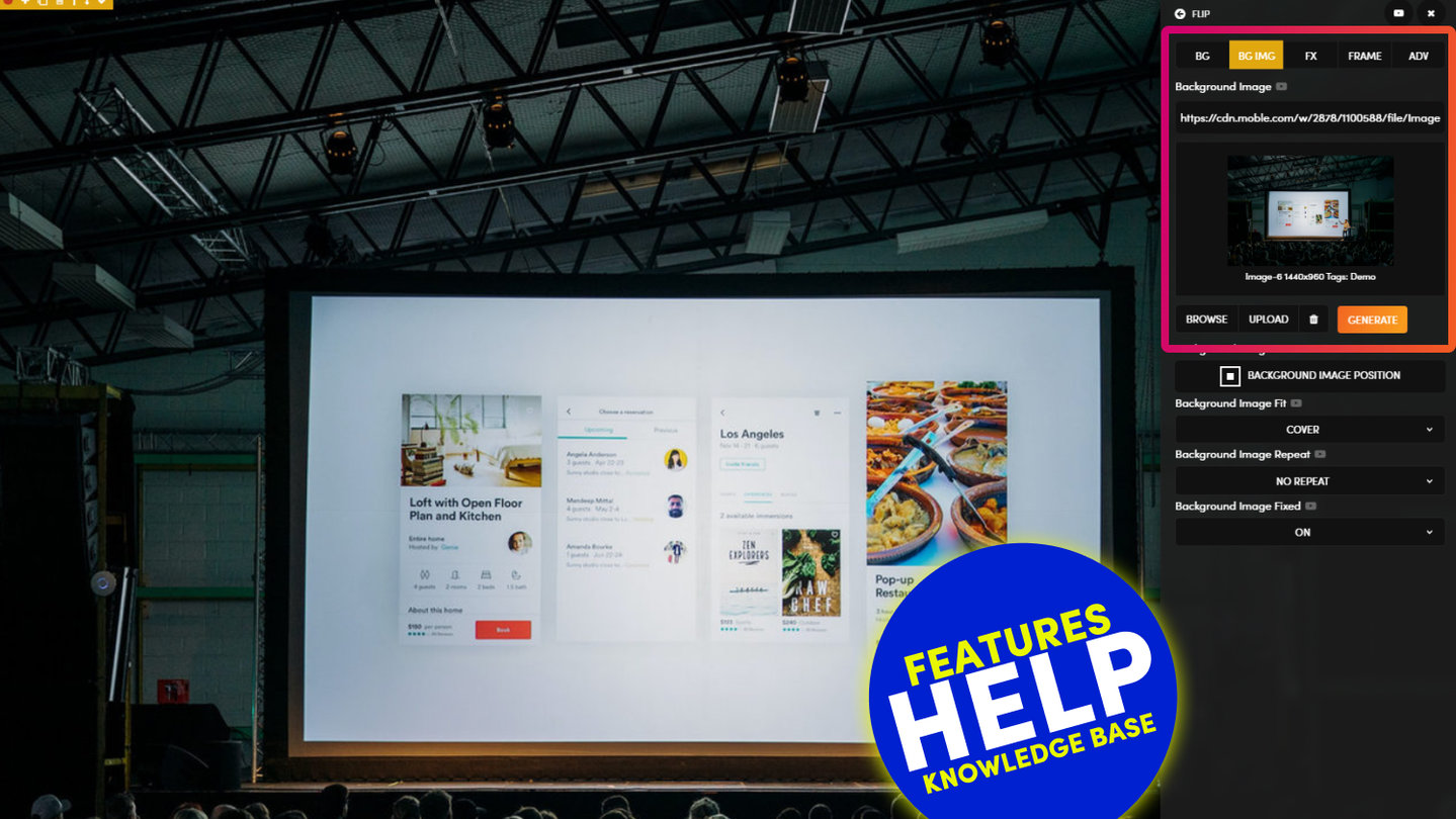
Background Image Position allows you to chose the focus point of your background image. This can save having to crop and resize images and is particularly important when considering how your background image might render across all devices.
08:26
Page Editor
The 5 Frames Method for AI Website Design. Learn the secret on how to design AI Layouts. Design for the Bots to keep your entire content team on track so they can never mess up your beautiful designs. MOBLE is a web builder for designers and a CMS for businesses, with an all-in-one No Code Visual Page editor.
D03 E02 | 06:39
Embed v Background Images - Fixed Height
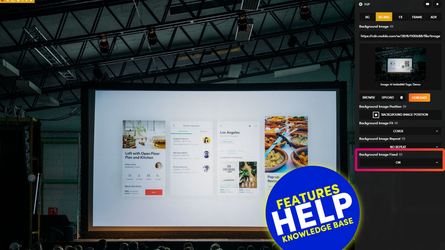
A common query for first timers is knowing when to use an embed image v's a background image. Background Images are most commonly used when you want to apply text on top of an image, here we choose a background image so that a Fixed Height can be applied to your Frame.
MORE ABOUT:
In this example, we see an image of MOBLE's office balcony. On the left-hand side are the residential buildings on the Pyrmont Peninsula, and on the right-hand side is the view over the harbour to the Balmain peninsula.
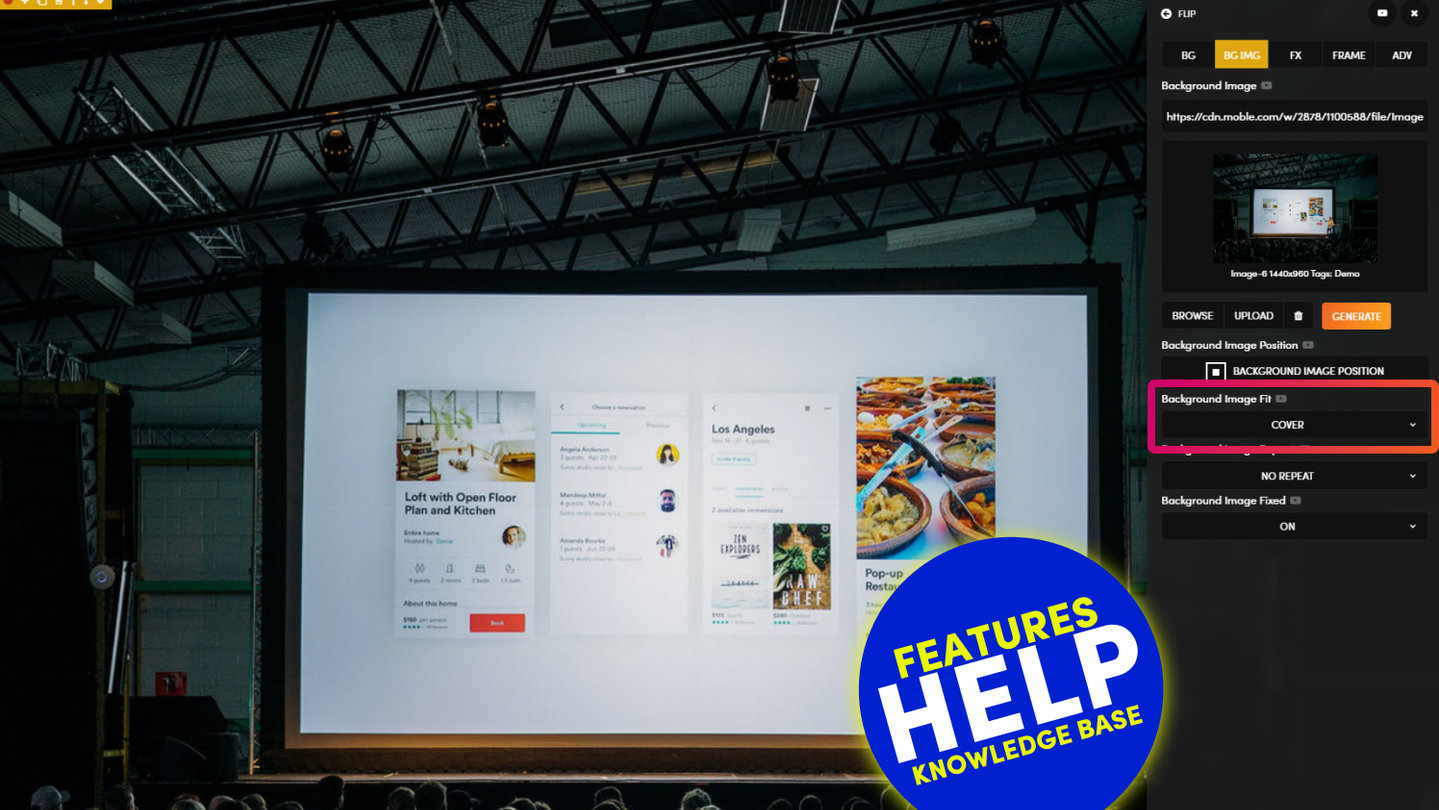
On Desktop, the full width of the image displays, as the image Fit is set to 'Cover' the full width. Though, how will this look on Mobile?
- If the Background Image Position is set to 'Top Left', then on mobile, you will see the residential buildings of the Pyrmont Peninsula on the left of the photo.
Notice this image is 1440px wide and 960px high, yet the frame has a Fixed Height 700px on desktop. If the image is set to 'Top Left', more of the table in the foreground is cropped. I prefer the Buildings in centre, so I'll chose Centre Left. - If the Background Image Position is set to 'Centre Right', then on mobile, you will see more of the Balmain Peninsula on the right of the Photo.
DESIGNER TIPS:
It's obvious to suggest that it's always a good idea to set your Background Image Position by focusing on the part of the image that is most relevant.
However, on many occasions, you will need text on top of the background image. Once you've added text, you can play with the image position to make your text more legible. In this example, the text works perfectly over the table in the foreground. To make the text even more legible:
- experiment with changing the height and width of the text, using the Width % and the Child Height tools.
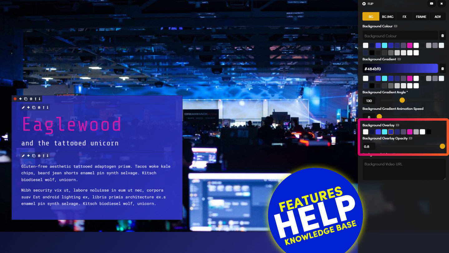
- experiment using a 'Background Overlay' behind the text. It's best practice with try and keep your Background Overlay colours the same across your entire website, though this is down to your particular brand/project.
- also try with a 'Blur' effect is added to the 'Backdrop Filter', this will naturally create a glassy look, and ensure the text will remain legible should the content team change to a less desirable image in the future.
RELATED HELP
PRICING PLANS
MINI
12 PAGES
70 AI THEMES
5,000 AI LAYOUTS
90 MINUTE CHALLENGE
5 DAY CHALLENGE
WEBSITE BUILDER
CMS
BUG FREE MAINTENANCE
ONLINE SHOP
AI HELP ASSISTANT
AI COPY ASSISTANT
AI PHOTO ASSISTANT
AI AGENTS
AI AUTOMATION
AI CHATBOTS | Unlimited
AI VOICEBOTS | 5 Agents
AI VOICEBOTS | $0.08 min
AI VOICEBOTS | Calendar Bookings
PLUS
50 PAGES
70 AI THEMES
5,000 AI LAYOUTS
90 MINUTE CHALLENGE
5 DAY CHALLENGE
WEBSITE BUILDER
CMS
BUG FREE MAINTENANCE
ONLINE SHOP
AI HELP ASSISTANT
AI COPY ASSISTANT
AI PHOTO ASSISTANT
AI AGENTS
AI AUTOMATION
AI CHATBOTS
AI VOICEBOTS | 5 Agents
AI VOICEBOTS | $0.08 min
AI VOICEBOTS | Calendar Bookings
PRO
500 PAGES
70 AI THEMES
5,000 AI LAYOUTS
90 MINUTE CHALLENGE
5 DAY CHALLENGE
WEBSITE BUILDER
CMS
BUG FREE MAINTENANCE
ONLINE SHOP
AI HELP ASSISTANT
AI COPY ASSISTANT
AI PHOTO ASSISTANT
AI AGENTS
AI AUTOMATION
AI CHATBOTS
AI VOICEBOTS | 10 Agents
AI VOICEBOTS | $0.08 min
AI VOICEBOTS | Calendar Bookings
ELITE
UNLIMITED PAGES
70 AI THEMES
5,000 AI LAYOUTS
90 MINUTE CHALLENGE
5 DAY CHALLENGE
WEBSITE BUILDER
CMS
BUG FREE MAINTENANCE
ONLINE SHOP
AI HELP ASSISTANT
AI COPY ASSISTANT
AI PHOTO ASSISTANT
AI AGENTS
AI AUTOMATION
AI CHATBOTS
AI VOICEBOTS | 15 Agents
AI VOICEBOTS | $0.08 min
AI VOICEBOTS | Calendar Bookings
AI AGENCY
40% PLATFORM PAYOUT
100% SERVICES YOU SELL
AGENCY SITE ($199 ELITE PLAN)
PARTNER LICENSE
MY SALES DASHBOARD
MY CLIENTS DASHBOARD
LOGIN TO CLIENT SITES
STAFF PERMISSIONS
TEAM LAYOUTS
NORMALLY $199 /month
PROMO $99 /month
PARTNERS & INTEGRATIONS
70 Award
Winning AI Themes
GETTING AROUND
SUPPORT
AI SALES LINE
AI SUPPORT LINE
GET A QUOTE
A Web Builder for Design. A CMS for Business. We serve all businesses from SME's to Enterprise. Talk with us for AI development, custom website design, website development, ecommerce websites, directories, intranets and social networks.


