PICK YOUR AI THEME TO GET STARTED
BACKGROUND OVERLAY
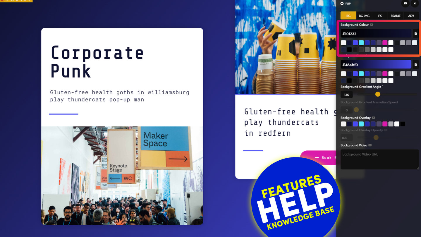
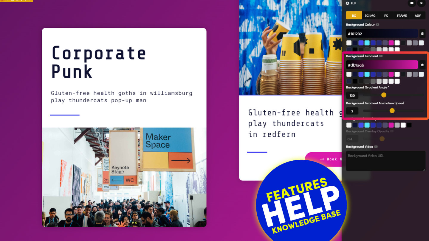
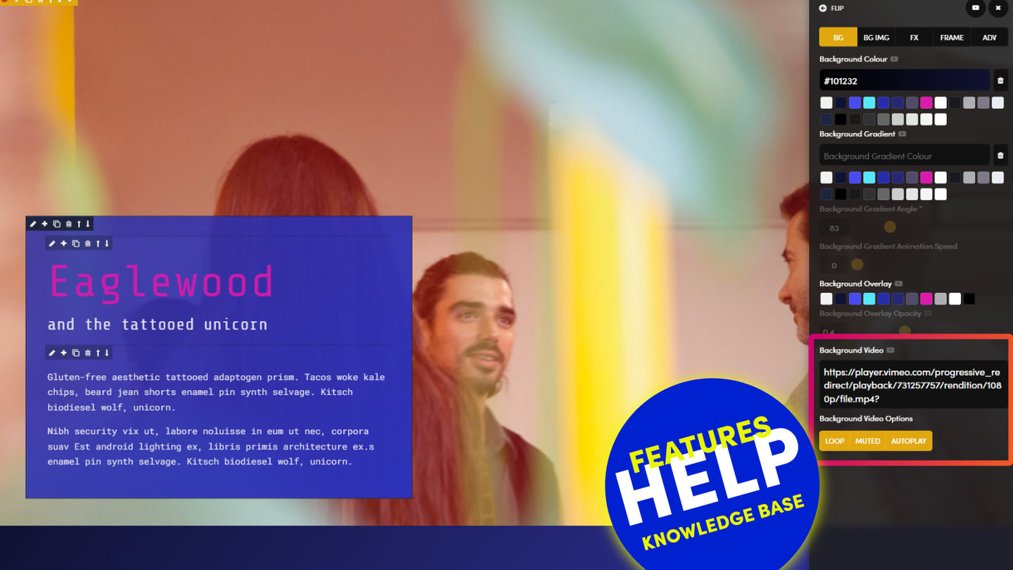
Background Overlay enables you to place a transparent layer between your background and your text. While this feature can dramatically enhance your website aesthetics, it is an essential user experience function to ensure the legibility of your text.
MORE ABOUT:
Background Overlay is frequently used where an image has similar colours to the text that is placed on top of it. For example, if you have an image of a field of yellow sunflowers and one of your main brand colours is yellow, you may wish to place an overlay on top of the image, to allow the text to be read clearly.
SWATCHES:
Your website has ten overlay colours in total. These are controlled in the Colours tab of the Styles area, found via the Main Menu.
The ten overlay colours are:
- Primary
- Secondary
- Accent 1
- Accent 2
- Accent 3
- Accent 4
- Accent 5
- Accent 6
- Light
- Dark
OVERLAY OPACITY:
Opacity measures the Overlay's ability to pass light through its surface.
- An overlay that is 100% opaque is not transparent
- An overlay that is 0% opaque is completely transparent
There are 4 strengths of Opacity to chose from:
- 0 - Completely see through. Do not select a Background colour, Gradient or Opacity
- 0.2
- 0.4
- 0.6
- 0.8
- 1 - Completely opaque. Do not select Opacity, only select a background colour.
D03 E02 | 02:17
Background Colours
See how Background Colours were used in the 5 Day Challenge to make Light and Dark Layout variants. Quickly changing the background colours allows designers to capitalise on their great work with extras Layouts for their content team to use.
Scrub to 2:45 mins to see background overlay.
D03 E03 | 14:09
Background Overlay with Child Headlines
Here we see Background Overlay used in the Advanced Masterclass during the 5 Day Challenge. Background Overlay can be used to sit over a Background Image to make text more legible.
RELATED HELP
PRICING PLANS
MINI
12 PAGES
70 AI THEMES
5,000 AI LAYOUTS
90 MINUTE CHALLENGE
5 DAY CHALLENGE
WEBSITE BUILDER
CMS
BUG FREE MAINTENANCE
ONLINE SHOP
AI HELP ASSISTANT
AI COPY ASSISTANT
AI PHOTO ASSISTANT
AI AGENTS
AI AUTOMATION
AI CHATBOTS | Unlimited
AI VOICEBOTS | 5 Agents
AI VOICEBOTS | $0.08 min
AI VOICEBOTS | Calendar Bookings
PLUS
50 PAGES
70 AI THEMES
5,000 AI LAYOUTS
90 MINUTE CHALLENGE
5 DAY CHALLENGE
WEBSITE BUILDER
CMS
BUG FREE MAINTENANCE
ONLINE SHOP
AI HELP ASSISTANT
AI COPY ASSISTANT
AI PHOTO ASSISTANT
AI AGENTS
AI AUTOMATION
AI CHATBOTS
AI VOICEBOTS | 5 Agents
AI VOICEBOTS | $0.08 min
AI VOICEBOTS | Calendar Bookings
PRO
500 PAGES
70 AI THEMES
5,000 AI LAYOUTS
90 MINUTE CHALLENGE
5 DAY CHALLENGE
WEBSITE BUILDER
CMS
BUG FREE MAINTENANCE
ONLINE SHOP
AI HELP ASSISTANT
AI COPY ASSISTANT
AI PHOTO ASSISTANT
AI AGENTS
AI AUTOMATION
AI CHATBOTS
AI VOICEBOTS | 10 Agents
AI VOICEBOTS | $0.08 min
AI VOICEBOTS | Calendar Bookings
ELITE
UNLIMITED PAGES
70 AI THEMES
5,000 AI LAYOUTS
90 MINUTE CHALLENGE
5 DAY CHALLENGE
WEBSITE BUILDER
CMS
BUG FREE MAINTENANCE
ONLINE SHOP
AI HELP ASSISTANT
AI COPY ASSISTANT
AI PHOTO ASSISTANT
AI AGENTS
AI AUTOMATION
AI CHATBOTS
AI VOICEBOTS | 15 Agents
AI VOICEBOTS | $0.08 min
AI VOICEBOTS | Calendar Bookings
AI AGENCY
40% PLATFORM PAYOUT
100% SERVICES YOU SELL
AGENCY SITE ($199 ELITE PLAN)
PARTNER LICENSE
MY SALES DASHBOARD
MY CLIENTS DASHBOARD
LOGIN TO CLIENT SITES
STAFF PERMISSIONS
TEAM LAYOUTS
NORMALLY $199 /month
PROMO $99 /month
PARTNERS & INTEGRATIONS
70 Award
Winning AI Themes
GETTING AROUND
SUPPORT
AI SALES LINE
AI SUPPORT LINE
GET A QUOTE
A Web Builder for Design. A CMS for Business. We serve all businesses from SME's to Enterprise. Talk with us for AI development, custom website design, website development, ecommerce websites, directories, intranets and social networks.


