PICK YOUR AI THEME TO GET STARTED
DEVICE STACK
Device Stack is a useful tool to determine how columns stack on mobile devices. Often you might wish columns to stack in two columns rather than one on mobile and here we look at the settings available.
In the video above, notice the Frame that immediately wraps around the columns is where you will find the Device Stack feature.
There are three settings available:
SINGLE
Single is the default setting. E.g. if your page has 3 columns, on Mobile they will be stacked each column on top of each other, with left on top.
DOUBLE (VIDEO ABOVE)
Double is a popular control and stacks your double stacks your blocks into 2 columns.
If your page has 3 columns and also select Double, the first two with appear in 2 columns on mobile, with the third below.
FIXED (VIDEO BELOW)
Fixed is used to fix all columns on Mobile, in one row. Effectively, this disables the stacking action. and displays your columns on Mobile as they would be on Desktop. For example, this is a great feature where you have a set of icons, that you'd like to line up horizontally next to each other on Mobile.
D03 E02 | 02:24
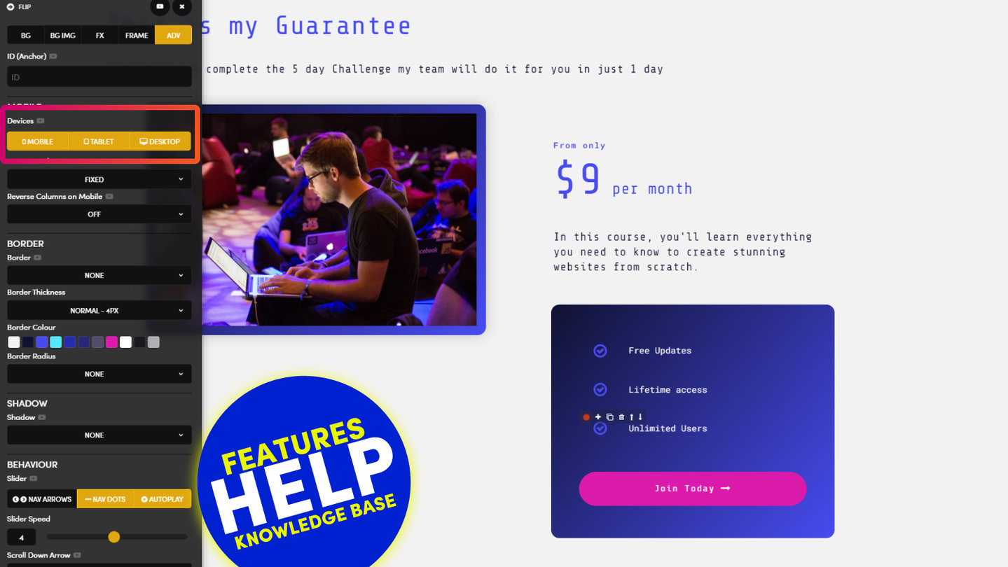
Show on Devices: Desktop, Tablet, Mobile
Here you learn how to show and hide Frames on Mobile, Table and Desktop which can be extremely useful to show less on mobile so that you content is both neat and concise.
D03 E02 | 01:09
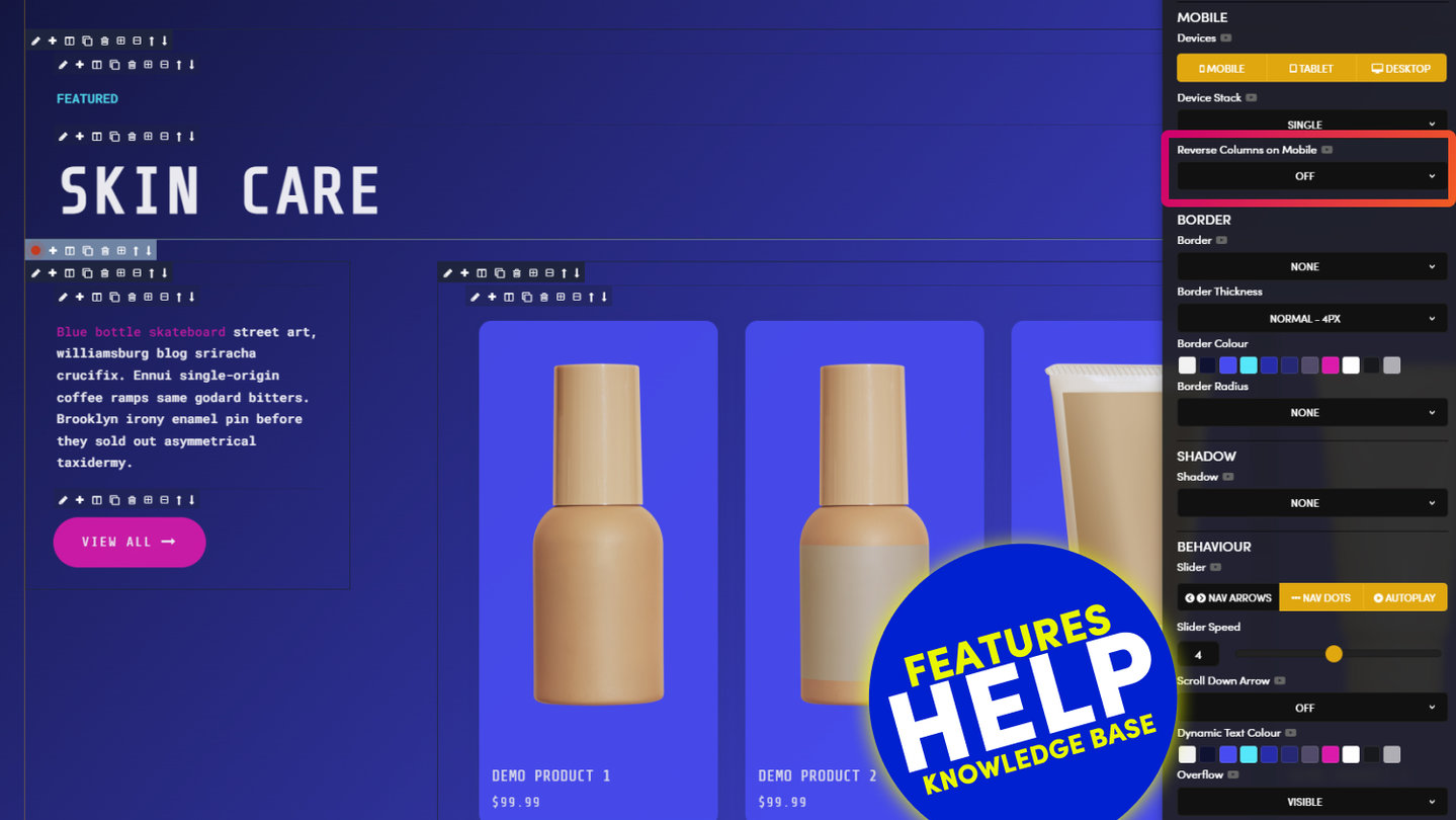
Column Reverse
Column Reverse on Mobile will reverse the order in which your columns stack on Mobile. By default, the Left Column stacks to the top on Mobile, though by setting Column Reverse the Columns will stack from Right to Left. Therefore, in this example, the Title Column, will stack on top, ensuring consistent mobile formatting with other Layouts on the page.
RELATED HELP
PRICING PLANS
MINI
12 PAGES
70 AI THEMES
5,000 AI LAYOUTS
90 MINUTE CHALLENGE
5 DAY CHALLENGE
WEBSITE BUILDER
CMS
BUG FREE MAINTENANCE
ONLINE SHOP
AI HELP ASSISTANT
AI COPY ASSISTANT
AI PHOTO ASSISTANT
AI AGENTS
AI AUTOMATION
AI CHATBOTS | Unlimited
AI VOICEBOTS | 5 Agents
AI VOICEBOTS | $0.08 min
AI VOICEBOTS | Calendar Bookings
PLUS
50 PAGES
70 AI THEMES
5,000 AI LAYOUTS
90 MINUTE CHALLENGE
5 DAY CHALLENGE
WEBSITE BUILDER
CMS
BUG FREE MAINTENANCE
ONLINE SHOP
AI HELP ASSISTANT
AI COPY ASSISTANT
AI PHOTO ASSISTANT
AI AGENTS
AI AUTOMATION
AI CHATBOTS
AI VOICEBOTS | 5 Agents
AI VOICEBOTS | $0.08 min
AI VOICEBOTS | Calendar Bookings
PRO
500 PAGES
70 AI THEMES
5,000 AI LAYOUTS
90 MINUTE CHALLENGE
5 DAY CHALLENGE
WEBSITE BUILDER
CMS
BUG FREE MAINTENANCE
ONLINE SHOP
AI HELP ASSISTANT
AI COPY ASSISTANT
AI PHOTO ASSISTANT
AI AGENTS
AI AUTOMATION
AI CHATBOTS
AI VOICEBOTS | 10 Agents
AI VOICEBOTS | $0.08 min
AI VOICEBOTS | Calendar Bookings
ELITE
UNLIMITED PAGES
70 AI THEMES
5,000 AI LAYOUTS
90 MINUTE CHALLENGE
5 DAY CHALLENGE
WEBSITE BUILDER
CMS
BUG FREE MAINTENANCE
ONLINE SHOP
AI HELP ASSISTANT
AI COPY ASSISTANT
AI PHOTO ASSISTANT
AI AGENTS
AI AUTOMATION
AI CHATBOTS
AI VOICEBOTS | 15 Agents
AI VOICEBOTS | $0.08 min
AI VOICEBOTS | Calendar Bookings
AI AGENCY
40% PLATFORM PAYOUT
100% SERVICES YOU SELL
AGENCY SITE ($199 ELITE PLAN)
PARTNER LICENSE
MY SALES DASHBOARD
MY CLIENTS DASHBOARD
LOGIN TO CLIENT SITES
STAFF PERMISSIONS
TEAM LAYOUTS
NORMALLY $199 /month
PROMO $99 /month
PARTNERS & INTEGRATIONS
70 Award
Winning AI Themes
GETTING AROUND
SUPPORT
AI SALES LINE
AI SUPPORT LINE
GET A QUOTE
A Web Builder for Design. A CMS for Business. We serve all businesses from SME's to Enterprise. Talk with us for AI development, custom website design, website development, ecommerce websites, directories, intranets and social networks.


