PICK YOUR AI THEME TO GET STARTED
FIXED HEIGHT
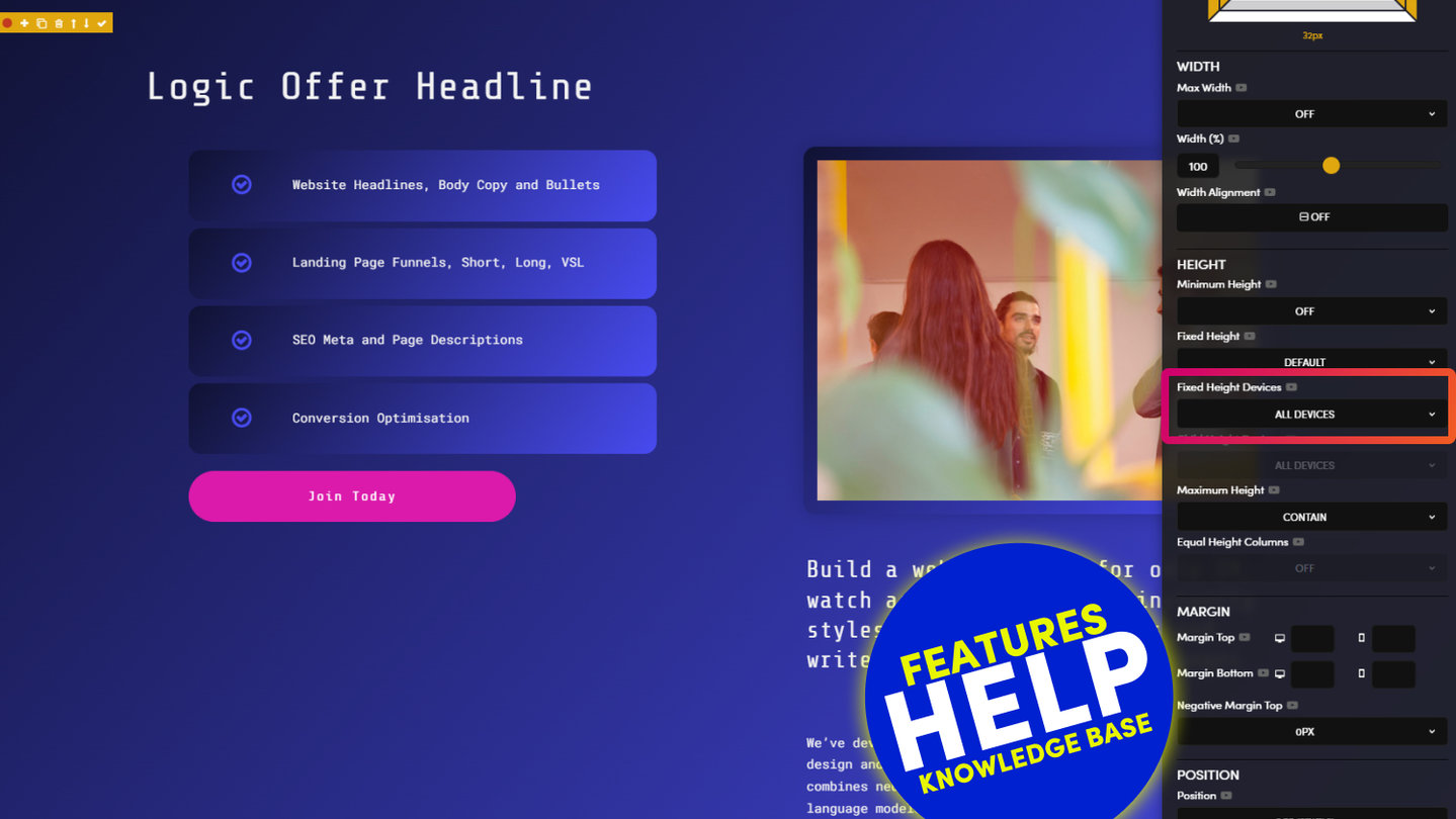
Fixed Height allows you to fix the exact height of your frame. Use Fixed Height, rather than Minimum Height, when you do not wish for your Frame Height to expand as more content is added within it. E.g. Columns and Grids. Fixed Height is also used when your Frame is intended to become a Parent Frame, with a Child Frame inside it.
FIXED HEIGHT INSTEAD OF MINIMUM HEIGHT:
Both Fixed Height and Minimum Height Fixed the Height of a Frame. You might wish to do this on a set of Columns, or in a Grid where you would like the Columns Heights to be flush.
If you set Minimum Height and the content exceeds the height, then the Frame Height will keep growing. If you set Fixed Height then the frame height will remain Fixed, and content will Overflow the frame.
D03 E02 | 06:39
Fixed Height with Background Images
A common query for first timers is when to use Minimum Height vs Fixed Height. Here we choose a Fixed Height to ensure all Background Images within a column maintain the same height, even if different lengths of content are later applied on top of the background images by the content team.
If using a Fixed Height in such a way, you might decide to apply an Overflow Behaviour, to preempt the content team adding more content in the future.
OVERFLOW:
If content Overflows the Frame you have 3 options to control the overflow:
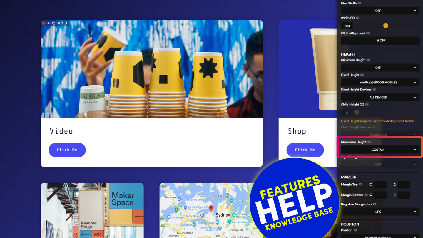
- Visible: Content is not clipped and therefore overflows into the frame below.
- Hidden: Content is clipped and therefore the content that overflows will not be seen.
- Scroll: Content is clipped and a scroll bar is added so that the rest of the content can be seen.

D03 E02 | 03:56
Fixed Height with Background Videos
Just like choosing a Background Image, you can also choose a Background Video and determine the size and shape of your video with a Fixed Height.
PARENT + CHILD HEIGHT
A good example of Parent Frames is when you have a Column or a Grid with Text on Top of a Background Image. In this case you'll want to have a Parent and Child relationship:
PARENT: The Parent Frame has a Fixed Height with a Background Image.
CHILD: The Child Frame includes Text. You can control the Height of the Child Frame with the Child Height. Consider giving the Frame and Background Colour or Overlay.
Since the Child Height is a % height, the Parent must always have known Fixed Height, this minimum Height can not be used.
By Default, when you add a Child Height, this will be set to Desktop Only, meaning it will not apply to Mobile. This is the default behaviour since a Mobile is a smaller screen than Desktop, and therefore the Child elements most often will fill the screen, and therefore no height is required.
However in some cases, the Child elements on Mobile do not fill the screen, e.g. Title Bars. In which case, you can set Fixed Height Devices to 'All Devices' to ensure you Height will also display.
D03 E03 | 14:09
Parent Fixed Height with Child Height %
If you set a Fixed Height to a Parent Frame you can use the Child Frame % tool to give your Child a vertical position. Combine this with Width % and Width Alignment and you can design Blocks to be positioned anywhere on your page.
TROUBLESHOOTING RULE
Lots of Text: 'Desktop'
Short Headline Text: 'All Devices'
TROUBLESHOOTING:
If your Parent Fixed Height does not show on Mobile:
Click on the Parent Frame and set Fixed Height Devices to 'All Devices'.
If your Child Frame does not align on Mobile:
Click on the Child Frame and set Child Height Devices to 'All Devices'.
ABSOLUTE + RELATIVE HEIGHT
A good example of Parent Frames is when you have a Column or a Grid with Text on Top of a Background Image. In this case you'll want to have a Parent and Child relationship:
PARENT: The Parent Frame has a Fixed Height with a Background Image.
CHILD: The Child Frame includes Text. You can control the Height of the Child Frame with the Child Height. Consider giving the Frame and Background Colour or Overlay.
Since the Child Height is a % height, the Parent must always have known Fixed Height, this minimum Height can not be used.
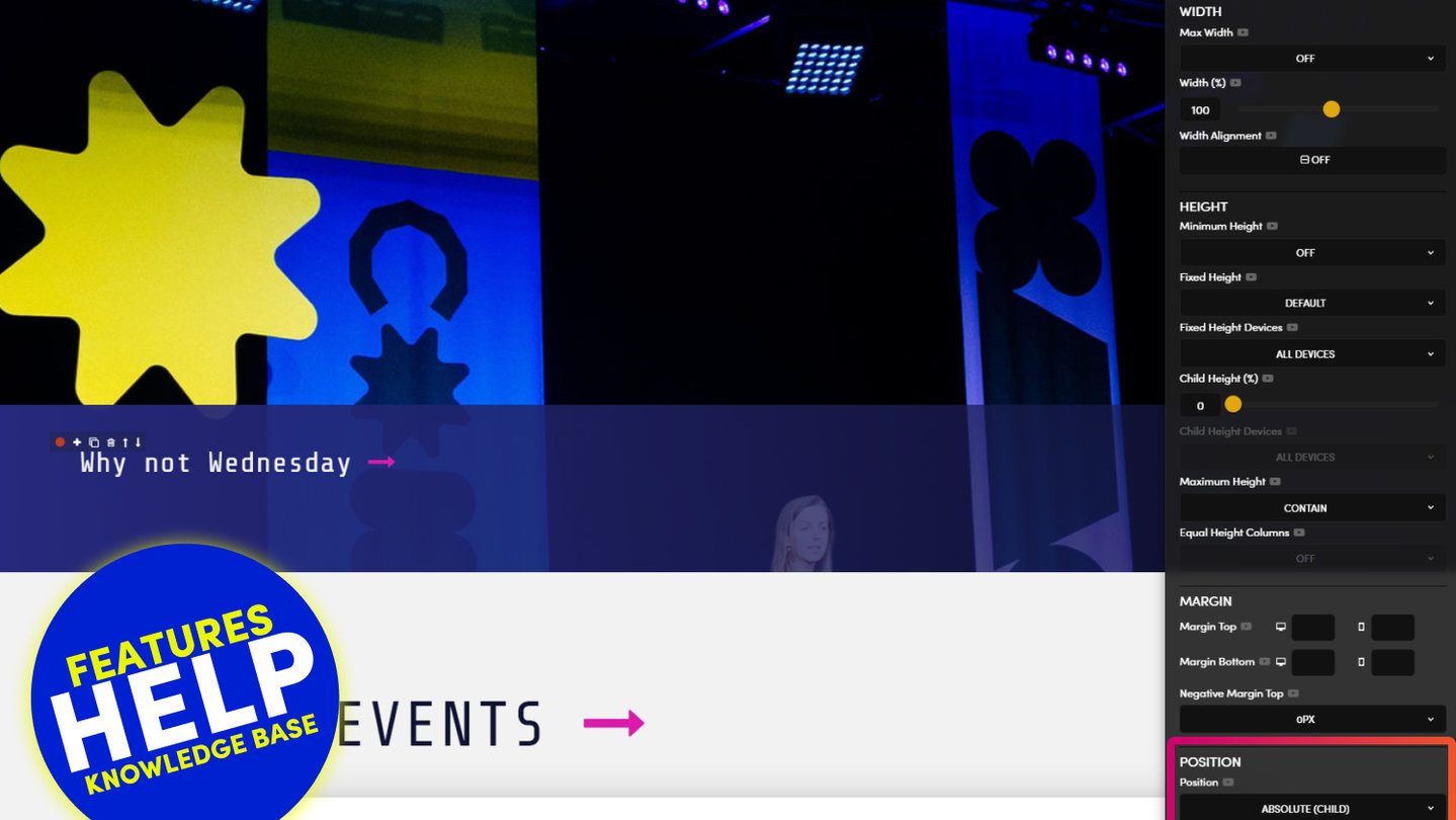
Another option that Frontend Developers use for this Parent and Child relationship is what we call 'Absolute' and 'Relative'. Where it can be said that "the position of Child Frame becomes 'Absolute', 'Relative' to the Parent Frame".
ABSOLUTE (CHILD): The Child Frame set's the Position. We therefore select 'Absolute' plus we also set the Position e.g. 'Bottom-Left'.
RELATIVE (PARENT): The Parent Frame is the frame that the Child is 'relevant' to. Think of it like the anchor that the Child is connected to. So therefore, the position that you set for the Child is relative to the position of Parent.
D03 E03 | 04:02
Parent Fixed Height with Absolute and Relative Positions
Paul | 04:02
So what's going on here? Well said simply:
"Position your Child Frame 'Absolute Bottom Right' relative to the Parent Frame."
Ok, so if you can position your Child relative to the Parent, isn't this the same as the Child Height feature above? Yes it is, so which one should you use? Well, most of MOBLE's clients tend to use Child Height (%) to position Child Frames. However, most Frontend Developers tend to use Absolute and Relative, rather than Child Height.
Why is this? Well, this is because Frontend Developers don't have a UI like MOBLE to play with, where Child Height is quite easy to visualise and more flexible in height position (Simply put, there are more Percentages than Absolute positions, so it's just more flexible and works in far more use cases).
Therefore, the MOBLE Team, tend to encourage Child Height rather than Absolute and Relative. We also know from years of experience that there are less potential conflicts when your future content team begin to add new features and content to your page. An example of this is Background Video, as you now know MOBLE makes the hard decisions for you behind the scenes, well, there is also code running behind the scenes too. You don't need to know any of this, but when you add a Background Video we automatically apply a Relative class for you, and if the content team start randomly adding Relative classes everywhere, and don't clean up their classes as they go, they could in theory, start to leave a trail of unused Relative classes around the page, which could confuse the Video behaviour and cause a conflict. This is really is an edge case, and MOBLE has algorithmic procedures to prevent such situations by striping out unwanted classes, but even so, we've scene it happen. So MOBLE encourage Child Height for Designers and Absolute and Relative as a supporting tool for Advanced users.
So when should you use Absolute and Relative?
In this Episode, we use an Anchor link inside an Image, to Navigate up and down the page. This Image is "Absolute Bottom Right Relative to the Parent Frame". The Image, therefore ignores the Outer Padding, and hugs the Absolute Bottom right. So if you ever have a requirement to place a Frame in a position that ignores Padding, this is a great time to consider Absolute and Relative. We cover Absolute and Relative some more in upcoming episodes.
TROUBLESHOOTING:
Sometimes when using Position, you might notice that the width of your Child Frame does not expand to the Full Width. This might be caused be a conflict elsewhere. If this happens, go to the ADV (Advanced) Tab and in the Class box add the class: max-width

RELATED HELP
PRICING PLANS
MINI
12 PAGES
70 AI THEMES
5,000 AI LAYOUTS
90 MINUTE CHALLENGE
5 DAY CHALLENGE
WEBSITE BUILDER
CMS
BUG FREE MAINTENANCE
ONLINE SHOP
AI HELP ASSISTANT
AI COPY ASSISTANT
AI PHOTO ASSISTANT
AI AGENTS
AI AUTOMATION
AI CHATBOTS | Unlimited
AI VOICEBOTS | 5 Agents
AI VOICEBOTS | $0.08 min
AI VOICEBOTS | Calendar Bookings
PLUS
50 PAGES
70 AI THEMES
5,000 AI LAYOUTS
90 MINUTE CHALLENGE
5 DAY CHALLENGE
WEBSITE BUILDER
CMS
BUG FREE MAINTENANCE
ONLINE SHOP
AI HELP ASSISTANT
AI COPY ASSISTANT
AI PHOTO ASSISTANT
AI AGENTS
AI AUTOMATION
AI CHATBOTS
AI VOICEBOTS | 5 Agents
AI VOICEBOTS | $0.08 min
AI VOICEBOTS | Calendar Bookings
PRO
500 PAGES
70 AI THEMES
5,000 AI LAYOUTS
90 MINUTE CHALLENGE
5 DAY CHALLENGE
WEBSITE BUILDER
CMS
BUG FREE MAINTENANCE
ONLINE SHOP
AI HELP ASSISTANT
AI COPY ASSISTANT
AI PHOTO ASSISTANT
AI AGENTS
AI AUTOMATION
AI CHATBOTS
AI VOICEBOTS | 10 Agents
AI VOICEBOTS | $0.08 min
AI VOICEBOTS | Calendar Bookings
ELITE
UNLIMITED PAGES
70 AI THEMES
5,000 AI LAYOUTS
90 MINUTE CHALLENGE
5 DAY CHALLENGE
WEBSITE BUILDER
CMS
BUG FREE MAINTENANCE
ONLINE SHOP
AI HELP ASSISTANT
AI COPY ASSISTANT
AI PHOTO ASSISTANT
AI AGENTS
AI AUTOMATION
AI CHATBOTS
AI VOICEBOTS | 15 Agents
AI VOICEBOTS | $0.08 min
AI VOICEBOTS | Calendar Bookings
AI AGENCY
40% PLATFORM PAYOUT
100% SERVICES YOU SELL
AGENCY SITE ($199 ELITE PLAN)
PARTNER LICENSE
MY SALES DASHBOARD
MY CLIENTS DASHBOARD
LOGIN TO CLIENT SITES
STAFF PERMISSIONS
TEAM LAYOUTS
NORMALLY $199 /month
PROMO $99 /month
PARTNERS & INTEGRATIONS
70 Award
Winning AI Themes
GETTING AROUND
SUPPORT
AI SALES LINE
AI SUPPORT LINE
GET A QUOTE
A Web Builder for Design. A CMS for Business. We serve all businesses from SME's to Enterprise. Talk with us for AI development, custom website design, website development, ecommerce websites, directories, intranets and social networks.


