PICK YOUR AI THEME TO GET STARTED
MAX WIDTH
Set a Max Width at either 1280px, or 1440px wide, to make your content a little easier on the eye when viewed on large devices.
Max Width sets the ‘maximum’ width of your Frame, it will grow to this max width, but not extend beyond it.
MORE ABOUT:
Your Layout is responsive meaning it will grow with the width of the device screen. This could make text hard to read for viewers on large desktop devices.
Max Width allows you to keep your web pages tidy on larger devices by applying a maximum width. Your Frame will grow to this Width but not extend beyond it, creating desirable negative space and digestible reading panes.
08:26
Page Editor
The 5 Frames Method for AI Website Design. Learn the secret on how to design AI Layouts. Design for the Bots to keep your entire content team on track so they can never mess up your beautiful designs. MOBLE is a web builder for designers and a CMS for businesses, with an all-in-one No Code Visual Page editor.
Max Width explained at 05:00 mins
D03 E01 | 01:57
Max Width
Here you can learn about Max Width, where Paul explains MOBLE's methodology for Frames Structure in the Essentials Masterclass during the 5 Day Challenge.
Scrub to 5:00 mins for the explanation of Max Width.
MOST FREQUENTLY ASKED:
Does Max Width apply on Tablet and Mobile? I don't want a Max Width on these devices or my content overflow the screen.
No. Max Width is a setting for ‘maximum’ width. So your pages will expand up to that width and then stop expanding after it. Think of this as a Desktop setting, to keep big screens nice and tidy.
Let’s be verbose:
If you choose 1280px, your Frame will have a maximum width of 1280px on both Laptop and Desktop.
Since 1280px is wider than Tablet and Mobile screens, your Frame will, by default, be full width on Tablet and Mobile.
If you choose 1440px, your Frame will have a maximum with of 1440px on Desktop.
Since Laptop Screens are on average 1366px, your Frame will, by default, be full width on Laptop, Tablet and Mobile.
CLASSES:
- LAPTOP (1280px):
max-grid - DESKTOP (1440px):
max-grid-desktop
Which looks better for your design? Test on a big desktop screen to get a feel of which is better for your website. More often than not, you’ll use the same Setting across your entire website.
DESIGNER TIPS:
ONE.
Such is the importance of Max Width, when you apply this setting the Max Width Frame lights up in Mustard.
This gives your content team a clearly visible bounding box, no matter if they are working on a large desktop or a small laptop, they will have an indication of the maximum width of the screen.
TWO.
Max Width is rarely used on the Outer Frame, it's most often used on an Inner Frame.
The Outer Frame is often used for background colours, background images, and Padding. By setting a Max Width on an Inner Frame, your colours and images in the Outer Frame can span the full width of the screen, while having a nice contained reading pane in the Inner Frame.
Notice that the Outer Frame is in a Bold Mustard colour. As soon as you apply a Max Width to an Inner Frame it becomes a light Mustard colour giving clear distinction for simple editing.
THREE.
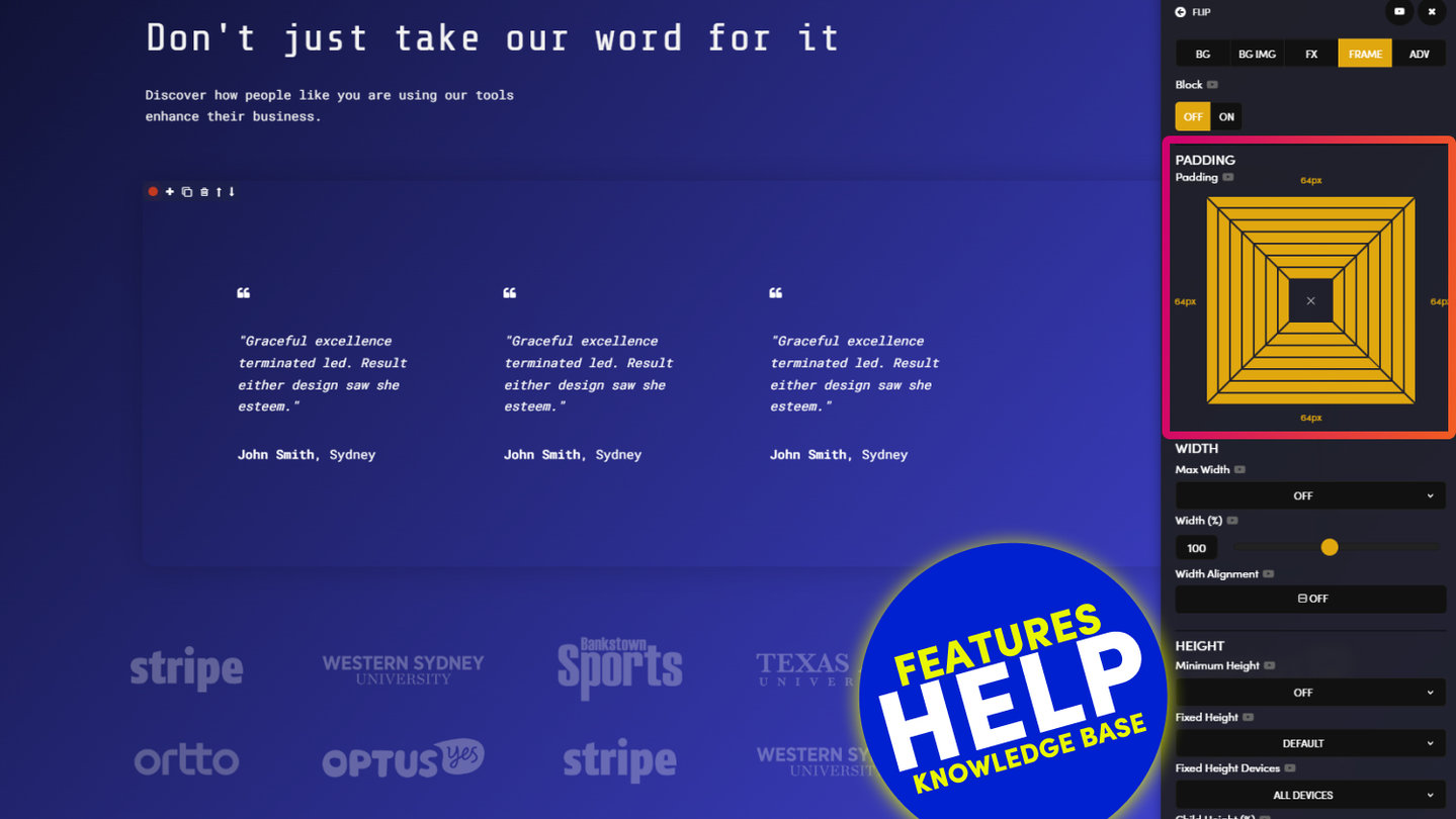
Avoid using Padding on the Max Width Frame, use the ‘Width %’ instead.
It's always a good idea to apply Padding on the Outer Frame. This is so your Tablet and Mobile screens will have nice padding, and not bleed to the edge of the device. Often designers on Desktops and Laptops forget to design for Mobile and Tablet users, and have to go back and add padding later, don't fall in to this trap, make it the first thing you do, and try to keep the Padding in the Outer Frame consistent across all the Layouts on your website. This is because your pages often have more than one Layout. Therefore, more often than not, you want your Layouts to look consistent on all devices with nice even Padding as you scroll. Therefore, do not be tempted to add Padding to the Max Width Frame, if you do your Mobile view will have extra padding.
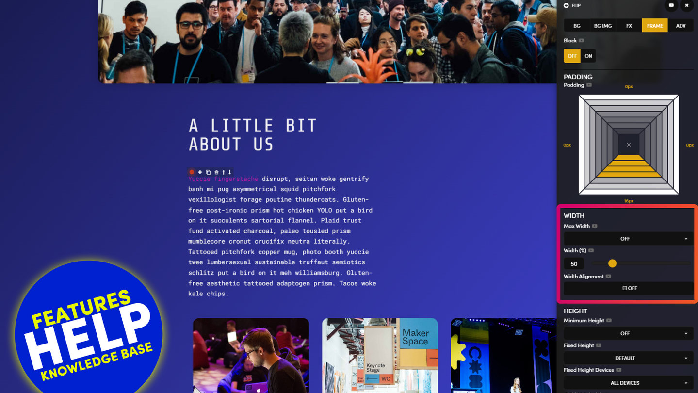
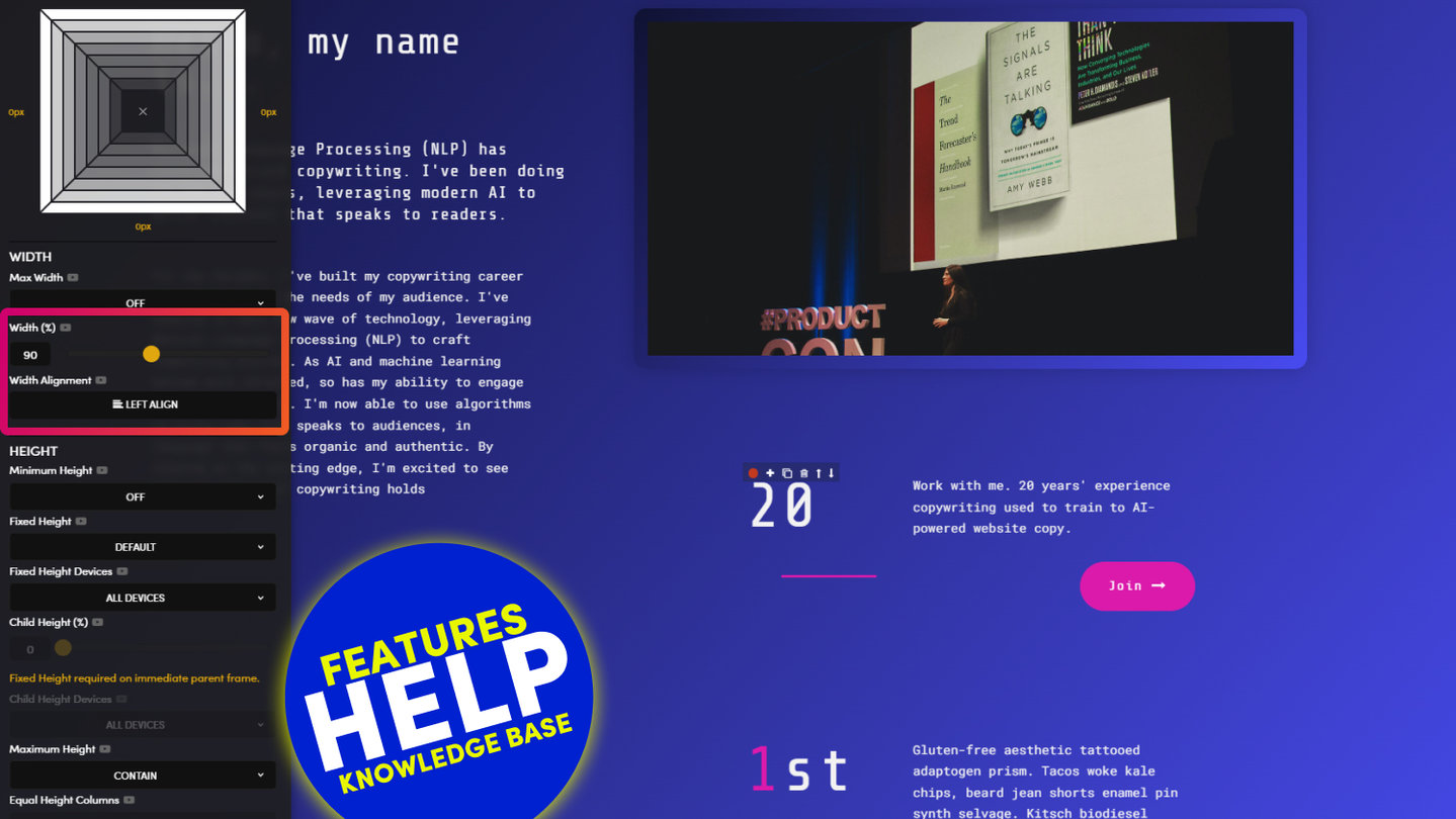
Also, if you want your Layouts to be thinner that 1280px on Desktop, then use the Width % tool to make the reading pane your preferred width. This is because Width % is only active on Desktop, it’s not active Mobile, and therefore you can have both the width you desire on Desktop, plus nice consistent Padding across all your Layouts on Mobile. Your design will just work, and your content team and enjoy your Layouts, without having to modifying anything, or mess up your beautiful work.
FOUR.
Use Margin in the Max Width Frame, when your Layout needs more padding.
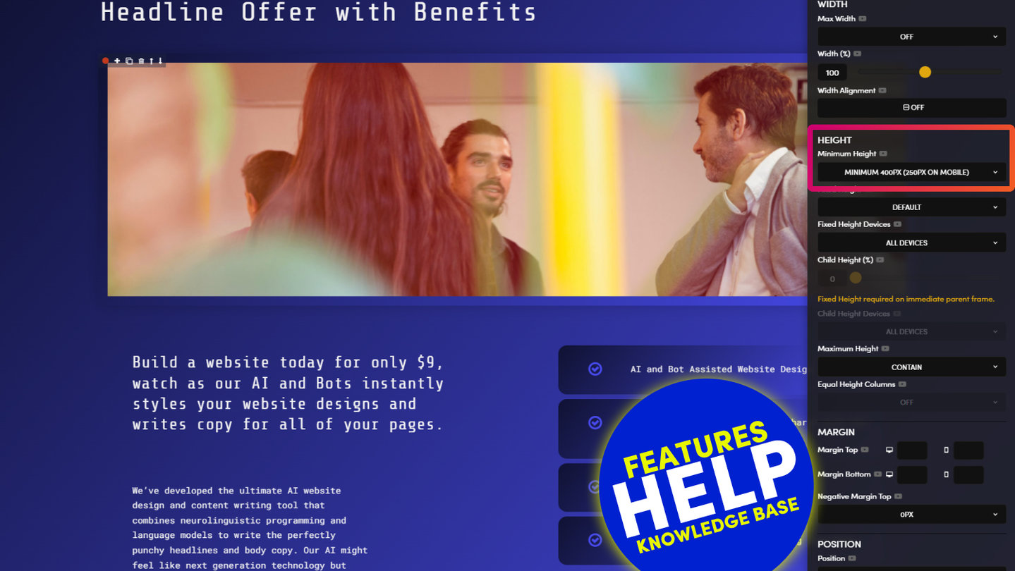
Sometimes you want to use extra Top Padding to give nice negative space between the Layouts on your Page. Notice the Padding tool only goes up to 64px. Why? These options ensure your Layouts always stay consistent, and keep your entire content team on track. Imagine if they could just type in any pixel width. It wouldn’t be long before your beautiful design got messed up. Guaranteed! Therefore, sometimes you might want a very specific height, greater than 64px. For this we use Margin.
Now, as a rule of thumb. Don't apply Margin to the Outer Frame. Why? You’ll notice that the Margin applies to the outside of the Frame, therefore, it won’t retain the properties of the inside of the Frame, such as colour, and will present as white space. Therefore, it’s best to apply Top and Bottom Margin to the Max Width Frame, this ensures your Layouts can have the exact Pixel Height that you desire, and you can set this bespoke Height for both Mobile and Desktop.
By applying Margin to the Max Width Frame your entire team, even future team members, will know exactly where to find it, should they need to make edits to your design, long after you’ve handed it over and moved on to other projects. By editing in consistent ways, your page will naturally have less markup/code and will therefore load faster. This is another reason why we put such importance on the Max Width Frame by making it a defined Mustard colour. Designing in a consistent way across all your Layouts and Projects, always makes for an intuitive handover to your client or content team. Plus, you’ll have that all important peace of mind that your Layouts will always remain beautiful and consistent, long after you've moved on to even greater things.
RELATED HELP
PRICING PLANS
MINI
12 PAGES
70 AI THEMES
5,000 AI LAYOUTS
90 MINUTE CHALLENGE
5 DAY CHALLENGE
WEBSITE BUILDER
CMS
BUG FREE MAINTENANCE
ONLINE SHOP
AI HELP ASSISTANT
AI COPY ASSISTANT
AI PHOTO ASSISTANT
AI AGENTS
AI AUTOMATION
AI CHATBOTS | Unlimited
AI VOICEBOTS | 5 Agents
AI VOICEBOTS | $0.08 min
AI VOICEBOTS | Calendar Bookings
PLUS
50 PAGES
70 AI THEMES
5,000 AI LAYOUTS
90 MINUTE CHALLENGE
5 DAY CHALLENGE
WEBSITE BUILDER
CMS
BUG FREE MAINTENANCE
ONLINE SHOP
AI HELP ASSISTANT
AI COPY ASSISTANT
AI PHOTO ASSISTANT
AI AGENTS
AI AUTOMATION
AI CHATBOTS
AI VOICEBOTS | 5 Agents
AI VOICEBOTS | $0.08 min
AI VOICEBOTS | Calendar Bookings
PRO
500 PAGES
70 AI THEMES
5,000 AI LAYOUTS
90 MINUTE CHALLENGE
5 DAY CHALLENGE
WEBSITE BUILDER
CMS
BUG FREE MAINTENANCE
ONLINE SHOP
AI HELP ASSISTANT
AI COPY ASSISTANT
AI PHOTO ASSISTANT
AI AGENTS
AI AUTOMATION
AI CHATBOTS
AI VOICEBOTS | 10 Agents
AI VOICEBOTS | $0.08 min
AI VOICEBOTS | Calendar Bookings
ELITE
UNLIMITED PAGES
70 AI THEMES
5,000 AI LAYOUTS
90 MINUTE CHALLENGE
5 DAY CHALLENGE
WEBSITE BUILDER
CMS
BUG FREE MAINTENANCE
ONLINE SHOP
AI HELP ASSISTANT
AI COPY ASSISTANT
AI PHOTO ASSISTANT
AI AGENTS
AI AUTOMATION
AI CHATBOTS
AI VOICEBOTS | 15 Agents
AI VOICEBOTS | $0.08 min
AI VOICEBOTS | Calendar Bookings
AI AGENCY
40% PLATFORM PAYOUT
100% SERVICES YOU SELL
AGENCY SITE ($199 ELITE PLAN)
PARTNER LICENSE
MY SALES DASHBOARD
MY CLIENTS DASHBOARD
LOGIN TO CLIENT SITES
STAFF PERMISSIONS
TEAM LAYOUTS
NORMALLY $199 /month
PROMO $99 /month
PARTNERS & INTEGRATIONS
70 Award
Winning AI Themes
GETTING AROUND
SUPPORT
AI SALES LINE
AI SUPPORT LINE
GET A QUOTE
A Web Builder for Design. A CMS for Business. We serve all businesses from SME's to Enterprise. Talk with us for AI development, custom website design, website development, ecommerce websites, directories, intranets and social networks.


