PICK YOUR AI THEME TO GET STARTED
PADDING
Learn how to set up a Layout from scratch, and where to apply Padding to each Frame for consistent responsive design across all devices.
If you always design in a consistent way your pages will be easy to build and manage. While MOBLE lets designers access all the tools in each and every frame, there is a simple, consistent, methodology, for setting up Layouts, that just works. Follow this methodology to make Layouts from scratch, with clean semantic code, that load quickly, and will be easy for your content team to use and understand, ensuring your website design will remain beautiful, long after you've moved on to other projects.
08:26
Page Editor
The 5 Frames Method for AI Website Design. Learn the secret on how to design AI Layouts. Design for the Bots to keep your entire content team on track so they can never mess up your beautiful designs. MOBLE is a web builder for designers and a CMS for businesses, with an all-in-one No Code Visual Page editor.
D03 E02 | 06:28
Setup: Frames Structure
As an Agency, MOBLE designed a methodology of how to structure Frames, that are not just convenient for initial designers, but also keep our clients on track so they never stray off brand. As a platform, MOBLE bots have been created to serve this methodology, and if you stick to what you learn in this episode, our bots will be able to make rapid future changes changes and redesigns for you.
D03 E02 | 03:39
Setup: Blocks Structure
Create Blocks as 'Cards' that live inside your inner padding. Here we explain exactly what to do if you require padding on Cards, meaning a third Block of padding required, which always sits on the inside of the Inner Padding.
D03 E02 | 05:22
Setup: Columns and Grids Structure
Create Blocks as 'Cards' that live inside your inner padding. Here we explain exactly what to do if you require padding on Cards, meaning a third Block of padding required, which always sits on the inside of the Inner Padding.
D03 E02 | 02:09
Shortcuts: Padding
Create Blocks as 'Cards' that live inside your inner padding. Here we explain exactly what to do if you require padding on Cards, meaning a third Block of padding required, which always sits on the inside of the Inner Padding.
Hold 'Alt ⌥' = all sides
Hold 'Ctrl ⌘' = one side all columns
Hold 'Alt ⌥' + 'Ctrl ⌘' = all sides all columns
D03 E02 | 01:34
Shortcuts: Move Frames and Blocks
It's possible to pick up and entire frame, including all it's components to a new location on your page. Here we explain this extremely useful shortcut.
SHORTCUT
Move an Active Frame ''
Click the Pencil Icon to make the frame active (red dot).
Hold 'Shift' + click '+' on destination frame
MORE ABOUT:
The first thing to note is that Padding sits on the inside of the Frame.

Choose between 8 Padding sizes:
- 0px
- 2px
- 4px
- 8px
- 16px
- 32px
- 48px
- 64px
WHY DO I HAVE TO SELECT A PADDING SIZE, WHY CAN'T I JUST TYPE IN A PIXEL WIDTH?:
A website design might first design a mockup in Figma, or Photoshop. In such programs, there is no limitation to the Padding. E.g. you could choose to make Padding 20px. However, this might seem desirable on first approach, though this does not consider a CMS and the content team that needs to manage pages.
If the CMS has a free form pixel size for Padding, invariably the website page gets messy, very quickly, once it has left the designers care, and in to the hands of day to day content management team. Website Builders are often good for the Designer, but do not consider what happens after the designer has handed over the website to the client or content team. MOBLE understands this issue and solves it by giving very tight padding sizes that just work, and are flexible for the design to work with, and easy for the content team to manage. The end result is that the designer is happy for an easy hand over, and confident that their Portfolio piece will remain beautiful. The content tea can just get on with business and apply settings that they can easily understand and replicate. It just works.
"You are not just designing for your immediate design considerations, your are designing for all future content users, so that they will always stay on track."
D03 E02 | 02:00
Margin - Padding can be bespoke Height
Designers sometimes question why MOBLE don't recommend having bespoke Padding Widths. MOBLE's UI has Left and Right Padding in widths of 2px, 4px, 8px, 16px, 32px, 48px and 64px. Working with these precise widths ensures your content team will always keep consistent padding alignment. It also means that our bots can apply your padding preferences to all Layouts, giving your team an extra 5,000 Layouts to play with, that will always be perfectly aligned.
Remember, if you do want to customise your frame to an exact width, you should use the Percentage Width tool allowing to have the precise look that you require.
D03 E02 | 03:39
Margin - Padding can be bespoke Height
While we don't recommend having bespoke Padding for Left and Right, you can use Margin to determine the exact pixel height for Top and Bottom, on both desktop and mobile.
DESIGNER TIPS:
How to use Padding when setting up a layout from scratch:
OUTER FRAME
The Outer Frame is often used for a background image, or a background colour. You should apply Padding on this Frame. Even if it doesn't feel like you need Padding on Desktop, it will Automatically create your padding on Mobile. If you're a beginner just use 64px on all sides.
MAX WIDTH
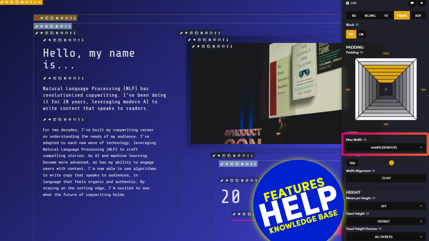
The Inner Frame is where you apply a Max Width. This is the Maximum Width of a Frame on Desktop. Notice this Frame lights up in Light Mustard as soon as you add a Max Width. If you're a beginner, do not adding Padding to this Frame. Adding Padding automatically creates a 16px Padding on Mobile. If you've added Padding on the Outer Frame, plus added Padding on the Inner Frame, you will now have 32px on Mobile. Therefore, it's not advisable to add Padding here since not all Layouts will have a Max Width, and you want all Layouts to be consistent on all devices.
FRAME WIDTH (%)
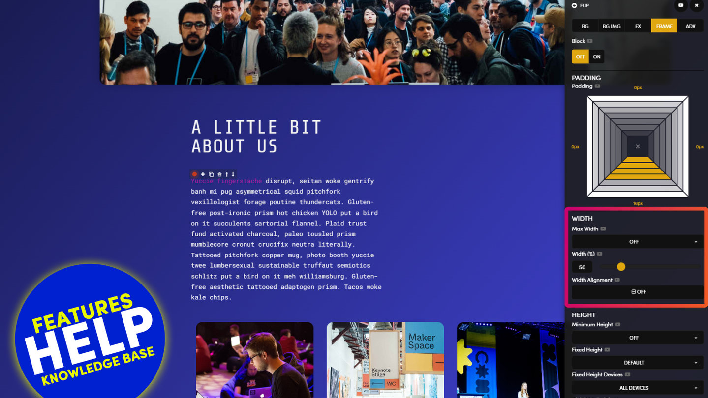
On the inner Frame consider using Width % to reduce the width of the Frame. This is better than using extra padding as Width % is inactive on Mobile, therefore your Mobile Padding will remain neat and consistent.
MARGIN
The Padding tool only goes up to 64px. In instance where you'd like to add more Margin to give your Layouts more vertical space, use the the Margin tools. Here you can add custom heights for this Layout. The height you add often depends on the other Layouts that are above or below. This gives you the ability to decide and make your pages beautiful, with a consistent process across all your Layouts. If you're a beginner, then don't use Margin. 64px is most often the maximum you want to go.
BLOCK
A Block is where you want to add your Padding. Again, try to make this consistent. If you're a beginner, use 16px or 32px on all sides. Or, perhaps use 32px wide, and 16px high, to be more true to a landscape device screen. The main this is to try to be consistent on all you Layouts, then only deviate when you need to.
Once you've added Padding use the Block Tool to denote the Frame as a Block. In the future, your Layout may have many content editor as they come and go through the business. Making the Frame a Block, change the colour of the Frame to Dark blue. This make it easy for all users to understand where Padding lives, and helps make managing pages simple and consistent long in to the future.
COLUMNS
If your Layouts have Columns. Use the Column tool to add Columns. In this video (above), I'm selecting 3 Columns. Notice that I apply a Block Class to the Parent Frame of each Column.
Also, notice that your website is automatically responsive. The Columns Stack on mobile, even in the Editor. But you can use the Preview tools in the Top Bar, or click Save and View, to View you page in a new Tab.
PADDING SHORTCUTS
Rather than apply the Padding to each Side and then each Column separately, I use the following Shortcuts to apply the Padding to all Sides of all Columns in on click.
- OPTION ⌥: Applies Padding to all sides.
- CTRL ⌘: Applies Padding to all Columns
- OPTION ⌥ + CTRL ⌘: Applies Padding to all Sides and all Columns
CONTENT
Finally, you can add your Content. In this case, I'd like to add an Image, Text, and a Button. So I add three Frames, and add the relevant Content Components to each. Notice each Content Component is wrapped by a Frame. This allows me to add Padding, should I need it. In this case, I like to add 8px to the Top of the Button, as this feels just right.
IMAGE COMPONENT V'S BACKGROUND IMAGE
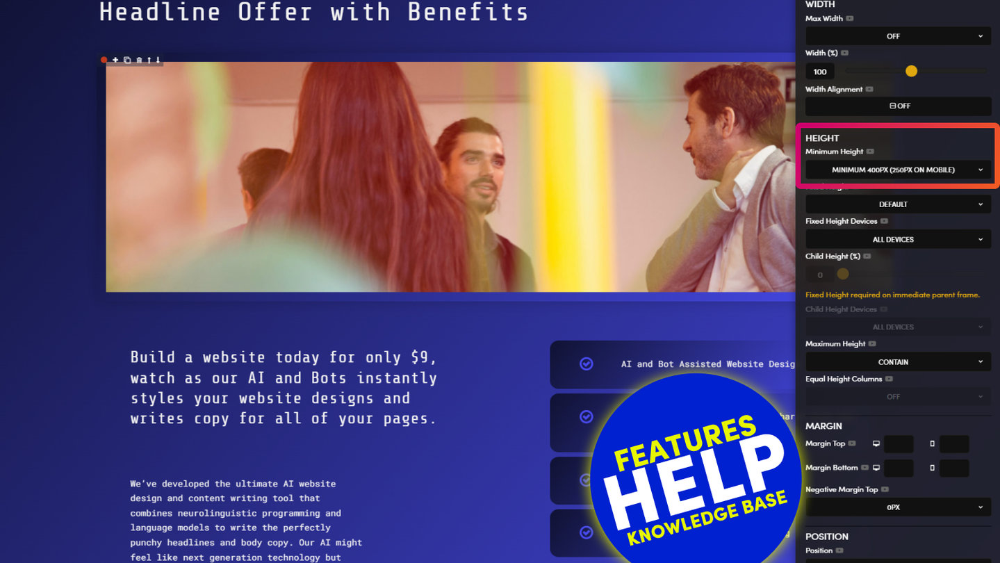
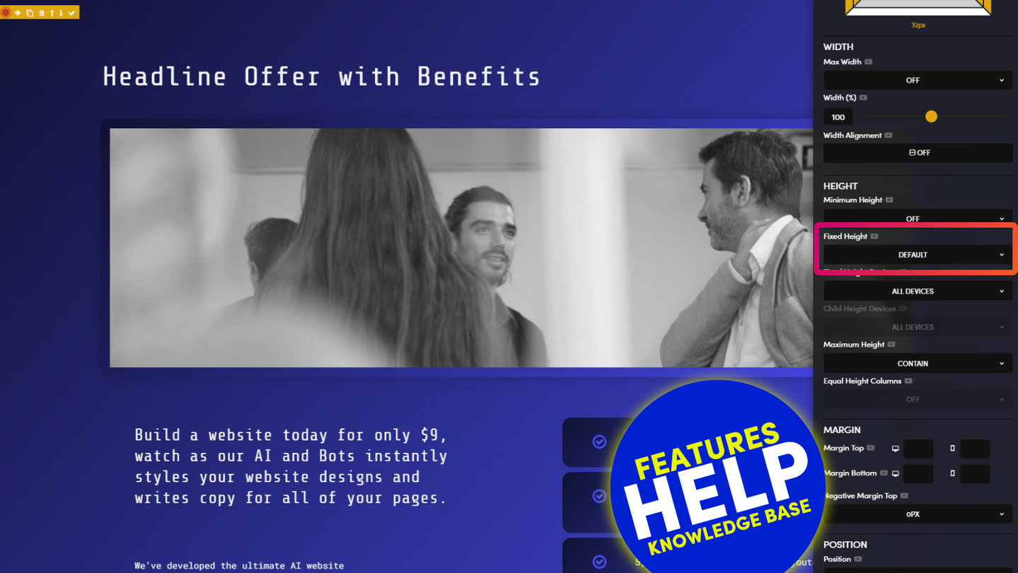
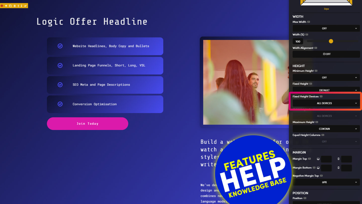
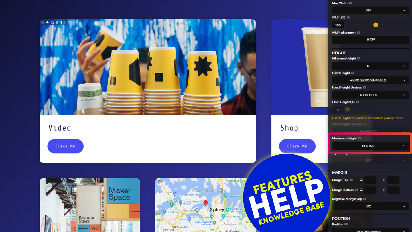
Notice the images I select have different heights. This is because these the first two images were 16X9 and the last Image was a square. Though, I'd like all the images to be the same height, in this case I'd like them to be quite tall at 500px high. Rather than use an Image Component to embed an Image, I can instead use an Image in the Background. I can give the Frame a Fixed Height of 500px. And I can adjust the position of the Image. Though, in this case I'll set the Image to 'Cover' the full width, and set it not to Repeat.
USE CHILD HEIGHT TO OVERLAY TEXT
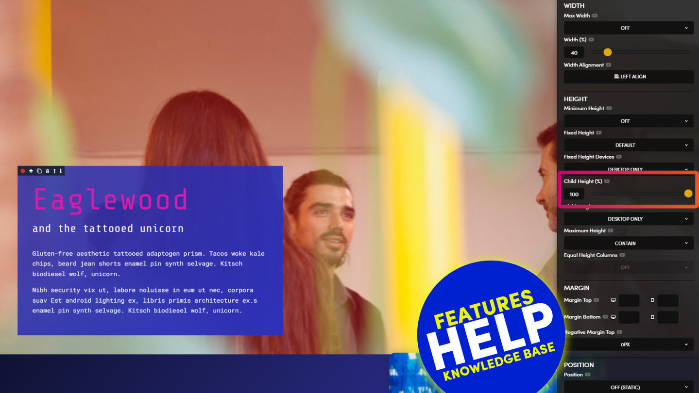
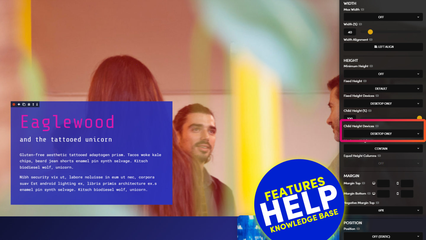
Sometimes you might wish to add Text on top of your Background image. In which case you can add another Frame. Notice that when a Frame has a Fixed Height it automatically become a Parent, and the Child Height tool becomes available. In this case, I'd like the text to sit on the bottom. So I drag the Child Height to 100%. The text is Quite hard to read, so I give it an Overlay and change the text Colour to White. I give the Frame some Padding, in this case 16px Left and Right, and 8px Top and Bottom.
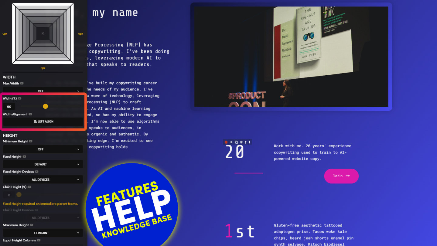
I also decide to make the Overlay 80% Width, so I use the Width tool and can play with the position of the overlay using Child Height and Width %, I can even adjust the alignment using Width Alignment.
I decide that I prefer the Grid View look, with text on Top of the Image, rather than the Card View with text below the image, so I clean up the Columns using the Delete tool.
CHANGING COLUMNS
I now need to add a new Column, so I use the column tool to make it 4 Columns. Notice that the last Column is duplicated. 4 Columns seems too condensed, so I'll actually make two Rows of two Columns. If I decide to make it 2 Columns. Notice the last two columns will delete. I don't want to loose that content, so I'll use the undo tool to bring it back to 3 Columns.
CLONING LAYOUTS AND MOVING BOCKS
I'll use the Clone tool to duplicate the 3 Columns. Then, I'll use the column tool to make the second row 2 Columns. If I want to move the Third Column of the First Row, to the First Column of the 2nd Row, I can hold SHIFT ⇧ and click the PLUS + icon of the chosen location. I can use delete to tidy up the Frames. And now use the Column to make the first Row 2 Columns.
Again, notice that these Rows are Responsive, and they stack on Mobile, but I'd prefer that they they'd double stacked on Mobile, so set the Device Stack to 'Double'.
VIDEO BACKGROUNDS
I decide that I want to make one of the Background Images a Background Video. So I head over to YouTube, or Vimeo, to get the link. In Vimeo, we use the 'Video File Link', located in the 'Distribution' Tab. I simply copy it, and Paste it in to the Background Video field. Click 'Save and View' to view the video in the tab, as we Play Videos in the Editor to save Memory. You can leave the Background Image.
VIDEO BANNER LAYOUT
I decide add a Banner, rather than create a Banner from scratch, I choose one from the Layouts tab, where there are 5,000 readymade Layouts. You can search Layouts for every type of web page, or you can for Layouts on specific Themes. There's currently 60 themes and we're always adding more. When you drag and drop any Layout from any Theme it will instantly change into your website Fonts and Colours for rapid design. Check out other videos on that. For now, I'll just drag this onto the page.
Notice the Hierarchy of the Frames is exactly as you've just leant. This is the beauty of building in a consistent way everything is intuitive for all users, with uniform, semantic markup. While there are many Video Banners all ready-to-go, the Layout I've chose doesn't have a Video. So I'll paste the Vimeo Link again.
ABSOLUTE CHILD POSITION, RELATIVE TO THE PARENT FRAME
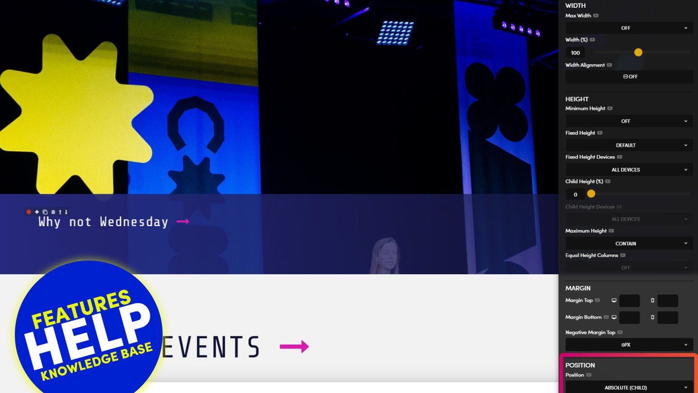
Now, I again want to add a Text Overlay. This time, I want my text to be in a Fixed position, and always remain Fixed to the bottom of the Banner on all devices. As web designers we say, I want the "Child Frame to be Absolute Bottom Left Relative to the Parent Frame". So, in Position you can see that I make the Child Frame 'Absolute' and 'Bottom Left' and 'Relative' to the Parent Frame.
USING BLOCK TO TIDY UP AND HANDOVER
You can see we've had two instance of how Child and Parent Frames can behave together. In many 'No-Code' platforms that you've probably tried, this can become very confusing, designers, even developers get it wrong, never mind their clients. So you can see how MOBLE simplifies even such advanced coding techniques. This is archived by having a nice, consistent, Page Hierarchy. It gives designers flexibility to create things, while all content, both now and in the future, the ability to pick up any Page and work in a Uniform way.
In Web Design, we call the Frame with the Padding a Block. So if you like you can use the Block tool to Tidy up your page and make it amazingly clear and simple for all future users.
DESIGNER MODE AND BUSINESS MODE
As designers we have an in joke, that you need to create two designs. The beautiful design for your Portfolio, that you first presented to your client, and the one the ends up on the Internet after your client has messed it up. You can see from this Tour that MOBLE is both a Web Builder for Designers and a CMS for Business. It helps designers create Beautiful Web Pages, plus hand them over in a way that your Content Team can understand. But it gets better than that. Notice in the Top Bar there is a Design Mode and a Business Mode. Design Mode is the Web Builder for Designers, and Business Mode is the CMS for Business. When you content team just wants to swap text and images, or change dynamic content they stay in Business mode.
WIREFRAME MODE
Certain Clients will want to see a Wireframe, so you can Flip you Page in to Wireframe mode. A share your page, knowing that even your Wireframes are responsive, so there's literally no need to waste time sketching mocks. If you like drag layouts with your clients. They instantly turn in to there brands fonts and colours, but you can flip them to Wireframe mode too!
SAVING LAYOUTS
Once you're happy with your Layout. Click the Check Icon on the Frame Tools and your Layout will instantly be Saved as a Layout and added to the Layouts Drawer for you Clients and Content Teams to use. You can present branded Layouts to your Clients and even charge for the number of Layouts they'd like to build.
DYNAMIC LAYOUTS
In the next episodes we're going to look at how to create Page Layouts for Online Store Product Pages, Category Pages, News Pages like the ABC or BBC, Video pages like Netflix. Event pages to sell Tickets or take RSVP, Donation Pages, even Subscription Pages and so much more. This isn't just a web page builder, it is an enterprise level CMS for powerful Dynamic Pages too, because you don't need to install apps like Shops, or Galleries, or Events, or Blogs you can just select the type of content you want, you can even combine content in the Same feed like Shop Products with Videos and related News. Just give it a tag and your content will instant display. As soon as your content team ads new content, products and images, it will instantly load on the page. They don't even have to edit the page. Of course, if you want to flip a grid, to a slider, or even a multi-slider. You can do it in a few clicks, to keep your page fresh, or quickly clone and build variants. The options are endless so make sure you watch the Widgets training to turn yourself from a designer to an enterprise level content management Pro.
CLASSES:
- PADDING LEFT
2px: padding-left-thinnest
4px: padding-left-thinner
8px: padding-left-thin
16px: padding-left
32px: padding-left-wide
48px: padding-left-wider
64px: padding-left-widest - PADDING RIGHT
2px: padding-right-thinnest
4px: padding-right-thinner
8px: padding-right-thin
16px: padding-right
32px: padding-right-wide
48px: padding-right-wider
64px: padding-right-widest - PADDING TOP
2px: padding-top-thinnest
4px: padding-top-thinner
8px: padding-top-thin
16px: padding-top
32px: padding-top-wide
48px: padding-top-wider
64px: padding-top-widest - PADDING BOTTOM
2px: padding-bottom-thinnest
4px: padding-bottom-thinner
8px: padding-bottom-thin
16px: padding-bottom
32px: padding-bottom-wide
48px: padding-bottom-wider
64px: padding-bottom-widest
RELATED HELP
PRICING PLANS
MINI
12 PAGES
70 AI THEMES
5,000 AI LAYOUTS
90 MINUTE CHALLENGE
5 DAY CHALLENGE
WEBSITE BUILDER
CMS
BUG FREE MAINTENANCE
ONLINE SHOP
AI HELP ASSISTANT
AI COPY ASSISTANT
AI PHOTO ASSISTANT
AI AGENTS
AI AUTOMATION
AI CHATBOTS | Unlimited
AI VOICEBOTS | 5 Agents
AI VOICEBOTS | $0.08 min
AI VOICEBOTS | Calendar Bookings
PLUS
50 PAGES
70 AI THEMES
5,000 AI LAYOUTS
90 MINUTE CHALLENGE
5 DAY CHALLENGE
WEBSITE BUILDER
CMS
BUG FREE MAINTENANCE
ONLINE SHOP
AI HELP ASSISTANT
AI COPY ASSISTANT
AI PHOTO ASSISTANT
AI AGENTS
AI AUTOMATION
AI CHATBOTS
AI VOICEBOTS | 5 Agents
AI VOICEBOTS | $0.08 min
AI VOICEBOTS | Calendar Bookings
PRO
500 PAGES
70 AI THEMES
5,000 AI LAYOUTS
90 MINUTE CHALLENGE
5 DAY CHALLENGE
WEBSITE BUILDER
CMS
BUG FREE MAINTENANCE
ONLINE SHOP
AI HELP ASSISTANT
AI COPY ASSISTANT
AI PHOTO ASSISTANT
AI AGENTS
AI AUTOMATION
AI CHATBOTS
AI VOICEBOTS | 10 Agents
AI VOICEBOTS | $0.08 min
AI VOICEBOTS | Calendar Bookings
ELITE
UNLIMITED PAGES
70 AI THEMES
5,000 AI LAYOUTS
90 MINUTE CHALLENGE
5 DAY CHALLENGE
WEBSITE BUILDER
CMS
BUG FREE MAINTENANCE
ONLINE SHOP
AI HELP ASSISTANT
AI COPY ASSISTANT
AI PHOTO ASSISTANT
AI AGENTS
AI AUTOMATION
AI CHATBOTS
AI VOICEBOTS | 15 Agents
AI VOICEBOTS | $0.08 min
AI VOICEBOTS | Calendar Bookings
AI AGENCY
40% PLATFORM PAYOUT
100% SERVICES YOU SELL
AGENCY SITE ($199 ELITE PLAN)
PARTNER LICENSE
MY SALES DASHBOARD
MY CLIENTS DASHBOARD
LOGIN TO CLIENT SITES
STAFF PERMISSIONS
TEAM LAYOUTS
NORMALLY $199 /month
PROMO $99 /month
PARTNERS & INTEGRATIONS
70 Award
Winning AI Themes
GETTING AROUND
SUPPORT
AI SALES LINE
AI SUPPORT LINE
GET A QUOTE
A Web Builder for Design. A CMS for Business. We serve all businesses from SME's to Enterprise. Talk with us for AI development, custom website design, website development, ecommerce websites, directories, intranets and social networks.


